With the introduction of Shopify Online Store 2.0, launched in June 2021, sections and blocks give you a powerful way to customize and extend your Shopify themes. It saves you tons of time in the process of setting up a new Shopify store.
Even though a Shopify theme set up with ‘sections’ is simple to use, you are limited to the capabilities of the sections your theme provides, and you can’t just customize every page however you like without custom modifications to your theme files. Here are a few examples:
- I have the Dawn theme installed in one of the stores, but I am not able to change the width of columns between the grids. I need 70 % width of the left column and 30% width right of the right column. I am not able to get any CSS code in base.css. (Source)
- I wanted to make the Multicolumn 5 columns instead of 4 on my Dawn theme (source)
- Dawn Theme Multicolumn - Desktop 3 columns instead of 4 (source)
- I would like to add a 3 column image section like this one (source)
So, what is the easiest way to create column-based layouts when building your Shopify pages with sections and blocks?
In this article, you will learn the best practices to create a grid layout for your Shopify sections and blocks and how to use free Easy Content Builder’s section settings to create versatile page layouts within your Shopify theme editor.
Grid layout best practices
Following a general guideline from Shopify and for the best practices, the grid layout should:
- Visual hierarchy: Structure primary/secondary column layouts so the primary column (with a larger width) is used for the main content block and the secondary columns (with a smaller width) is used for the less critical content blocks.
- Use equal-width layouts with two or more columns when each layout section has the same importance.
- For text-based content: Stack content blocks vertically to highlight information hierarchy.
- For other content that doesn't need to show hierarchy, stack content blocks horizontally or create a grid. The important thing is to ensure the section grid is fully responsive. You can do so by stacking content blocks into more rows or presenting horizontal sliding controls.
- For standard pages like homepage, product, About us pages, combine different column-based sections to present information clearly while guiding the user's visual flow. In some cases, it’s a good idea to separate different sections using a full-width section.
- For landing pages, create at least two layout options to see what works best - (1) split your layout into two or three columns, or (2) use a single-column layout that follows the F-shaped pattern of reading (which means visitors scan the page from left to right and top to bottom).
Besides those rules, a crucial tip when creating a grid layout for your section is ensuring you make room for white space. White space - known as spacing - is a fundamental element in grid design and is just as important to a grid as columns and rows are. Especially when you take a content-first approach, an effective use of white space can improve your page readability, information hierarchy, and encourage users to take action when browsing your pages.
Easy ways to create multi-column layouts using Easy Content Builder
You can use Easy Content Builder - our free Shopify app - to set up multi-column layouts using sections and blocks. The app helps you cut the need to design page layouts from scratch.
For those new to Easy Content Builder, this app enables you to add customizations to your existing Shopify theme or build a custom page from scratch. It provides you with a wide range of prebuilt sections to mix and match - video backgrounds, parallax effects, animation on scrolling, background mask image, multi-column layouts, countdown timer, upsell & cross-sell products, before & after sliders, accordions, tabs, galleries & more.
That said, you can create:
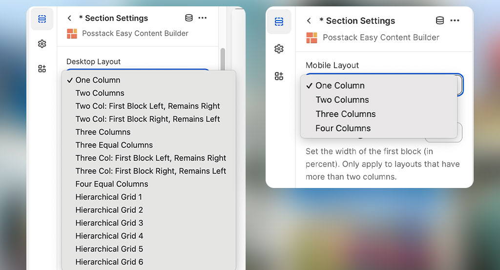
- One, two, three, four column layouts with customizable column widths.
- More 'freestyle' multiple-column layouts using Hierarchical grid.
- Or special sections like Icons With Text, Featured Products/Collections, Gallery that allow you to display multiple content items per row.
Good to know: this 7-min video will walk you through creating a custom template and assigning it to multiple product pages in bulk.
One column layout
Creating a one-column layout that can run full width or be centered on your page is handy for various use cases. For example, hero sections on your homepage or landing pages, a featured promotional banner on your collection page, or a featured brand story on your About us page, etc.
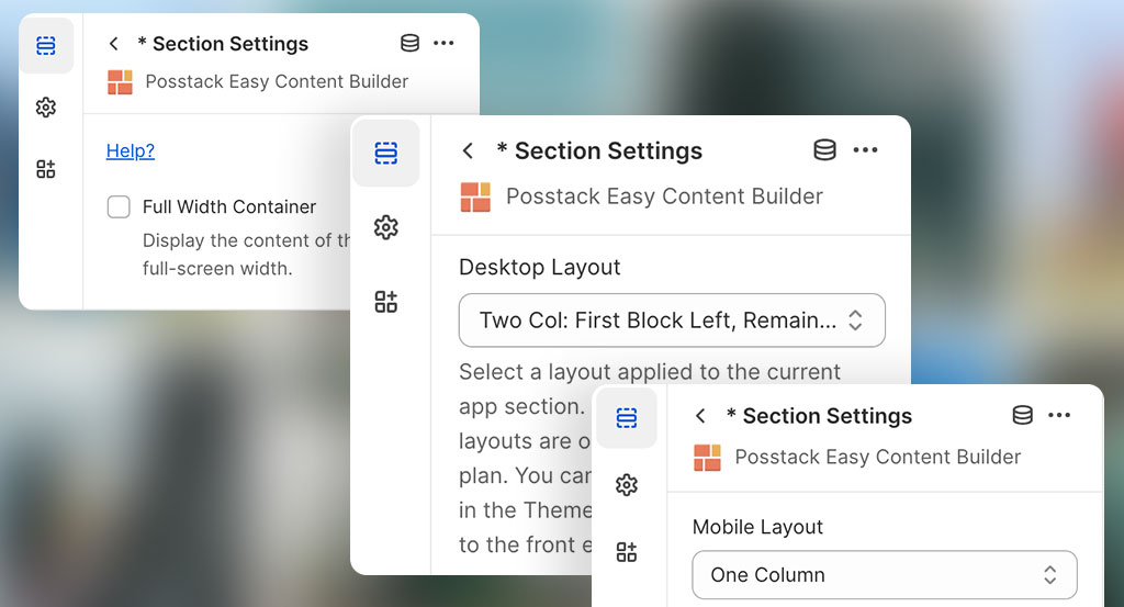
You don't need any technical expertise to launch a one-column layout with Easy Content Builder. The setup steps are straightforward - following this guide, you should be able to define the number of columns on Desktop/Mobile, enable the full-width, or specify the max container’s width like the screenshot below:
Here are two examples of one-column sections created by Easy Content Builder:
 Full-width hero with video background: view demo.
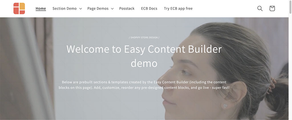
 One-column section “Our Products & Values” with 1000px container width: view demo.
Two, three, or four column layouts
Using two or more column layouts is a great way to create unique layouts for your Shopify pages. Easy Content Builder comes packed with flexible column options for 2, 3, and 4-column layouts.
 Easy Content Builder lets you flexibly define the layouts for desktop and mobile devices.
And most importantly, you can define the width (in percent) and the position (left or right) of the main column within a section. The app also lets you adjust the white space between columns and rows using the Row Gap, Column Gap configuration.
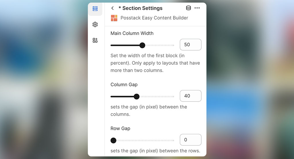 Flexibly define the column width and spacing.
Good to know: You can check out these step-by-step guides to learn how Easy Content Builder can help you create multiple-column layouts without using any code.
After you specify the column-based layout that fits your store, you add pre-built sections to each column. This will give you endless personalization options to create exciting and unique page layouts and designs.
Below are some examples of multi-column layouts created by Easy Content Builder for your inspiration:
 A landing page that mixed 1, 2, and 3-col sections: view demo.
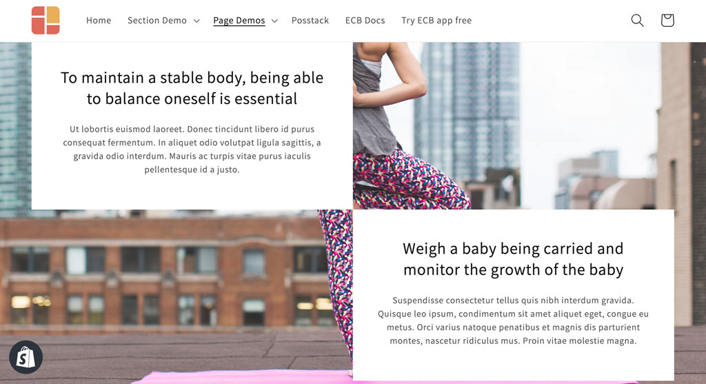 A 2-column section with a blank column: view demo.
 A 2-col section with the main column set with 60% width: view demo.
Hierarchical grids
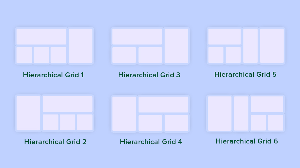 Easy Content Builder's Hierarchical grids
Besides the column-based layouts mentioned above, Easy Content Builder brings you new Hierarchical Grids that let you create a wide range of sections with even more interesting layouts.
The best part of this layout approach is that the initial 6 hierarchical grids open up unlimited layout options by combining them with various pre-built sections from our section library. You can check out 10+ hierarchical grid examples to see for yourself.
Special multi-column sections
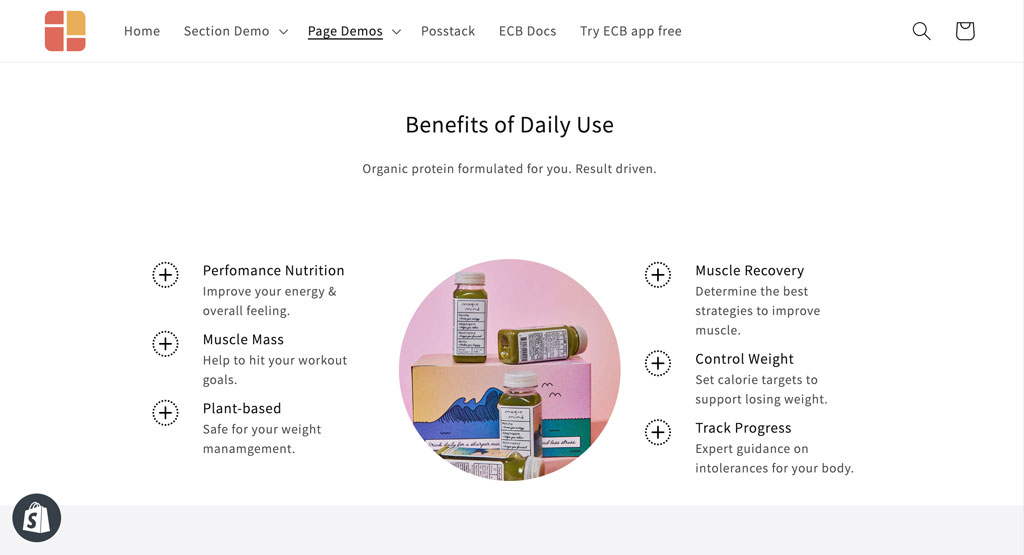
Remember you don’t always need to use the column grids introduced above to group and lay out content elements on your page. You can also take advantage of the 3rd option - using special sections that Easy Content Builder provides, such as Icons With Text, Gallery, Featured Products/Collections - to present a row of multiple items.
You can feature up to six elements per row for the Icons with Text and Gallery sections. If you use these sections on a smaller area, like below the main Add to Cart button on a Shopify product page, the section will automatically stack items into more rows.
 The Icons With Text presents 2 items per row: view demo.
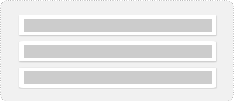
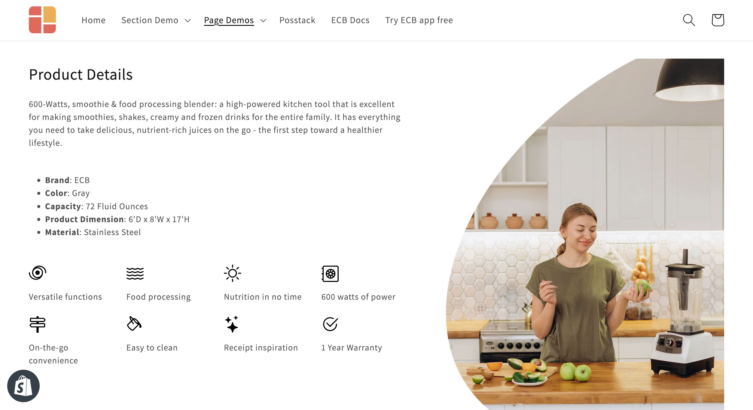
 The Icons With Text section presents 1 item per row: view demo.
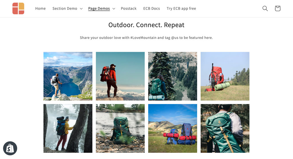 The Gallery section presents 4 items per row: view demo.
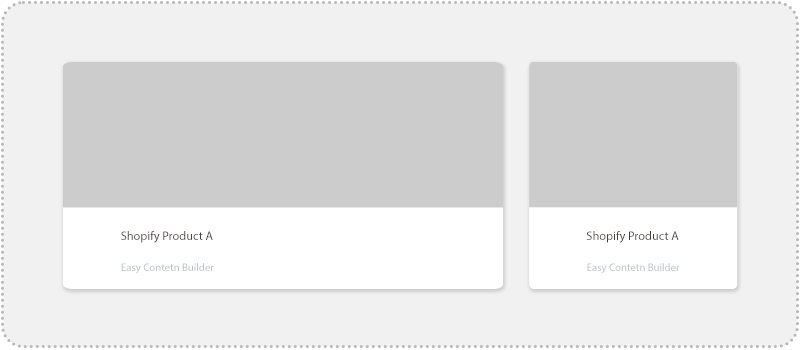
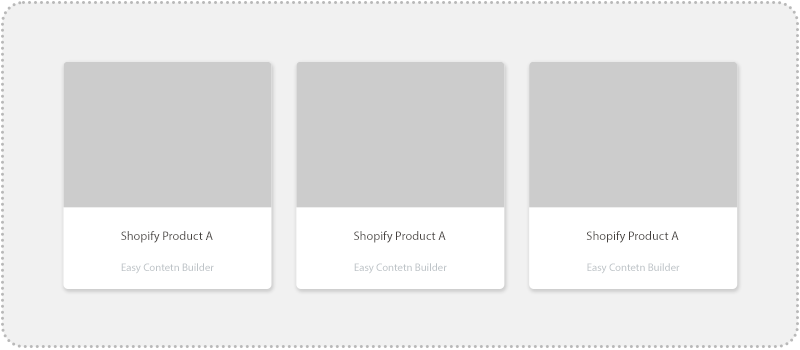
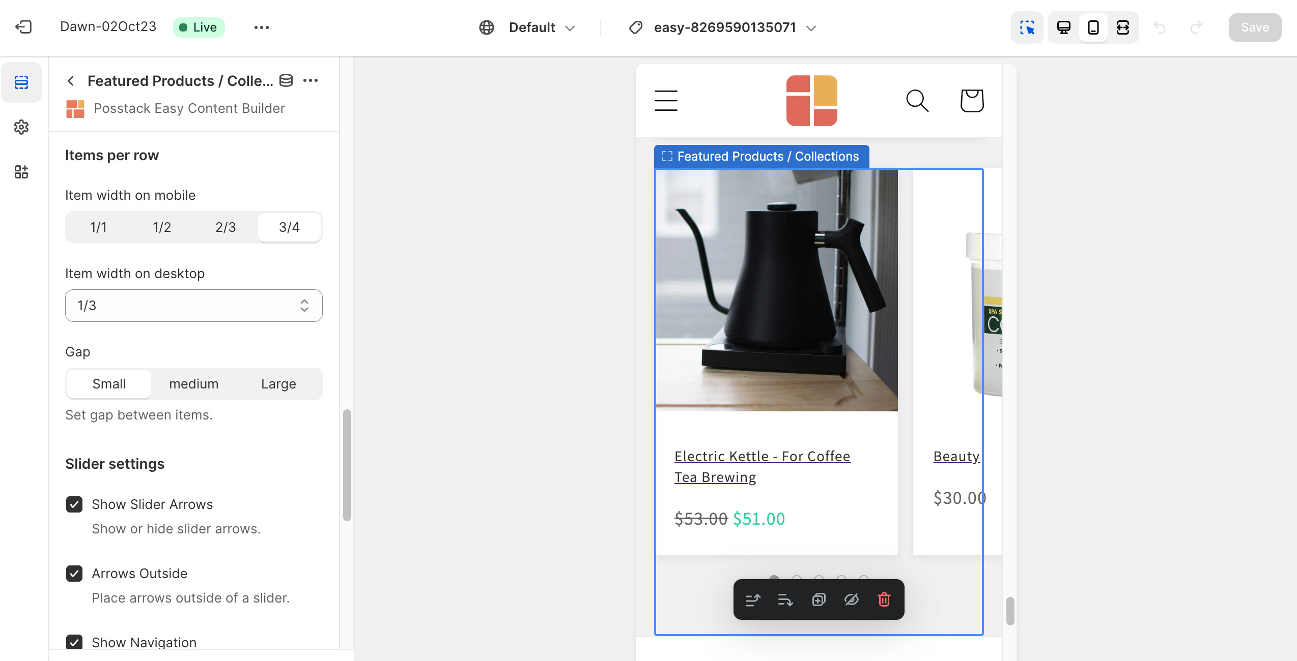
For Featured Products/Collections, you can control how many products should appear per row on Desktop and mobile devices:
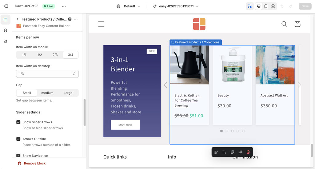 Featured Products/Collections created by Easy Content Builder
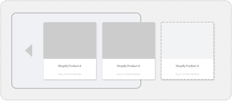
 Stacking product items horizontally on desktop and display horizontal sliding control on mobile: view demo.
Expanding your Shopify theme...
Sections have become a popular way to customize and extend Shopify themes. So, it's an obvious choice to create multiple column layouts at the section level.
If you choose to tailor your Shopify theme using Easy Content Builder (which is free), it saves you tons of time. With the 'mixed and matched' section library that Easy Content Builder provides, you can experiment and design different multiple column layouts to see what works best for your brand.
Check out this quick video of how to build a custom template and assign it to multiple product pages in bulk.
Download Easy Content Builder on the Shopify store
Useful links: Exploring the benefits of Shopify sections: Why does it matter?