We're pleased to announce the important improvements of our Easy Content Builder - bringing new hierarchical grids. This update gives you creative control to create a few different types of sections in more interesting layouts beyond the common column and modular grids.
We hope and believe it is a perfect way to tailor your Shopify themes with dynamic sections on any store page.
Before learning how you can leverage the new hierarchical grids, let's look at what Shopify sections are and how they work.
What are Shopify theme sections?
As you might know, the big Online Store 2.0 - an overhaul of how themes are built at Shopify launched Jun 2021 - allows you to use Shopify 'sections everywhere'.
By default, sections are modular components of a Shopify theme - to put it another way, themes use sections to create your page layout. Sections contain blocks that serve specific functionalities, such as Image With Text, Icons With Text, Before & After Slider, Image Gallery, Accordion, Tabs, etc.
Using sections and blocks enables you flexibly add, remove, and reorder your store's content without the need of coding.
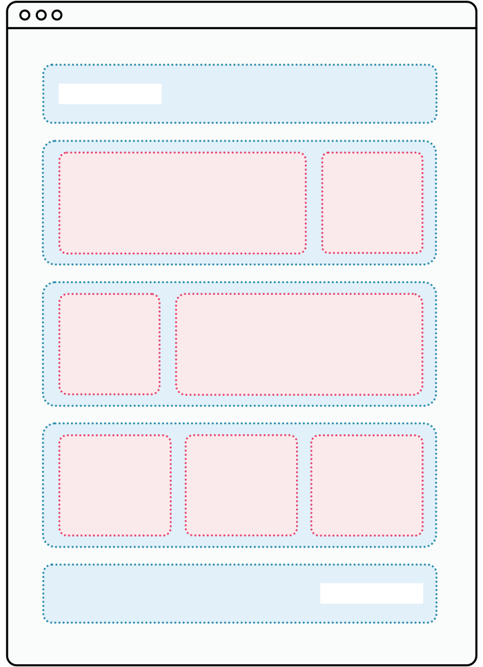
The Shopify sections are highlighted in blue, and blocks are highlighted in red.
Default Shopify sections vs. Easy Content Builder sections?
At present, Shopify lets you add up to 25 sections per each template and up to 50 blocks per each section. This provides more flexibility in how you can organize your page layout. However, which sections and blocks are available depends on the specific theme that you use.
If you opt for the Dawn theme - a free theme built by Shopify, you might notice a few drawbacks:
- Some sections have limits on the number of blocks you can add or limits on the number of blocks of a certain type. For example, Image with text section only lets you add one of each of the following blocks - a heading, a paragraph, a button.
- You can not build your page from rows and columns or create a custom collage of promo blocks.
- There is no carousel or slideshow, etc.
So, how to unlock the power of the Shopify sections to customize your Shopify theme?
We suggest using the Easy Content Builder - this app does the heavy lifting for you. It enables you to add (no-code) advanced functionalities to your theme layout directly within the Theme Editor, a few to name:
- Multiple-column layouts: organize each section in column grids, modular grids, or hierarchical grids.
- Upselling and cross-selling with Featured Products/Collections
- Hero section (with multiple CTAs, countdown timer, etc.)
- Image With Text (supports multiple styles including card, overlay, overlay with mask, flexible image placement, etc.)
- Icons With Text (handy for multi-purpose use cases: Featured Testimonials, Partner logos, How it works, etc.)
- Before & After Slider
- Image & Video Gallery
- Add full-width sections
- Extended section settings (parallax, animation on scrolling, image background, video background, gradient background, mask color and image, etc.)
More ‘Freestyle’ Hierarchical Grids
Now let’s take a closer look at how to enhance your Shopify theme sections with the new Hierarchical Grids.
In this release, Easy Content Builder brings the following Hierarchical Grid options:
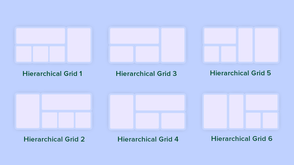
New hierarchical grids added to the Easy Content Builder app.
Depending on which grid option you choose, content blocks in each section are split into two-column or three-column layouts.
The best part of this hierarchical grid layout approach is that you can add a wide variety of content blocks into each section - Image With Text, Icon With Text, Gallery, Tabs, Accordion, Custom HTML, Featured Products/Collections, etc.
This gives you a wide range of layout options depending on the combination of those content blocks. For example, the Image With Text alone comes with 4 variations - Image Left/Right/Top/Bottom, which means you have at least 16 options to try with all Hierarchical Grid layouts. Now that you can see the possibilities, we're excited to see what you will come up with these new hierarchical grids in your real-life scenarios.
For now, let's have a quick glance at some examples of the hierarchical grids created on our Easy Content Builder's demo:
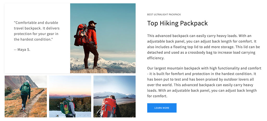
Easy Content Builder: Hierarchical Grid 1.
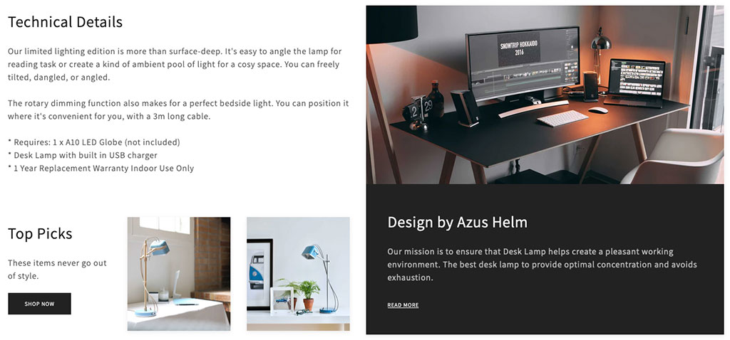
Easy Content Builder: Hierarchical Grid 1.
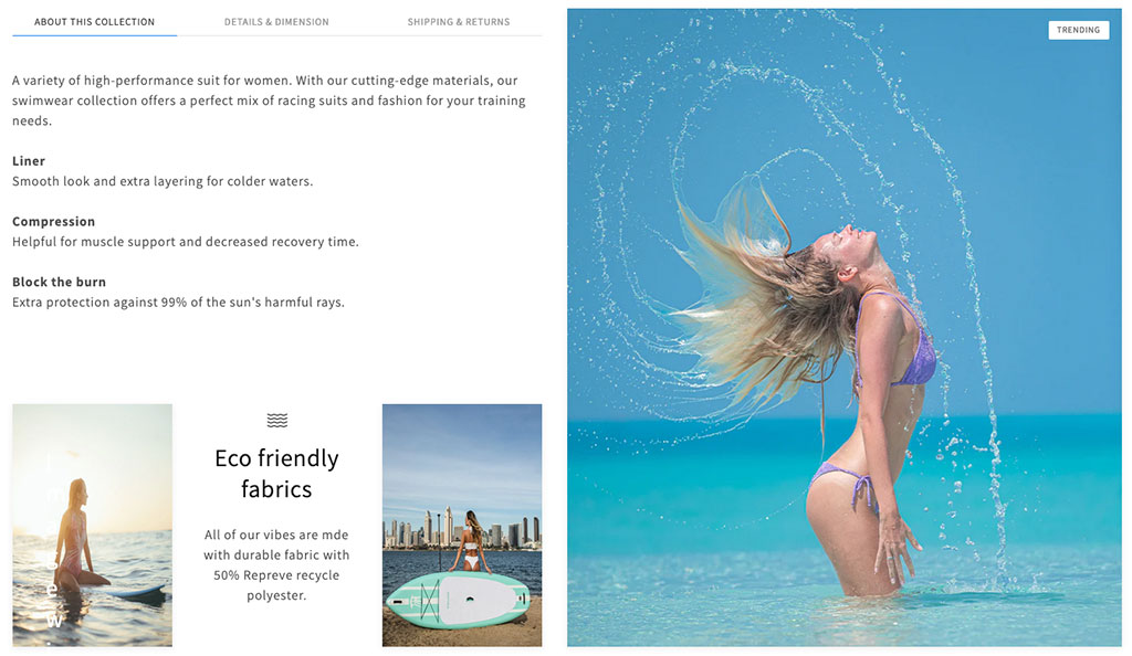
Easy Content Builder: Hierarchical Grid 1.

Easy Content Builder: Hierarchical Grid 2 - With a review carousel.
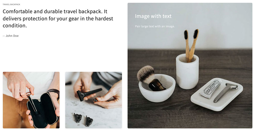
Easy Content Builder: Hierarchical Grid 3.
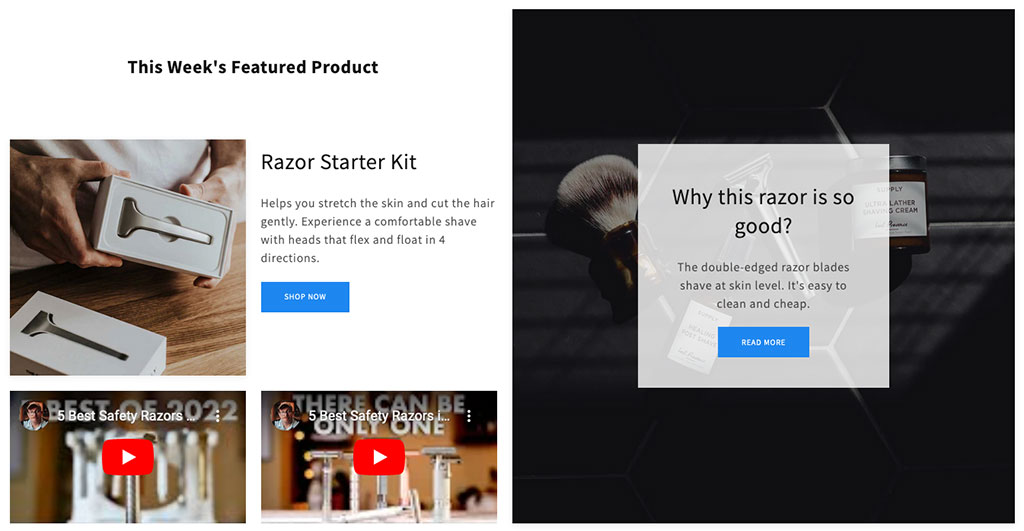
Easy Content Builder: Hierarchical Grid 3.
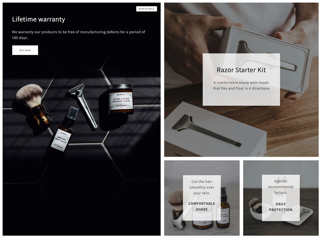
Easy Content Builder: Hierarchical Grid 4.
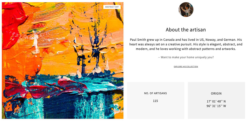
Easy Content Builder: Hierarchical Grid 4.
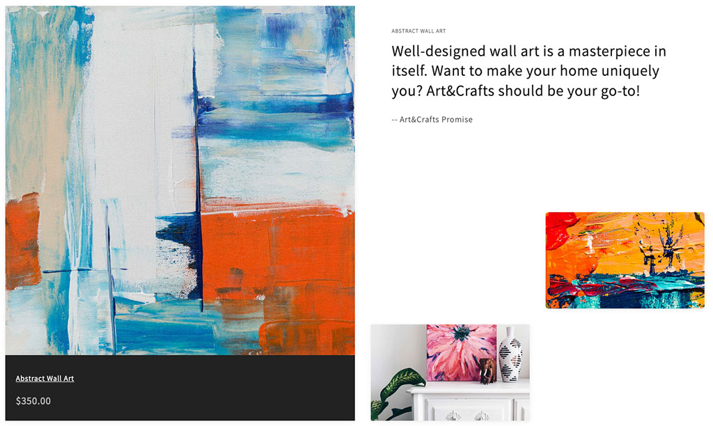
Easy Content Builder: Hierarchical Grid 4.
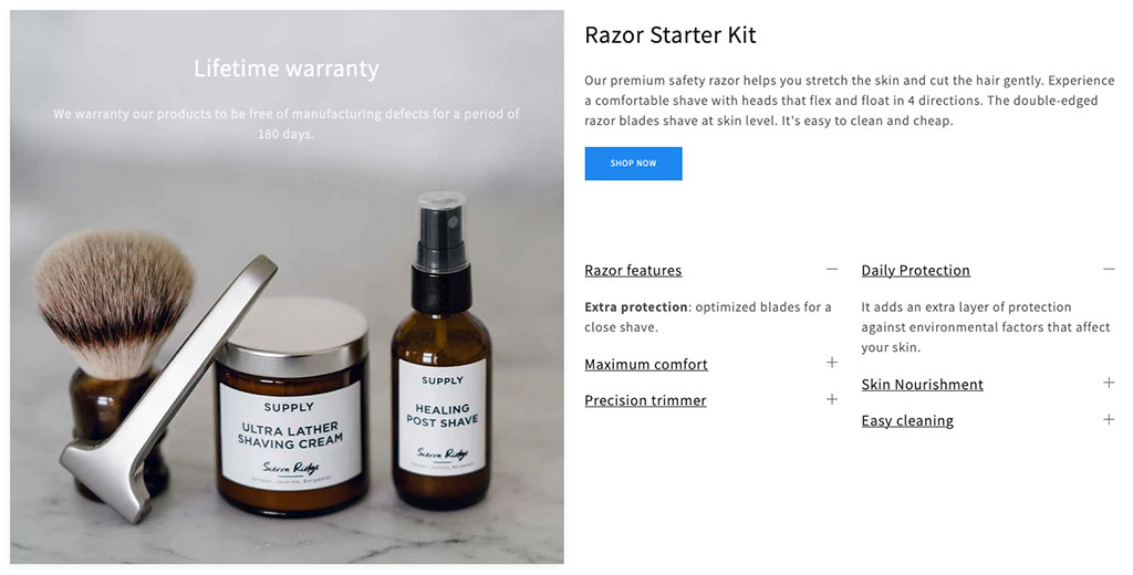
Easy Content Builder: Hierarchical Grid 4.
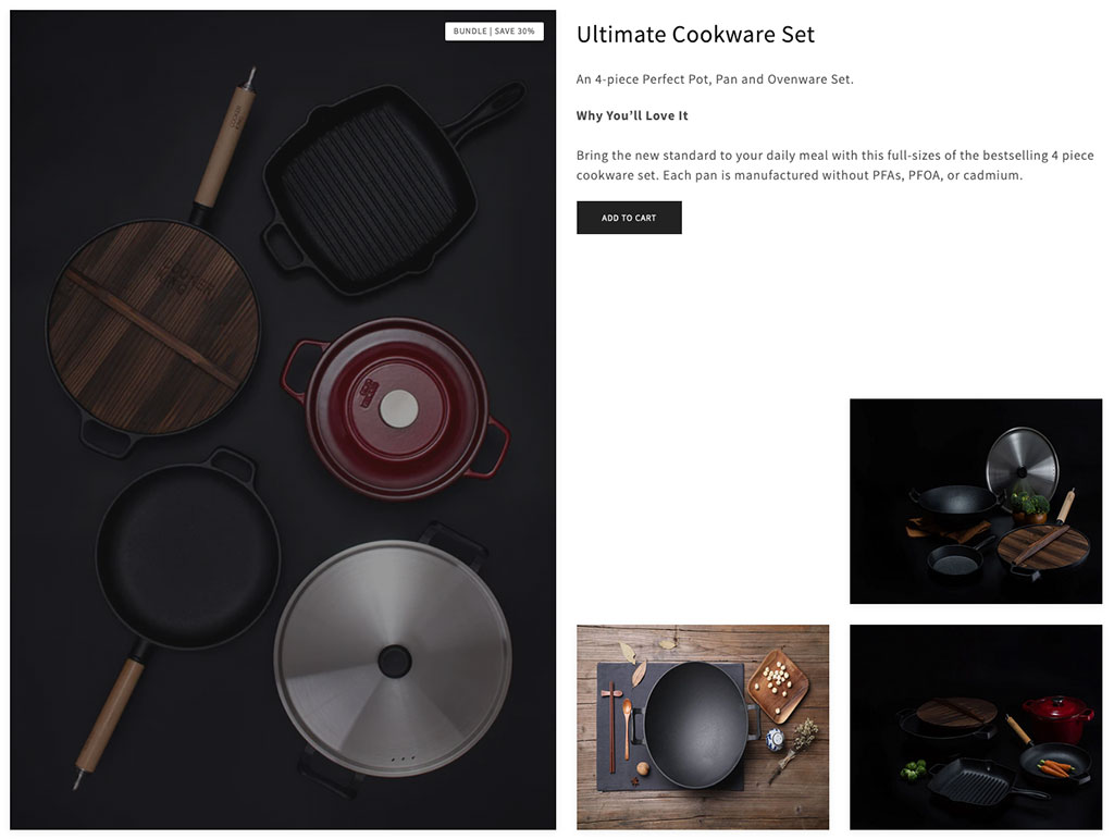
Easy Content Builder: Hierarchical Grid 4.
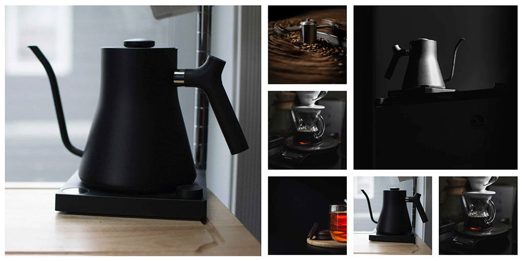
Easy Content Builder: Hierarchical Grid 6.
Conclusion
Theme sections have now become a primary way of building your Shopify store, it's a no-brainer to use a free app like Easy Content Builder which gives you a powerful tool for personalizing your Shopify themes without the need of editing your code.
It's a matter of minutes to build a Shopify page, all you need to focus on is to put the right sections into the right place to create a high-converting page.
We hope this article sheds light on how to level up your Shopify store design with the new hierarchical grids. Try Easy Content Builder today to see it for yourself.
