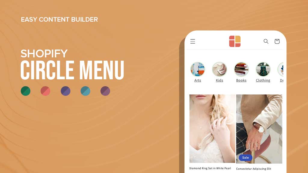
Most Shopify stores have some form of navigation menu. These menus can be either expandable (mega menu) or visible (sometimes called "bubble navigation") menus, depending on the design and layout of the store.
With the Circle Menu section available in Posstack Easy Content Builder, you can turn the collection list into a “bubble navigation” that fits well on any device, mobile and desktop. You can easily create the visual menu in different shapes - pills, square, or circle menus that showcase your featured product collections anywhere in your Shopify store.
The Circle Menu section is a great add-on that helps customers navigate your Shopify store and find what they need faster.
Circle menu use cases
Visual navigation (circle, square, pill menu) that Easy Content Builder provides is perfect for showing featured product collections, horizontal category filters, Shop By Brand on any page of your Shopify store, such as:
- Homepage
- Collection page (the circle menu can be assigned to all Collection pages)
- Product page
- Landing page
- Any custom page
The circle menu is particularly useful for stores with a large product inventory in different categories. With the circle menu, customers can easily find the products or collections they are interested in without having to scroll through the pages of products.
 You can assign the Easy Content Builder circle menu to all Collection pages.
The Circle Menu section also helps to improve the aesthetics of the store. The circular or pill shape of the menu adds an element of novelty to the store's design, making it more visually appealing.
 More visually appealing store design with Easy Content Builder pill menu.
Moreover, the square menu is perfect for horizontal category filters, which makes it easier for customers to filter products by category.
 You can use the Circle Menu as a Shop By Brand section.
 A sample visual navigation created by Easy Content Builder circle menu - showcasing your featured product collections.
Prioritizing your Shopify store’s navigation and findability is essential to ensure a seamless user experience. If users face difficulty finding what they are looking for, they may feel frustrated and choose to explore elsewhere.
Tip: What’s so great about Circle Menus? Should you stick with Mega Menus or try Circle Menus instead? This article will help answer those questions and share some handy tips to help you set up a navigation menu that really works for your Shopify store.
How to create a circle menu with Easy Content Builder
Creating a pills/square/circle navigation menu is simple and easy, without any coding required. All you have to do is add a Circle Menu section on the sidebar from the Shopify theme editor after installing Easy Content Builder (the Pro plan).
Here are steps:
- Add Section Settings to control the global settings of the circle menu section.
- Add a Circle Menu section to the page (you can add multiple circle menus on the same page)
- Then click on the Circle Menu title to configure the menu type and styles you want. Select the product collections that you want to show in the circle menu (Leave blank to display all categories).
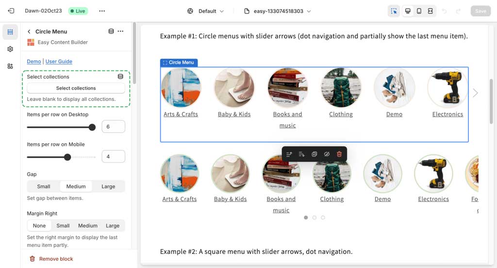
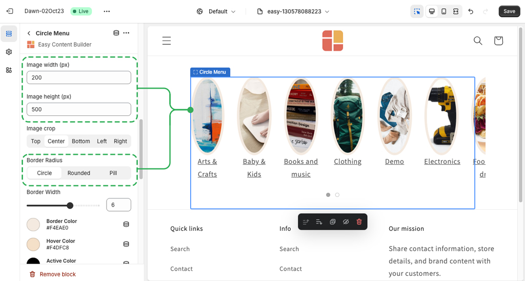
Depending on the shape of the menus you wish, you can combine three fields - Image Width, Image Height, and Border radius - to create a wide variety of shapes: circle, square, rectangular, and oval.
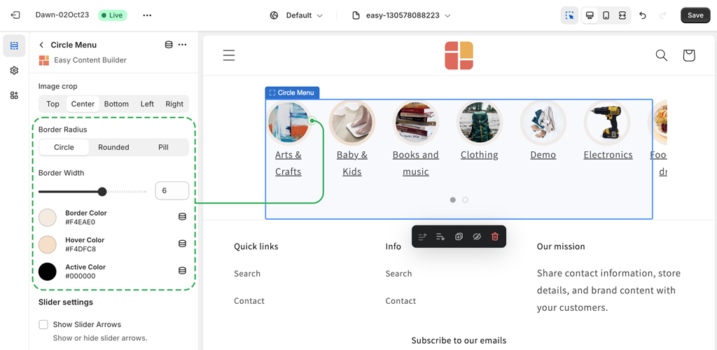
Then, you can set a color, hover color, active color, and width for the borders around the menu icons. You can also flexibly show/hide the slider arrows, dot navigation.
Now, with the Circle menu, you can add circle menus, category filters, or Shop By Brand anywhere on your Shopify pages.
Real sites using circle menus
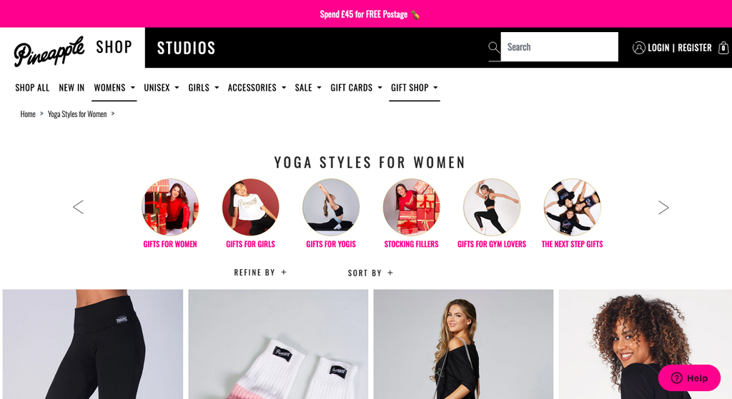
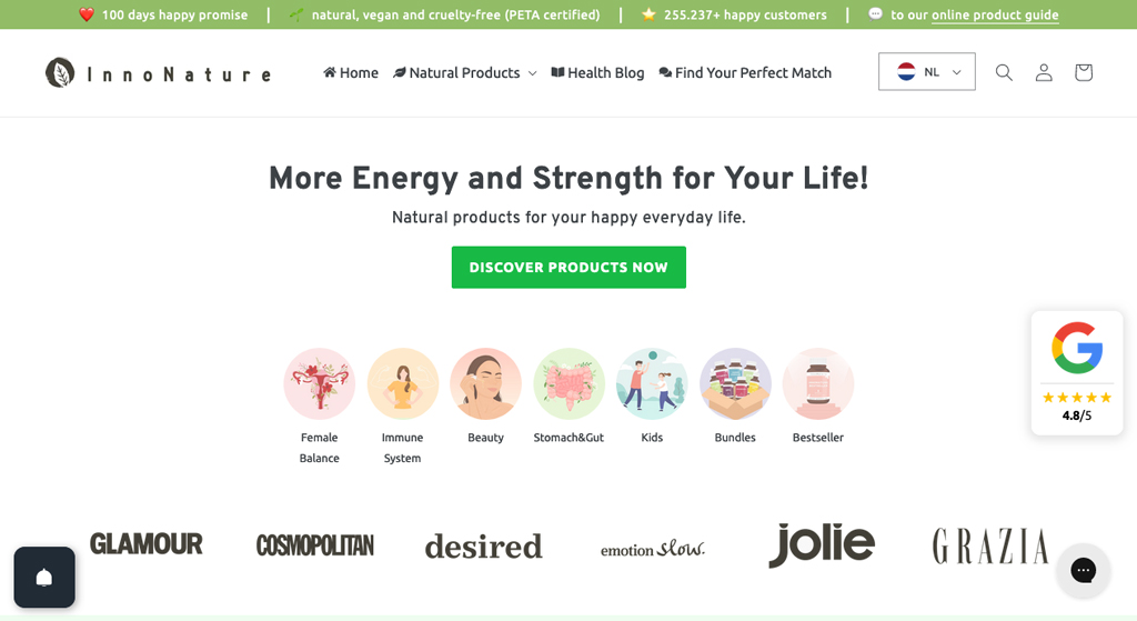
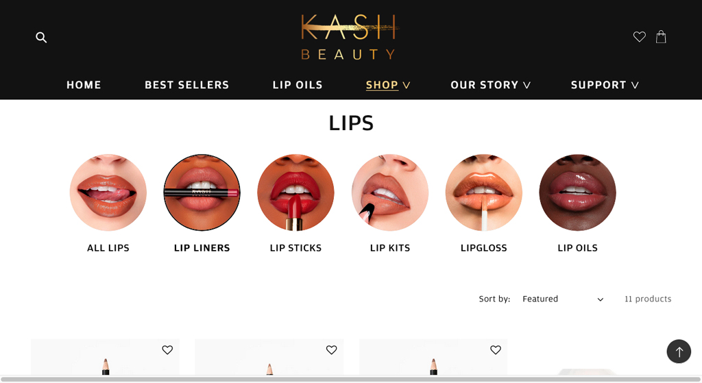
Let's look at how some ecommerce stores use the circle menus to make it easy for visitors to browse between collections and find what they want faster.
Pineapple
Innonature
Kash Beauty
Conclusion
In conclusion, the Circle Menu section is a great add-on for any Shopify store that wants to improve their navigation system and provide a unique browsing experience to their customers.
By using this feature, online store owners can showcase their featured collections in an organized and visually appealing manner, allowing customers to find what they need faster and more efficiently.
Additionally, the circle, square, or pill menu can add an element of novelty to the store's design, making it more attractive to customers.
