- What's the Difference Between Mega Menus and Circle Menus?
- Mega menu works well for Shopify navigation?
Mega Menus and Circle Menus are fantastic options to enhance navigation in your Shopify store, making it easier for your customers to find what they’re looking for and, ultimately, boost those sales.
But what sets them apart? Are there any downsides to using Mega Menus that you should keep in mind? And what makes Circle Menus such a great choice? Should you lean towards Mega Menus or give Circle Menus a shot instead? This article will help answer those questions and share some handy tips to help you set up a navigation menu that really works for your Shopify store.
What's the Difference Between Mega Menus and Circle Menus?
Mega Menus on Shopify are the big dropdowns in the top navigation bar that show a large number of menu items when you hover or click. They can vertically drop straight down or horizontally slide out to the side, letting customers see product collections or access other pages all at once.
On the flip side, Circle Menus let you create eye-catching visual menus that can be placed anywhere on your page. You can have multiple Circle Menu sections with different shapes (like circles, pills, or squares) and menu texts, displayed as sliders or grids. For example, you could show bestselling collections right below your main header and trending collections in the middle of the homepage, and have a grid of your product catalog above the footer.
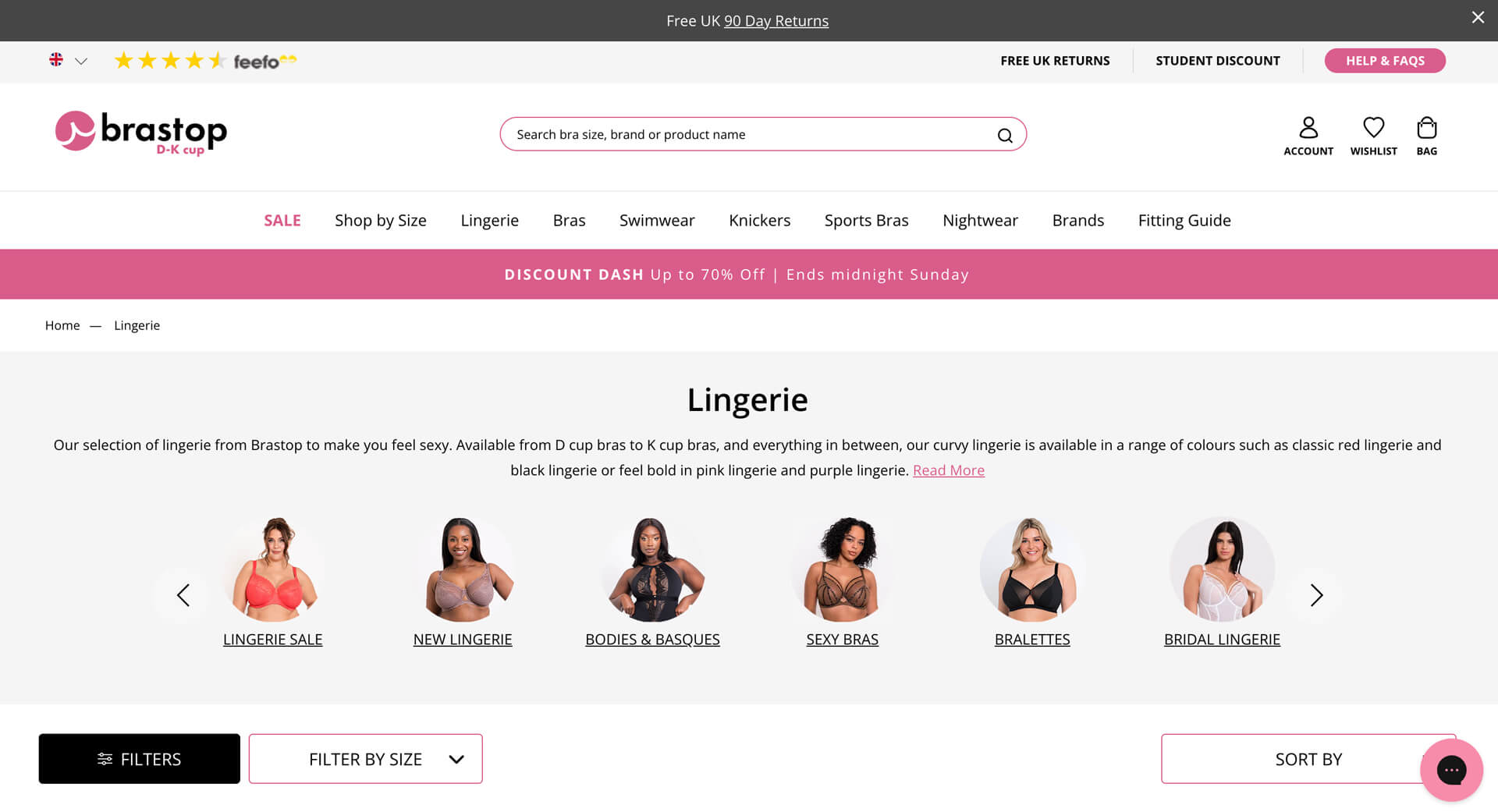
 Circle Menu on Brastop’s Collection pages
The awesome part? You can totally use both Mega Menus at the top and Circle Menus throughout the page together to boost your Shopify store's navigation. Circle Menus give a visual snapshot of key product collections right when visitors land on your page, so they don’t have to sift through the dropdowns of Mega Menus.
Mega menu works well for Shopify navigation?
Whether mega menus boost or hurt your CRO (conversion rate optimization) or SEO (search engine optimization) really depends on how you use them. If implemented well, a Mega Menu is a great fit for any Shopify store.
Mega Menus beat regular dropdowns
Mega menus are definitely better than regular dropdowns, especially for larger stores with tons of products and content. Here’s why:
- They allow you to group a lot of content together and clearly show how everything connects. You can even use different font styles or colors to make each section pop.
- They keep all your store's multiple-level categories visible at once—no endless scrolling. This makes it super easy for them to scan and navigate without needing to click through a bunch of pages.
- Plus, adding visual elements like icons or images can really boost click-through rates and conversions.
Some disadvantages to watch out for
Even though mega menus bring huge benefits, there are some drawbacks to consider:
- Mega menus can be tricky on mobile devices. What looks great on a desktop might not work as well on smaller screens.
- They’re not a good spot for a disorganized, overcrowded list. It’s essential to organize category groups within the menu.
- Having too many links at the top can hurt your SEO.
- Loading times can suffer if your navigation has too many links, slowing down your site.
So, it’s good to be aware of these downsides.
Mega Menu best practices
If you’ve got a big catalog or more than 6 links in a menu, think about using a mega menu. Keep mega menus simple:
- Clear grouping and labeling: Arrange sections by importance and list items alphabetically. Make sure the styles are consistent and the structure is easy to see.
- Limit depth and width: Stick to 2-3 levels maximum. Don’t try to show every single product on the homepage.
- Leave some space: Adding spacing between menu groups helps users scan through the items more quickly.
- Optimize for mobile: Always keep mobile users in mind!
How to add a Mega Menu to your Shopify store
Looking for a more advanced mega menu for your Shopify store? You can either use a third-party app or dive into customizing your theme code.
If you’re just starting out and don’t have too many menu links yet, the default Shopify mega menu is a great option (first introduced in the Dawn theme v5.0.0). While it’s pretty straightforward and only allows for a text-only layout, it’s super easy to set up your main navigation without needing an extra app.
Tip: Take a look at this step-by-step guide for creating a mega menu using the Dawn theme.
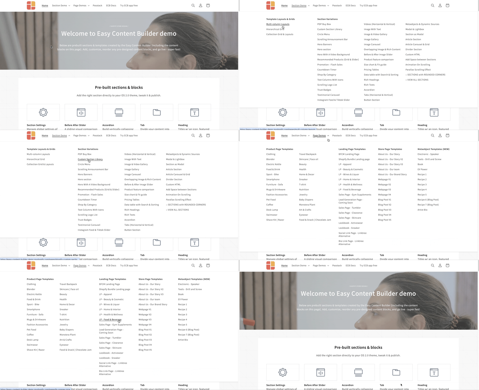
 We utilized the default mega menu from the Dawn theme in our Easy Content Builder demo.
Circle Menu: Is it better than Mega Menu?
If having a navigation menu at the top is your main focus, then Mega Menus are the way to go. However, in many cases, Circle Menus can really elevate your Shopify store's navigation when paired with mega menus.
When to Use Circle Menus
 Circle Menu section packed with our Easy Content Builder.
- If you want to showcase multiple collection links on your homepage or other store pages without cluttering the main menu. Plus, you can highlight multiple Circle Menus on a single page.
- When you need specific menu options that match what customers are looking for on those pages instead of high-level catalog links.
- If you want everything to be visible right away on the page.
- If you want to keep your menu always accessible on mobile without hiding it in an off-canvas menu.
- If you prefer flexible styling for menu shapes (circle, square, rectangular, oval, or pill shapes) that match the context of how your products will be used in real life.
- And if you want to support structured data (schema.org) to create rich snippets for your menu, boosting your store's SEO.
So, if any of this sounds like what you need, definitely consider using Circle Menus.
Circle Menu examples
One of our clients, Voldt.co.uk, has done an awesome job using the Circle Menu (with the Easy Content Builder) on their product pages, collection pages, and homepage to highlight their top charging cable collections. This ‘bubble navigation’ is a great way to help customers navigate their store and find what they need more easily.
 ECB Circle Menu on Voldt’s collection page.
Voldt found a cool benefit of the Circle Menu: it can be set up with a collection list metafield. This means you don’t have to create multiple metafields to make the Circle Menu work dynamically. Plus, you can show different numbers of items in different products or collections — like 3 items in one and 6 or 7 in anothern— all using a single metafield.
 ECB Circle Menu on Voldt’s homepage.
On top of that, Easy Content Builder supports structured data (schema.org) to create rich snippets for the Circle Menu, boosting Voldt’s SEO even further.
And if you want more inspiration, check out 10 more examples of real eCommerce sites using Circle Menus.
How to add a Circle Menu to your Shopify store
Want to add Circle Menus to your Shopify pages? A simple way to do this is by using the Circle Menu section in Posstack Easy Content Builder. You can transform your collection list into a visual menu (also called “bubble navigation”) in various shapes — pills, squares, rectangles, ovals, or circles.
Check out this step-by-step guide or watch the quick 1-minute video tutorial below to get all the details on setting up your Circle Menu.
Conclusion
Both Mega Menus and Circle Menus are great add-ons that make it easier for customers to navigate your Shopify store and quickly find what they're looking for.
Mega Menus are perfect for showcasing high-level categories at the top of your store, while Circle Menus offer specific options that are directly relevant to the pages customers visit.
Plus, getting a Mega Menu to work well on mobile can be a bit tricky since users need to tap on the main item to expand and see all the sub-items. That’s where Circle Menus shine. They offer a visual menu optimized for mobile, with fewer clicks needed, which can help boost your average order value (AOV).
