For any Shopify store, in addition to the main mega menu with multi-columns and images, there's another useful menu type called the circle menu (also known as bubble navigation) that can be integrated within the body of the homepage, the filter at the top of collection pages, or any page of your choice.
Check out these 10 real ecommerce stores that use circle menus to enhance their navigation. This will give you valuable insights and best practices for implementing circle menus in your Shopify store.
Let's dive in.
10 circle menu examples on real ecommerce stores
Boll & Branch
Boll & Branch is an American e-commerce company that specializes in luxury bedding. They are committed to redefining luxury organic bedding, sheets, and towels by directly sourcing the highest-quality raw materials and maintaining uncompromising standards. They take great care in managing their supply chain from the source and crafting their fabrics from scratch. With Origin Track, you can trace each of their products entirely, from seed to stitch.
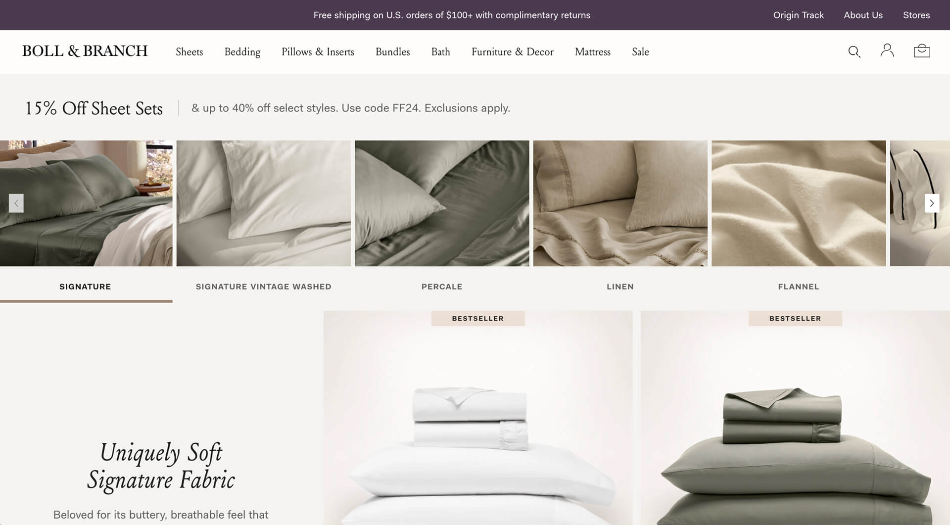
On their collection pages, Boll & Branch utilizes the circle menu in a carousel format to provide visitors with an intuitive way to browse between collections and quickly find what they're looking for. This demonstrates an effective use of the circle menu, visually showcasing prominent product images to entice visitors to explore the collections further.
Takeaways: For products like bedding and furniture, the square or rectangular menu shape works best, as it conveys the real-life context in which the products will be used.
Spanx
Spanx, an American underwear maker, specializes in shapewear, clothing, activewear, and intimates. They offer a diverse range of slimming intimates, body shapers, hosiery, apparel, and the latest innovations in shapewear for both men and women.
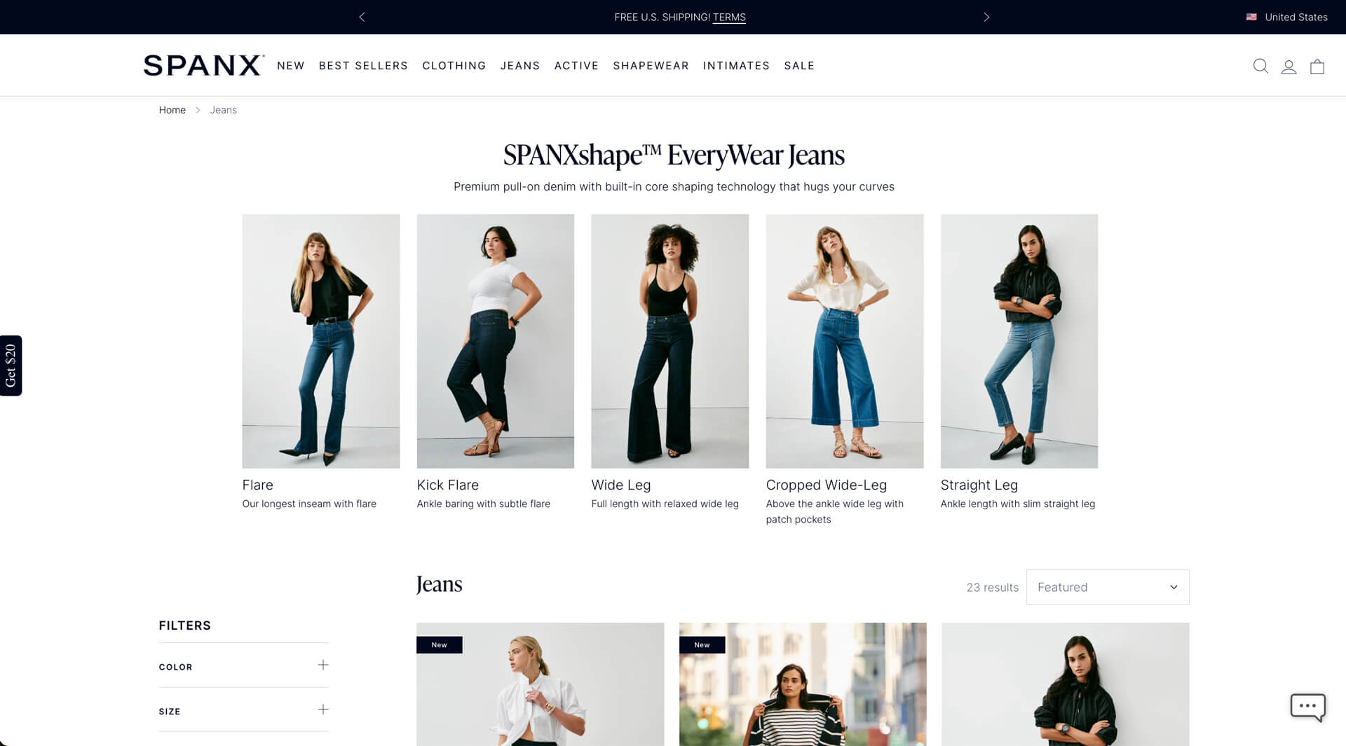
Spanx utilizes the circle menu on their collection pages to visually display related collections, serving as a category filter in an appealing manner.
Takeaways: For apparel, activewear, and shapewear products like those offered by Spanx, lifestyle product photos are most effective, as they make the products more relatable and help shoppers envision how they would incorporate the items into their own lives.
LYTD Fashion
LYTD Fashion is a youthful company that specializes in crafting high-quality textiles. They are dedicated to producing unique and sustainable clothing items such as hoodies, T-shirts, and more, catering to diverse target groups.
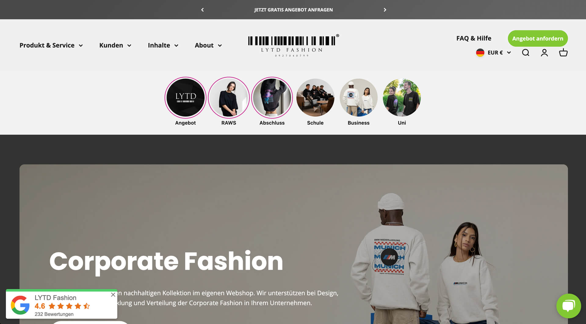
LYTD Fashion showcases their prominent collections at the top of the homepage and collection pages, effectively complementing the main menu. This approach enables visitors to quickly navigate to their desired products as opposed to navigating through dropdown menus in the header.
Takeaways: Implementing circle menus like LYTD's allows for the display of numerous collection links on the homepage and collection pages without overcomplicating the main menu. This streamlines the browsing experience for customers.
Brastop
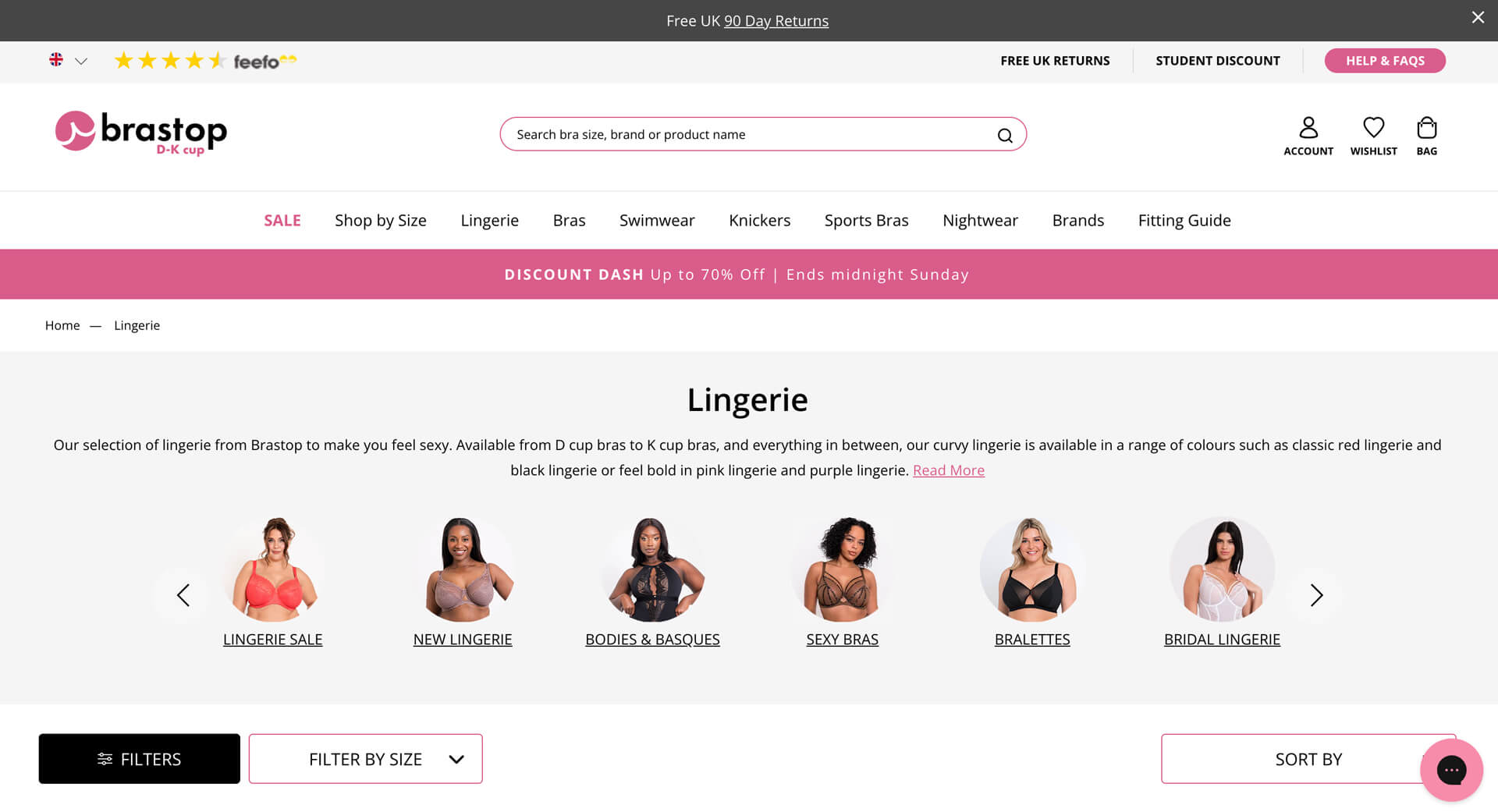
Brastop specializes in D-K cup lingerie and swimwear, offering a wide range of beautiful styles available in over 125 sizes spanning D-K cups and 28-48" back bands.
With an extensive product range like Brastop's, it's ideal to utilize the Circle Menu at the top of collection pages, showcasing all related collections in a carousel format. This not only saves space above the fold but also visually emphasizes the products.
Takeaways: Using a circle menu on your Collection pages is a clear choice if you have a wide range of products. Just imagine a customer effortlessly navigating your content-rich site and quickly finding exactly what they need.
Omsom
Founded by two first-gen Vietnamese sisters, Vanessa and Kim Pham, Omsom is a venture-backed CPG brand that brings bold and authentic Asian flavors to American households. They collaborate with iconic Asian chefs to create delicious sauces and noodle dishes.
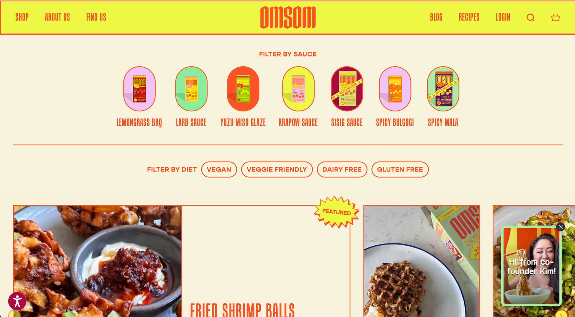
They feature a pill menu on their Recipe blog to encourage visitors to explore their related cooking recipes.
Takeaways: A horizontal navigation bar positioned at the top of the website page header is best suited for displaying high-level categories and sections. The Circle Menu, on the other hand, can include precise menu options relevant to the pages that customers want to see.
Missoma
Founded by Marisa Hordern in 2008, Missoma stands out as one of the pioneering demi-fine jewelry brands, leading the charge in recycled gold and silver demi-fine jewelry. They offer a range of contemporary statement pieces, delicate designs, and personalized jewelry for everyday wear.
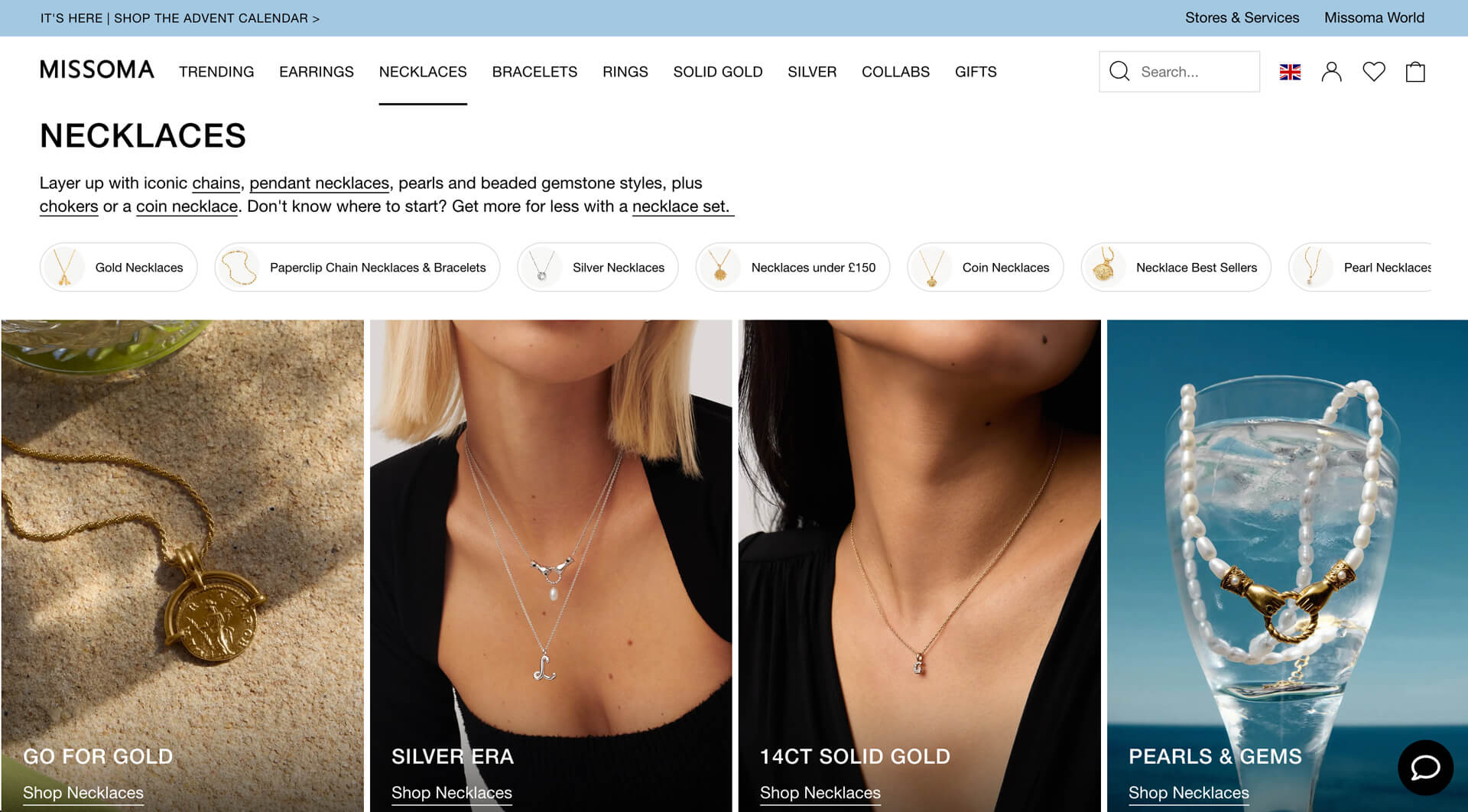
Missoma demonstrates an innovative use of the Circle menu as a category filter. This clever implementation allows for more links to be presented within limited screen space.
Takeaways: Utilizing a circle menu that showcases collection names within the image (with an overlay opacity) is an effective way to conserve page space.
Serene Western
Serene Western, a jewelry brand founded by Ayita in 2013, blends Native American culture with modern designs. Each piece of turquoise jewelry is meticulously handcrafted in the United States.
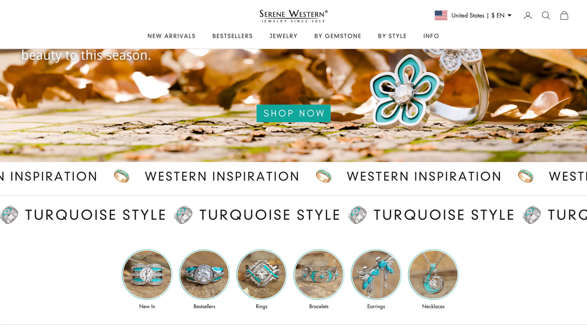
Serene Western utilizes a simple circle menu within the homepage body to showcase their top collections just below the hero section. This option efficiently guides users to the pages they wish to view in a matter of seconds.
Takeaways: Showing circle menus within the homepage is an effective option to flatten the navigation structure. Instead of relying on a mega menu with numerous levels that might overwhelm visitors, the circle menu aids in directing visitors to the most crucial products and collections with just a few clicks.
Pineapple
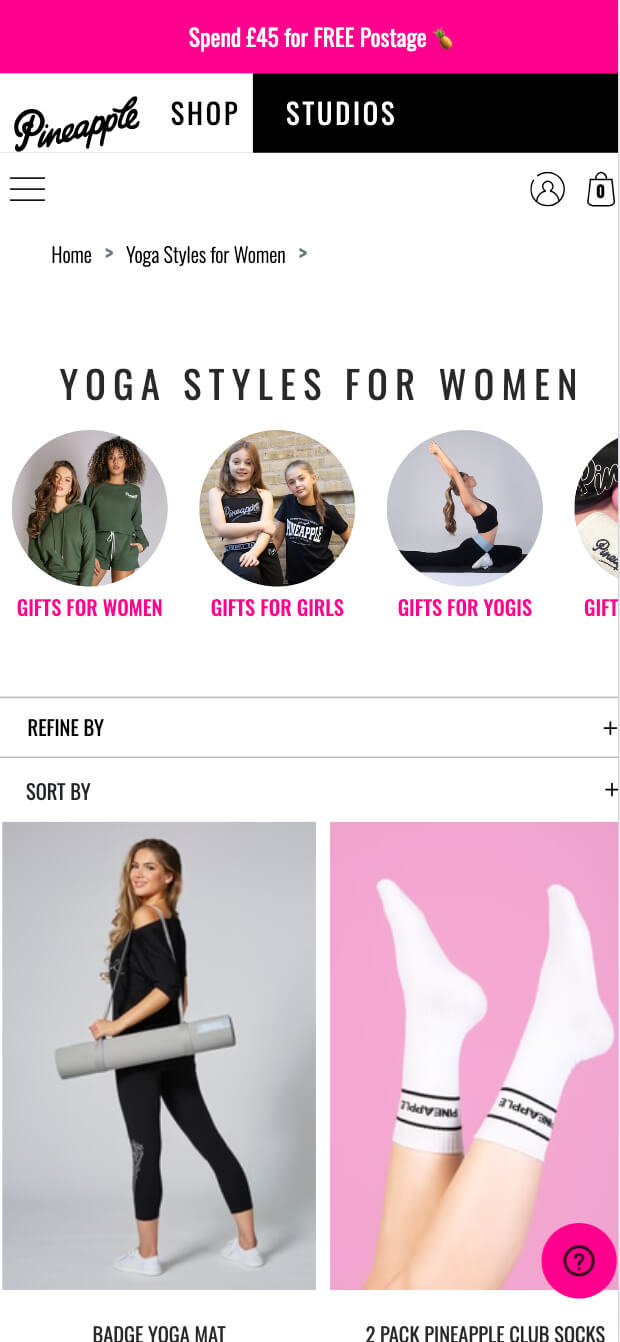
Pineapple, a leading global lifestyle brand established by Debbie Moore and based in London, offers a comprehensive collection of women's and girls' clothing, dancewear, and eyewear.
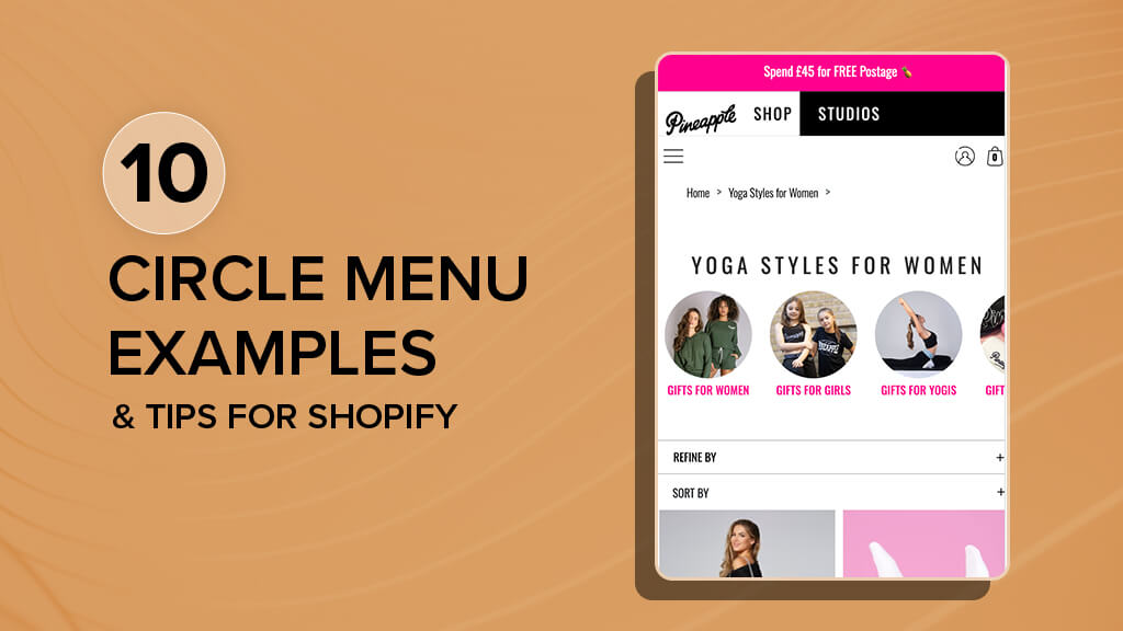
Pineapple integrates a Circle menu in a carousel format on their collection pages, effectively consolidating navigation options into a single horizontal filter positioned at the top of the collection page.
Takeaways: Prioritizes the optimization of the menu for smaller screens. A horizontal circle menu bar on mobile allows visitors to swipe left or right to view all available menu items without the need for additional clicks.
Innonature
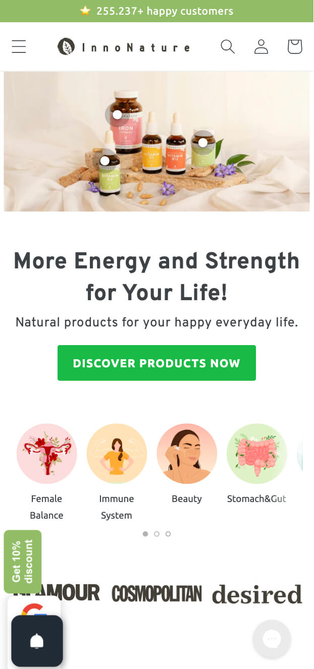
InnoNature, a startup from Hamburg, Germany, offers natural health products made locally in Germany using strict controls and supervision, and featuring natural and vegan ingredients.
The InnoNature shop, powered by Shopify Plus, prominently showcases its top collections on the homepage just below the hero section and on their collection pages. Since InnoNature began selling directly to consumers (DTC), the placement of their circle menu is crucial to provide clear and direct navigation, helping visitors find their desired products with minimal clicks.
Takeaways: When it comes to menu placement, there's no need to reinvent the wheel. Customers expect standard conventions. For instance, featuring the most important collections on the homepage works effectively for websites with diverse collections.
Kash Beauty
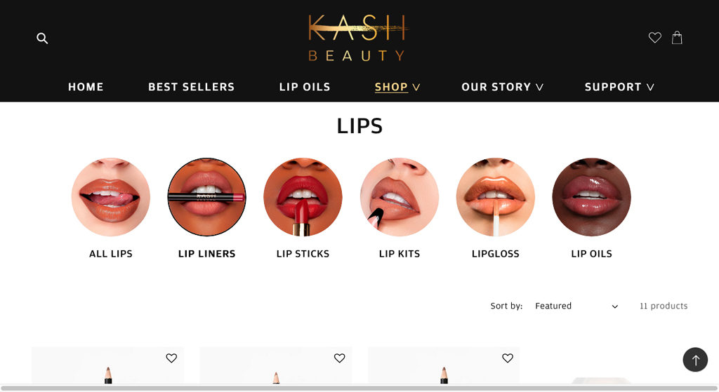
Kash Beauty is a newly established Makeup & Beauty Product brand by Ireland's most followed beauty influencer, Keilidh Cashell MUA.
Kash Beauty positions the circle menu at the top of their collection pages, making it convenient for shoppers to quickly navigate to the right page, thus shortening their path to conversion.
Takeaways: Collection page SEO is essential for any Shopify site, so it's vital that your circle menu section also supports rich snippets. While rich snippets may not directly impact how Google ranks your website, they can enhance the appeal and usefulness of your website's search results to potential visitors, ultimately increasing its click-through rate (CTR).
Easy way to add a circle menu with Easy Content Builder
If you're considering using circle menus for your Shopify store, take a look at the Circle menu section, which is part of the Easy Content Builder. It allows you to effortlessly create a pill, square, or circle navigation menu without the need for any coding.
To get started, simply add a Circle Menu section to the sidebar using the Shopify theme editor after installing Easy Content Builder (the Pro plan). You can configure it to display the collection title below the menu image or to show the collection names inside the image with an overlay-opacity. Importantly, Easy Content Builder automatically supports structured data (schema.org) to generate rich snippets for the Circle Menu section, which can greatly enhance the SEO performance of your Shopify store.
You can also check out our 1-minute tutorial video for a quick overview of how to set up a circle menu on Shopify.
Tip: Are there any drawbacks to using Mega Menus that you should consider? And what’s so great about Circle Menus? Should you stick with Mega Menus or try Circle Menus instead? This article will help answer those questions and share some handy tips to help you set up a navigation menu that really works for your Shopify store.
Conclusion
We believe that the 10 circle menu examples provided above have given you insights into implementing this type of menu on your Shopify stores.
Using the Circle Menu section in the Easy Content Builder (Pro plan) is a simple choice for enhancing your Shopify navigation menu without the need for coding. This feature enables you to showcase your featured collections in an organized and visually appealing way, simplifying the process for your customers to find the items they need swiftly and effectively.
