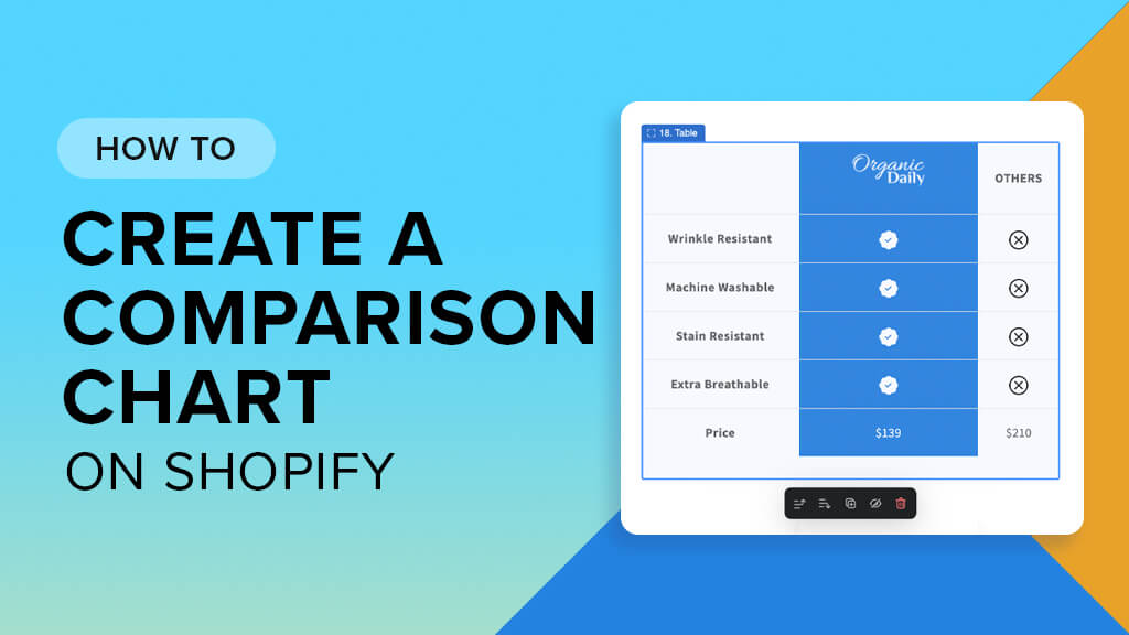
A product comparison chart (also known as product comparison table) is an essential feature for any Shopify store. It lets customers check out your product features and key differences side-by-side, making it easier for them to find which product is best for their needs. This ultimately speeds up their journey from just browsing to making a purchase.
In this article, I’ll walk you through how to create a comparison chart on any Shopify page without any coding, all thanks to Easy Content Builder. But before we get into the step-by-step guide, let’s take a look at some fun custom comparison charts you can make with Easy Content Builder.
Product comparison chart examples
Here are 5 typical responsive comparison charts we made using Easy Content Builder just for demo purposes. They show you how flexibly you can create product comparison tables featuring:
- Custom YES/NO icons
- Personalized product images or logos
- An unlimited number of columns and rows (you can easily manage your content and rearrange the order of columns and rows using spreadsheets like Google Docs)
- Long or short-form text content
- CTA buttons
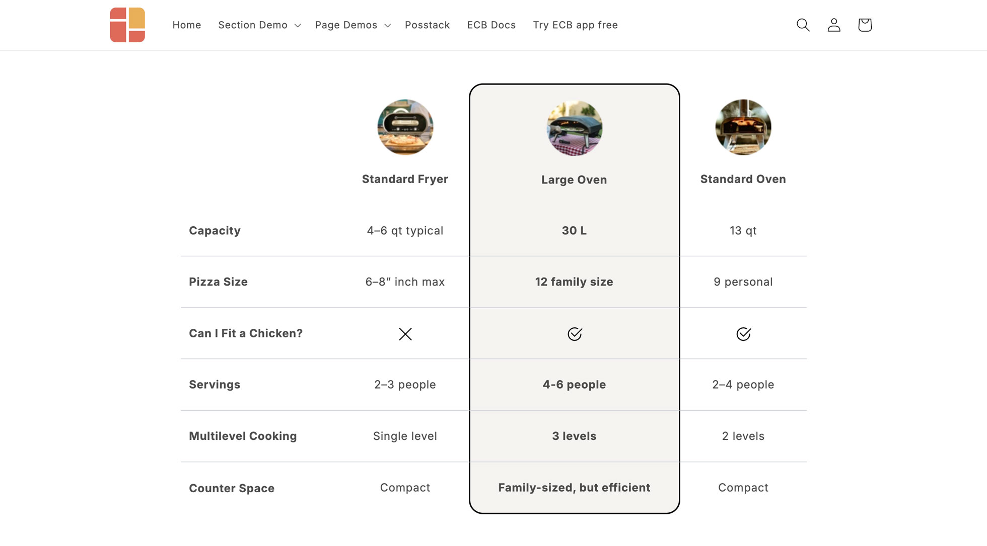 Comparison Chart Example 1: Side-by-side comparisons boost conversion rates by building trust and confidence. See the live demo.
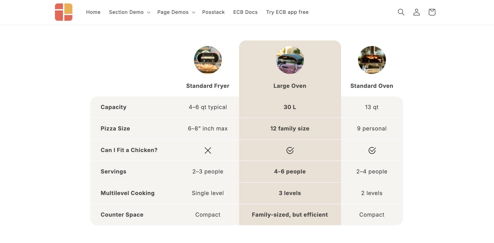 Comparison Chart Example 2: When customers can see why your premium option offers more value, features - side by side, they don't just buy faster, they buy better. See the live demo.
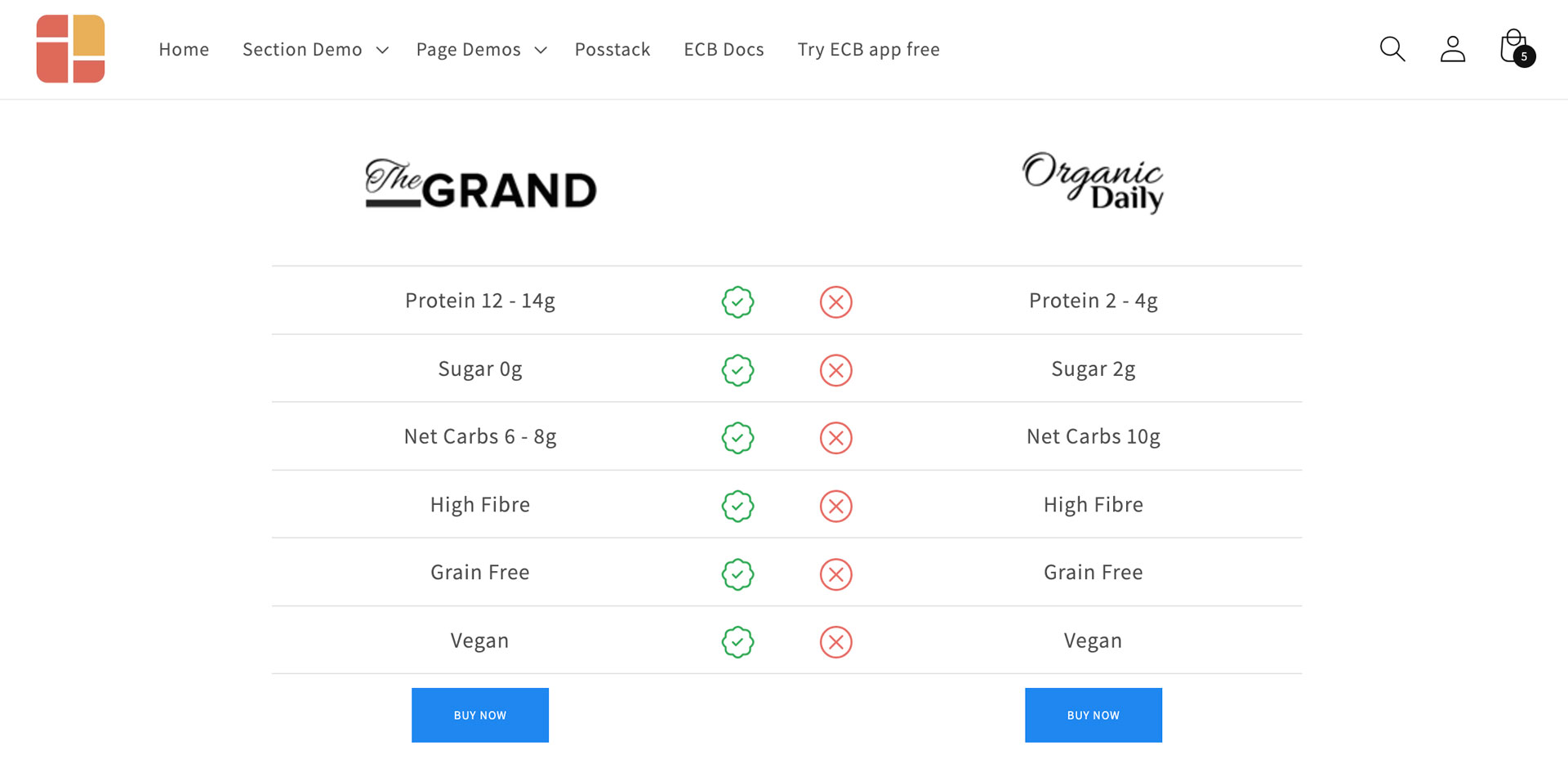 Comparison Chart Example 3: Guide users through each feature comparison step-by-step.
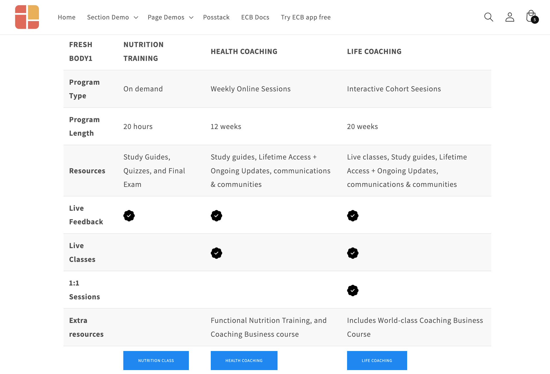 Comparison Chart Example 4: Combine a visual checklist system, using icons and crosses, keywords, and CTAs to convey the availability of features.
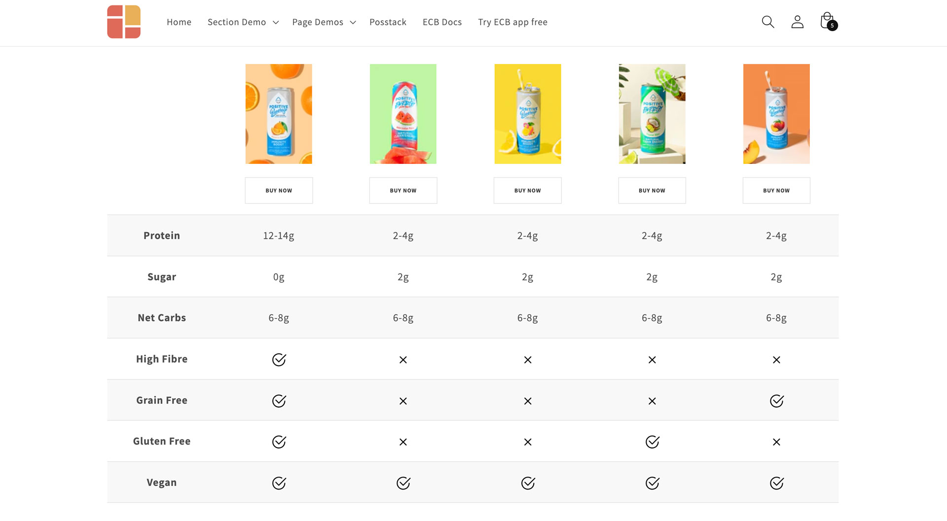 Comparison Chart Example 5: Clear icons, bold text, featured images, and CTAs enhance readability and allow users to assess the features offered quickly.
View all comparison chart demos
How to create a comparison chart
Creating a Comparison Chart using Easy Content Builder is simple. Here’s a quick guide:
Preparation: If this is your first time using Easy Content Builder, start by creating a template. Choose one of these options:
- Customize a single product page (or blog post, store page): follow this guide.
- Create a single template for multiple product pages (or blog posts, store pages): follow this guide.
- Customize your homepage or collection pages: follow this guide.
Step 1: Open your theme editor and navigate to the product, blog post, or store page where you want to add a comparison chart (If you've completed the Preparation step above, you'll be directed to the Theme Editor automatically).
Step 2: Add Section Settings to set up the global configurations for your comparison chart (like column width and background color).
Step 3: Prepare your custom data as follows:
- Create a spreadsheet (in Google Docs or Excel) and input your data based on the sample CSV. Then, download it as a CSV file by going to File > Download > Comma Separated Values (.csv).
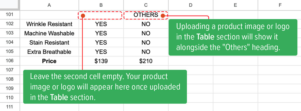
Step 4: Add a Table section with these configurations:

- Table Type: Normal Table
- Table Data:Insert your custom data from the CSV file generated in Step 3. For more information, please consult the General Configuration guide.
- Header First Row: enabled
- Header First Column: enabled
- Table/Card Style: enter these CSS classes uk-card-hover uk-card-default uk-height-1-1 uk-table-middle uk-table-divider
- Primary Column: 2 (you can choose any column you prefer)
- Primary Column Style: enter these CSS classes uk-card-hover uk-card-primary uk-height-1-1
- Link Style: enter these CSS classes uk-button uk-button-secondary
- Icon Yes: upload your CSV icon
- Icon No: upload your CSV icon
- Icon width: set your desired icon’s dimension (E.g. 24)
- Image Width: set your desired image’s width (E.g. 160)
- Image Height: set your desired image width (E.g. 40)
- Image: upload the images you wish to display in the Header.
That’s it.
For a quicker understanding, check out this video tutorial:
Conclusion
Your product features and offerings could be spread out over multiple pages or even a long scrolling page. That’s where the comparison chart comes in handy - it gives consumers a quick and easy way to spot the similarities and differences.
When you’re making these comparison charts, try to keep your table structure and content simple and to the point. Avoid using terms or jargon that might confuse your customers. Most importantly, don’t make them memorize details or bog them down with long tables filled with repetitive information. Keep things short and straightforward.
