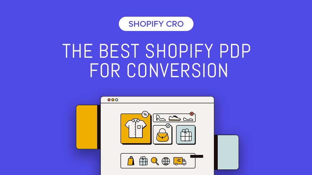
When building a Shopify store, your goal is to get users to hit the Add To Cart button, and there's no way you'll achieve that without a revenue-optimized product page.
We're exploring 3 top brands - all of which were built with Shopify - and learning how they optimize their product pages on mobile that motivate visitors to buy. Why is mobile conversion optimization so crucial to Shopify stores?
At least 79% of smartphone users have made a purchase through their mobile devices in the last six months of 2021.
If you're seeking ways to improve your product page CRO (conversion rate optimization) on mobile, then the key takeaways below are for you.
1. Bravenewlook
Brave New Look is a brand that offers custom print-on-demand apparel and home goods for expressing your personality and style in a personalized, unique way.

Takeaways:
- Content flow: Brave New Look's PDP allows for easy scanning of the content flow. Helping shoppers find your product information faster means a higher chance for them to buy.
- 1x1 Product images: square images helped give space for other elements. Besides, the carousel indicators within the product images also save vertical space.
- Trust: The reviews shown above the product title are a great way to build trust with new users.
- CTAs: The Add to Cart button was the most prominent with the black background color & not distracted by the other secondary CTAs (Buy With Shoppay, More Payment Options). All CTAs made full-width is another great point allowing for easy accessibility on mobile devices.
- Objection handler: the ‘Free Shipping’ offer pulled up above the product image gives shoppers a positive push to motivate them through the sales funnel.
Quick tip:
- Using a free content builder app like Easy Content Builder will let you add new sections to your themes right within your Shopify editor. This way, you can flexibly add any sections above the fold or below the fold and run A/B testing to pick the best ones. Learn about pre-built FREE sections available for your use here.
- Suppose you want to create fully custom data unavailable in Shopify's native data structure, such as recipes, ingredient lists, product manuals (pdf files), author bios, etc. In that case, we recommend you check out metaobject templates.
Check out this video tutorial that guides you on how to build a complete Shopify product page in under 25 minutes using Easy Content Builder's no-code sections. You don't need any coding or design skills — just start with your marketing ideas, and you'll transform them into a fully optimized product page with engaging sections in no time.
2. Allbirds
Allbirds is a New Zealand and American company that sells footwear and apparel made with natural materials like merino wool and eucalyptus.

Takeaways:
- Content flow: Allbirds follow one of the common hierarchies - pulling the Review (Trust) up the Product detail page, then surfacing the Product key information & Sales Pitch, and finally highlighting the primary action 'Select A Size'. This is a great approach to communicating key product details - product title, price, reviews, and 'free shipping' - above the Add to Cart button.
- 1x1 Product images: Like the Brave New Look’s case study above, the square images plus the carousel indicators within the product images are the best design pattern for mobile - helped save vertical space.
- CTAs: Allbirds applied the sticky Add to cart that always remains at the top of the screen. It stays within reach when shoppers scroll down the page - an effective way to reduce cart abandonment. The ATC made full-width is another great point for easy accessibility on mobile devices.
- Variant selectors: Allbirds surfaces all color and size swatches side-by-side. The color variants with labels guide shoppers to select products simply and clearly.
- Objection handler: Allbirds highlights Free shipping at the top of the screen. Why is this so important? 91% of shoppers are likely to become repeat customers if a business offers free shipping (according to a survey by Material Handling and Logistics).
Quick Tip:
- Consider hiding breadcrumbs on the product detail page and test this suggestion on your store to see if it works well. Why? We aim to get shoppers to click the Add to Cart button, so we shouldn't distract them with other additional actions.
Mansur Gavriel
Mansur Gavriel - a luxury handbag and shoe brand - redefines luxury through its distinctive approach to color and form. It offers beautifully-crafted leather goods in beautiful styles and hues.

Takeaways:
- Content flow: Mansur Gavriel treats their product images and Add to Cart button (sticky at the bottom of the screen) as the most prominent elements on the PDP, followed by the product key information (Review, Price, and Tax & Duties information) right below the product galleries. This content flow is simple and easy to scan.
- 1x1 Product images: Mansur Gavriel followed the best design pattern for mobile - using square images with the carousel indicators moved onto the product images. This approach gives vertical space for other supporting elements.
- CTAs: Mansur Gavriel showed a sticky and full-width Add to cart in a contrasting color that always remains at the bottom of the screen. Browsing through products on a tiny mobile screen can be time-consuming and frustrating, so the sticky Add to cart button is a useful solution. Keeping the ATC visible while browsing is a consistent reminder that shoppers can purchase directly from their mobile - an effective way to convert more sales.
- Below the fold: For the Instagram gallery & Recently Viewed sections below the fold, Mansur Gavriel removed the carousel indicators, just let the next image peek instead of prompt exploration. This is one of the best design approaches on mobile.
Conclusion
Optimizing your Shopify product pages on mobile is key to increasing conversion. We hope the section-by-section analysis from the Shopify stores, as mentioned above, helps give a glimpse of the critical CRO (Conversion rate optimization) tactics you can consider for your stores.
As a side note, every Shopify store - and every niche market - is different. You should explore various small usability 'chi', iterate, and test to find those that work best for your store.
Useful resources:
- Tailor your Shopify theme with our free Easy Content Builder app. You can quickly add pre-built sections to your theme - all within your Shopify editor, iterate, and test for conversion.