The 'Buy' section right above the fold of your Shopify product page (PDP) is super important. You don't need to squeeze every little detail in here, but you definitely want to ensure that it can sell the product using just what's in that space.
Check out these 5 sections from Easy Content Builder to make your 'Buy' box really pop at the top of your Shopify product page. Plus, this article also shares 7 great sections to enhance the area below the fold. The best part? You don’t need any coding skills. Your marketing team can jump right in and make changes right within the Shopify editor.
These sections do the heavy-lifting and assist you in:
- Keeping the main details clear and in the correct hierarchy.
- Creating a space-saving design that doesn’t compromise on readability.
- Revamping design elements: Use eye-catching colors and visuals to draw attention.
- Building trust: showcase the key benefits of your product(s).
- Enhancing credibility: display real testimonials to boost trust.
- Driving sales through product recommendations
- Optimizing for mobile devices.
Let's dive in.
Above the fold sections
Social proof
Static mini reviews:
- Made using the section: Icons With Text
This cool section allows you to display the rating and review either above or below the Product Title, based on what you like best. People typically check out reviews first before buying, so it’s a great idea to keep them front and center.
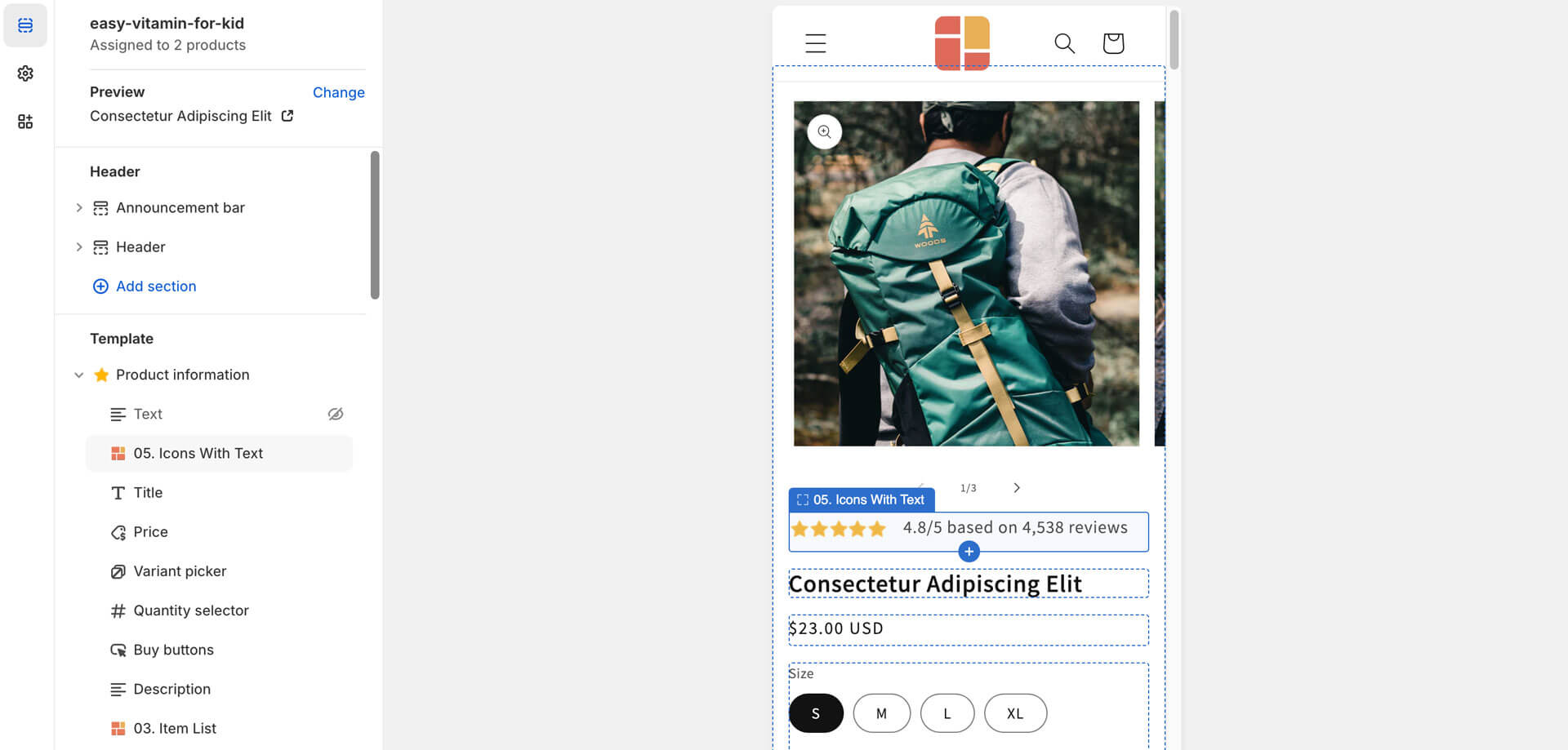 Show the rating and reviews flexibly any position within the ‘Buy’ section
Highlight benefits, trust badges
Text columns with icons or scrolling text bar:
- Made using the section: Icons With Text
Hit people with the key benefits that make your product the ultimate choice for them. If you have a guarantee, this is a perfect place to showcase it - right next to the Add to cart button. Also, don’t forget to add trust badges showing off recognizable and secure payment methods, certifications, and the like—these little touches really help give your customers peace of mind when they’re ready to order.
The Icons With Text section lets you control the size and boldness of icons and texts, visually highlighting what’s important and making it easy for customers to scan the information quickly.
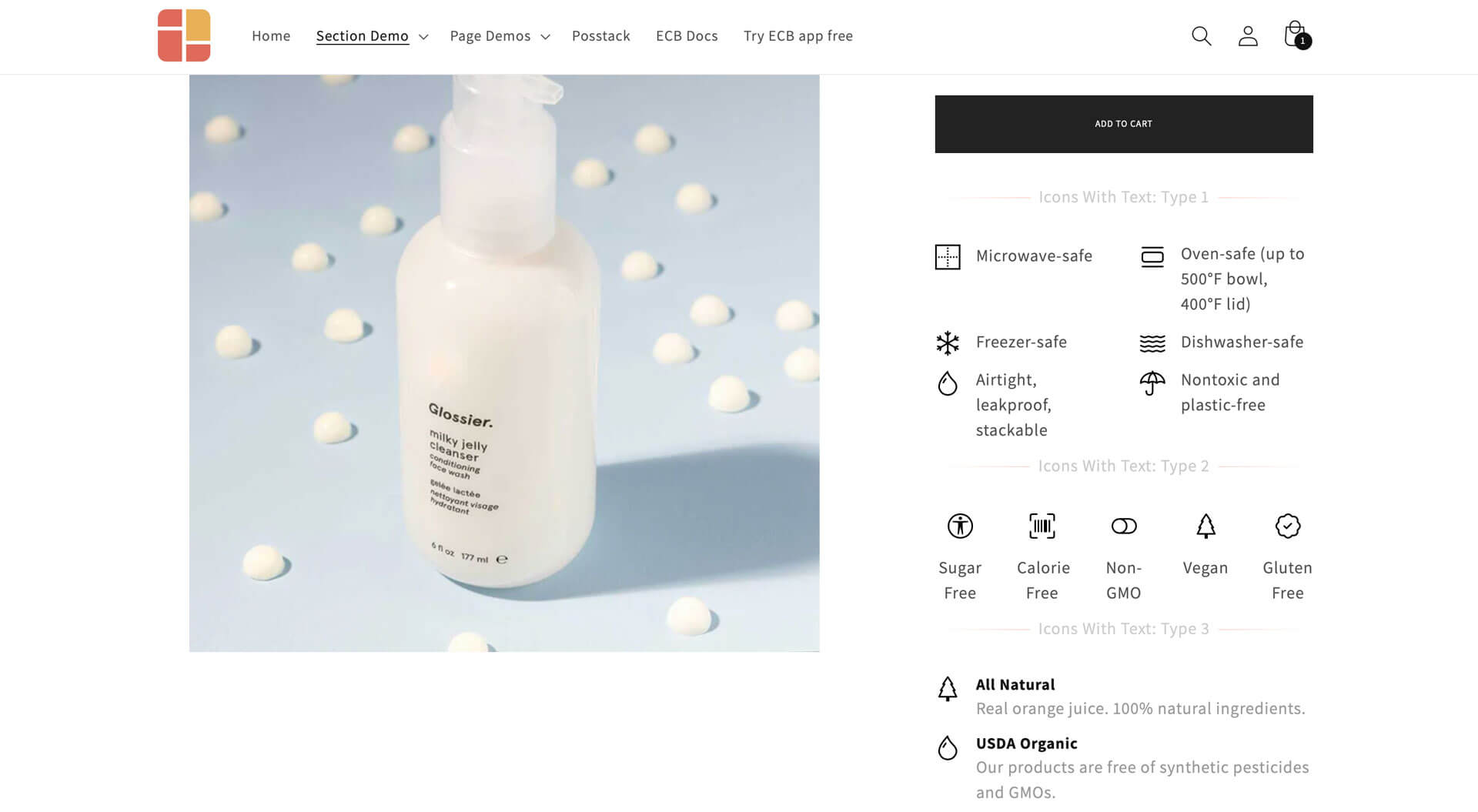 This example demonstrates different ways that Easy Content Builder allows you to display your benefits or trust badges. Check out the demo.
Free Shipping, Returns, Gift
Logistic and other information:
- Made using the sections: Icons WIth Text or Section Title
In any online store, customers usually spend quite a bit of time looking for important logistics info like delivery times, return policies, and extra fees. That’s why it's super helpful to present all this information at once - ideally in a neat, single line. Missing details like these can really hurt your sales.
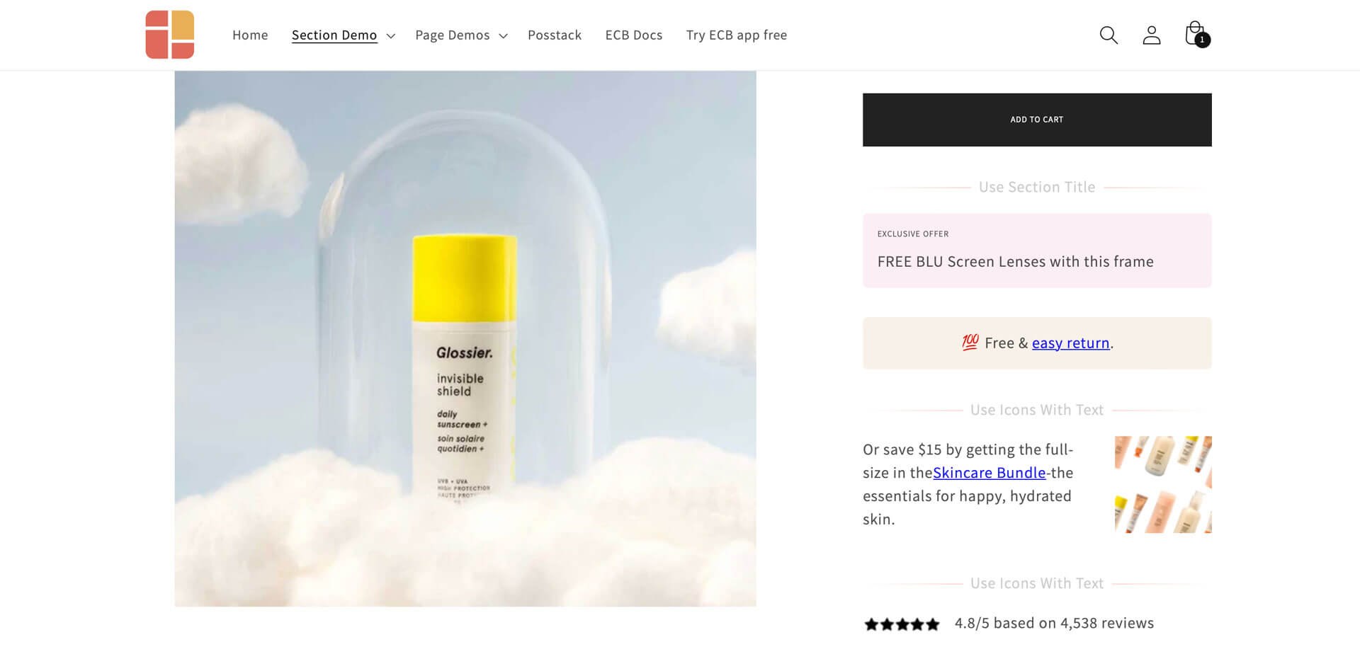 With Icons With Text or a Section Title from Easy Content Builder, you can showcase key details like your Shipping policy, Gift. Check out the demo.
Sometimes, you should attract attention using a scrolling text bar. You can also do so using the Icons With Text.
Embed UGC Videos
Showcase user-generated videos, How-to videos, etc:
- Made using the section: Icons With Text
Adding videos to your 'Buy' box can really boost the time customers spend on your Shopify store. It gives them a chance to see your products from different angles, which can lead to more sales.
With the Icons With Text section, you can set up a video carousel—when users click on it, the video pops up in a modal. This is a great way to showcase user-generated content from platforms like YouTube, TikTok, or Instagram, as well as how-to videos. These videos make a big difference since customers can’t physically see or touch the products like they would in a store.
 Using Icons With Text from Easy Content Builder, you can add a video carousel—when users click on it, the video pops up in a modal. Check out the demo.
The Easy Content Builder gives you 4 super simple ways to add videos to your Shopify page. Check out one of the two video tutorials below to see what works best for you.
Video Tutorial 1: Three ways to add videos to Shopify:
- Use a background video
- Integrate video sliders from YouTube, TikTok, or Instagram
- Place a video slider next to the Add to Cart button
Video Tutorial 2: Add a video slider with metaobjects.
This option lets you:
- Showcase more than 6 videos in a slider instead of the limit with Icons With Text.
- Feature unique videos on each page’s slider.
Product page upsell and cross-sell
Upselling is to sell "more of the same products" like upselling someone to a bundle or upgrading to higher-end versions of what they’re checking out. On the other hand, cross-selling is about offering complementary items—like selling a burger and suggesting fries or a milkshake.
Using the Item List section, you can highlight related product recommendations or upsell options right below the product description.
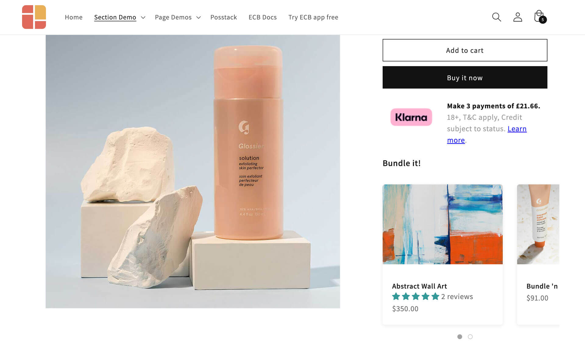 Highlight related product recommendations or upsell options with the Item list section.
Whether to show upsell or cross-sell options prior to initial purchase really depends on what you’re selling. For example, Kylie Cosmetics does a great job of cross-selling by suggesting Kylash Volume Mascara alongside the Wet Shimmer Eyeshadow Quad.
In contrast, eyewear brand Warby Parker focuses on upselling on their product pages. When you look at a pair of Brady glasses, you’ll see four different prescription types—stick with a single-vision for $95 or upgrade to the Progressive type for $295.
Handy sections for Below the Fold
The above the fold area provides your customers with just the right info to make that purchase decision. But often, your product could really use some extra sections further down the page to boost their confidence that they’re making the right choice.
So, what Shopify sections can you use below the fold for more sales? Here are a few effective sections from Easy Content Builder to get you started:
Grid
Sometimes, keeping your layout simple with a grid design is the way to go. Depending on the content you want to show off, Easy Content Builder has some great options to get you started:
Option 1: Check out the sections in Easy Content Builder that support grid layouts:
- Icons With Text: Create a grid of text columns with icons (you can fit up to 6 items per row)
- Item List: Showcase a grid of products or blog posts (you can choose items manually or pull from a specific collection).
- Circle Menu: Present a grid of your product collections.
- Gallery: Display a grid of product images
Option 2: Use the grid layouts - hierarchical grids or multi-col grids - offered in Easy Content Builder. This method lets you mix and match various types of content blocks within each column of a section.
Videos
Depending on what you’re selling, adding some video content can really help customers get a lively look at your product.
One thing to keep in mind is that a big challenge with online shopping is that people can’t physically see or touch the items before they buy them. That’s where videos come in handy — Videos can really boost their confidence and keep them engaged as they explore more about what you offer.
Check out these three sections from Easy Content Builder to showcase your videos:
- Video section: You can add horizontal or vertical videos from platforms like TikTok, YouTube Shorts, Vimeo, and Instagram Reels.
- Icons With Text section: This one lets you create a cool slider or grid of videos using dynamic sources. When someone clicks on a video, it opens in a modal - ideal for showcasing your Instagram Reels, TikTok clips, YouTube videos, and more.
- Section Settings: This special section allows you to incorporate a background video. You have the option to make it full-width or restrict it to a smaller area (such as ⅓ of the section). Additionally, it’s helpful to combine with the Section Title to showcase a product card highlighted in the video.
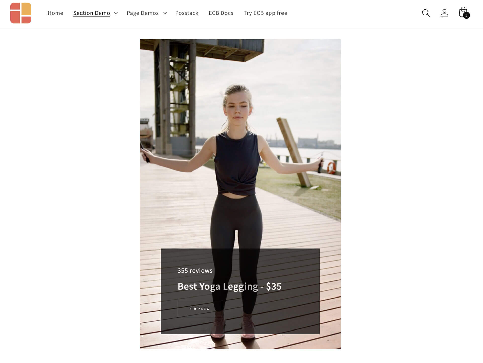 A product card overlay on a video is perfect for highlighting the product showcased in the video. Check out the demo.
Testimonial carousel
It's a great idea to showcase static mini reviews right above the fold to catch people's attention. But don't forget to add first-person testimonials and reviews further down the page. These really help build trust with your visitors and can boost those purchasing decisions.
You can get creative with the Icons With Text section from Easy Content Builder to display testimonials in different styles:
- A static review section (you can fit up to 6 reviews per row)
- A testimonial slider
- An auto-scrolling testimonial carousel
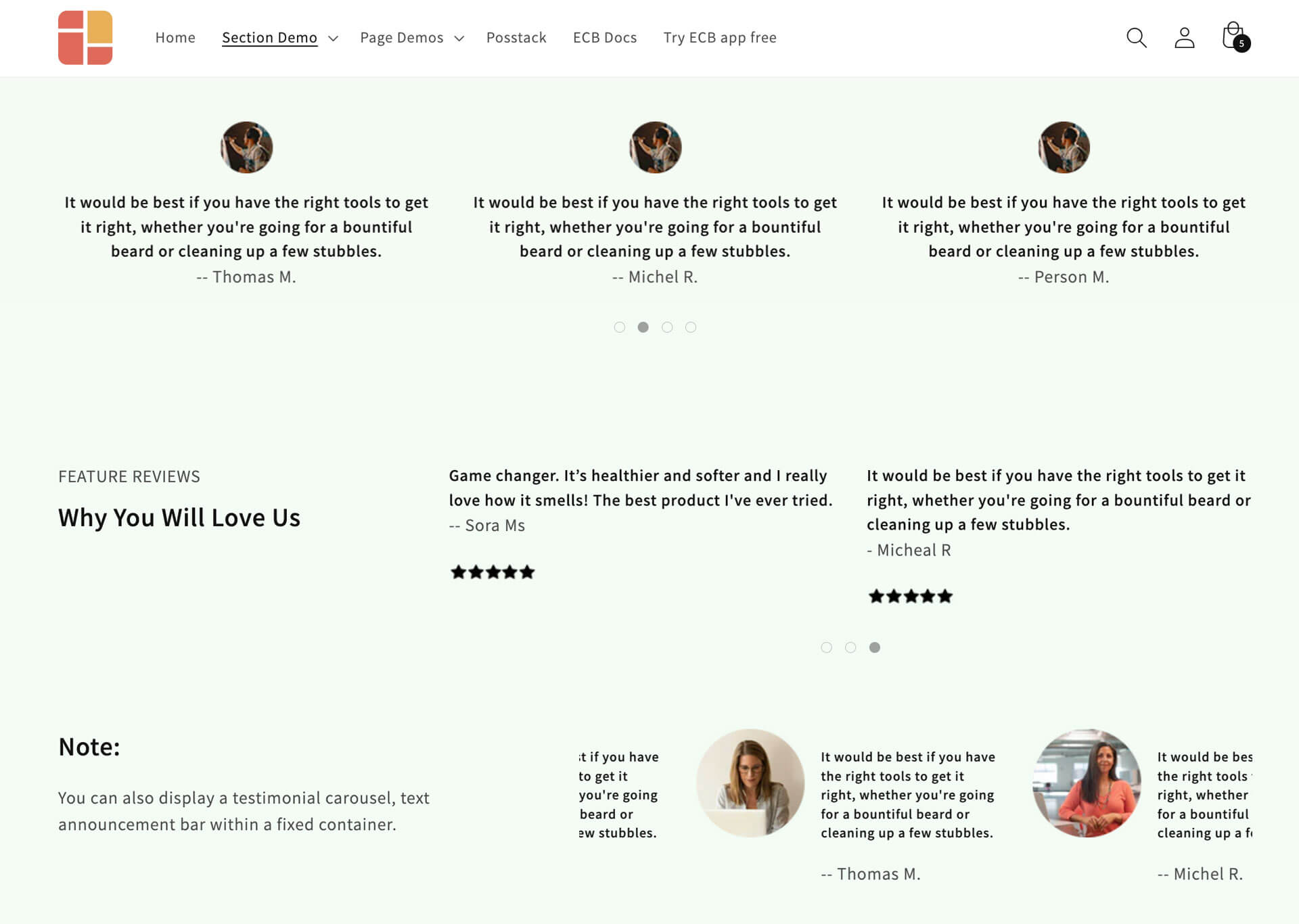 You can easily create a testimonial slider or auto-scrolling carousel with Icons With Text section. Check out the demo.
Product Comparison Chart
One of the best ways to boost your conversion rate (CRO) is by adding a product comparison chart (or table) to your product page. So why is it such a big deal?
It’s pretty straightforward: it helps users easily compare the features of each product or alternative. A comparison table takes all those technical details and turns them into simple language that the average consumer can understand.
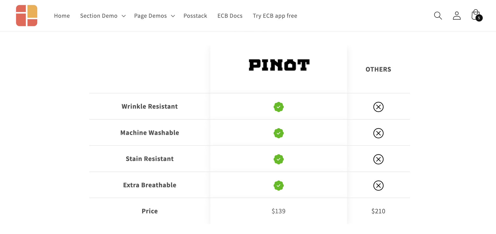 Check out different product comparison chart examples made with Easy Content Builder here.
With the Table section, Easy Content Builder makes it super easy to set up comparison tables on any page without coding. These fully responsive tables let your users see product features and key differences side-by-side. It's one of the best ways to highlight premium or upgraded versions.
Collapsed section
Getting a handle on your customers' common concerns or objections that might hold them back from making a purchase is super important but often overlooked.
By outlining potential objections and addressing them in a collapsible section, you’ll not only boost your conversion rate (CRO) but also cut down on product returns.
With the Accordion section, you can easily showcase all your key Q&A items anywhere on your product page, whether in a single-column or multi-column layout. It's a great way to keep things organized and user-friendly.
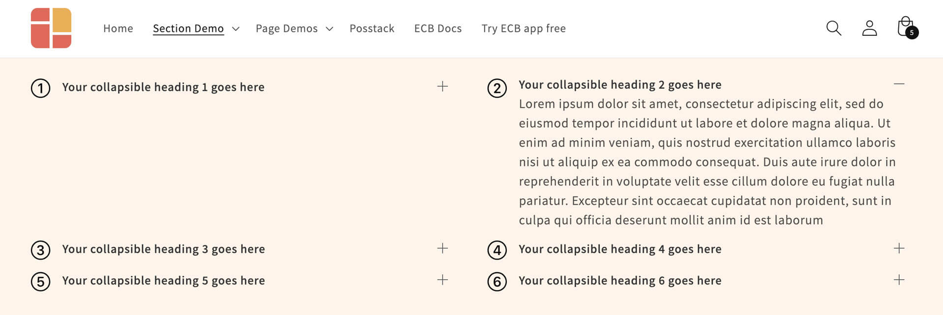 The Accordion section from Easy Content Builder helps you build vertically collapsing accordions.
Ajax-add-to-cart recommended products
A great way to boost your average order value (AOV) right from your product page is by suggesting related or recommended products. This is a super effective strategy for cross-selling additional items or upselling to higher-tier options.
With the Item List section from Easy Content Builder, you can easily showcase these recommended products at the bottom of your product page. Plus, when customers hover over the card, they can quickly select items and add them to their cart without even leaving the page. How convenient is that?
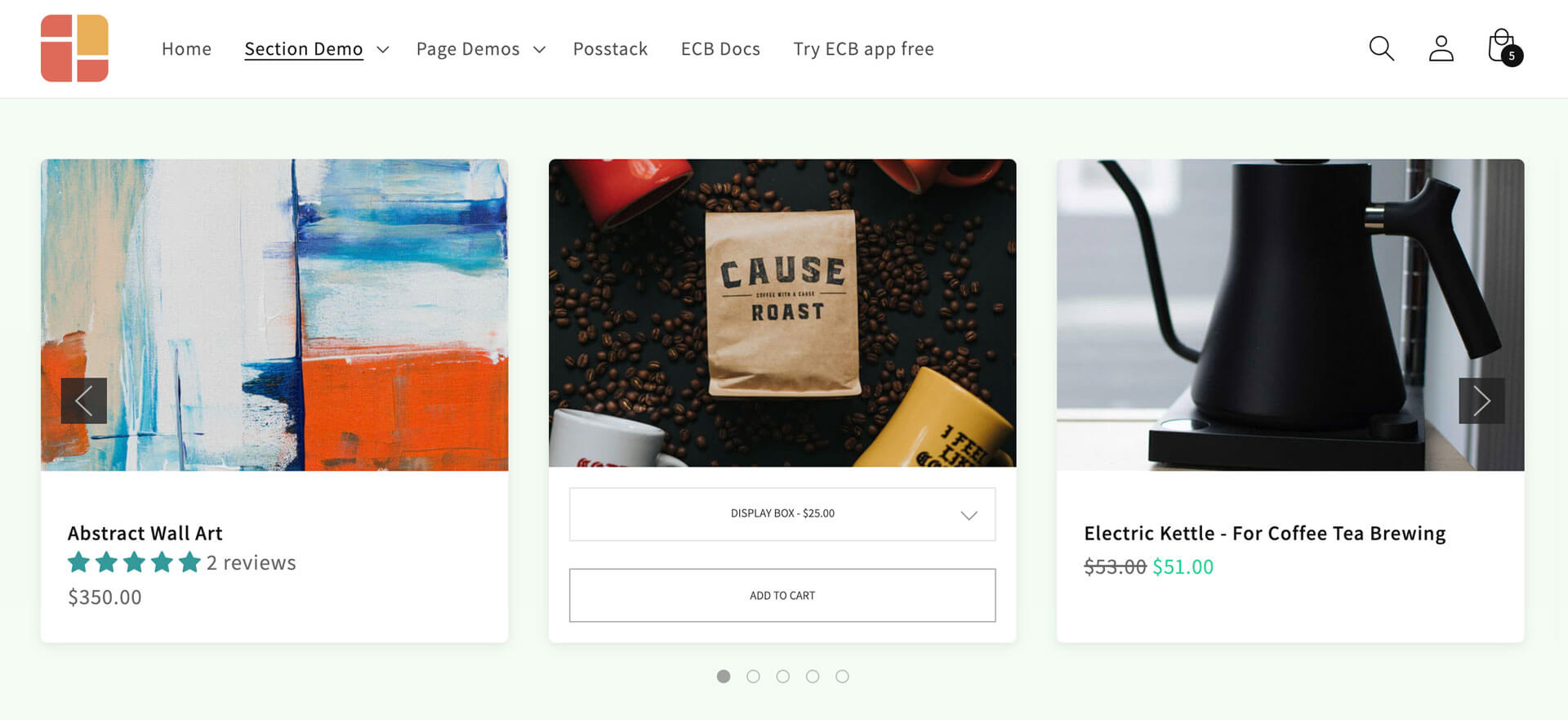 The Item List section allows customers to add products to their cart without leaving the page.
Others
In addition to the sections we've mentioned above, Easy Content Builder offers a bunch of other cool features to jazz up your Shopify product pages. You’ve got options like Tabs, Before & After sliders, Countdown Timers, Banners, Parallax Scrolling, and more. Feel free to check them out here.
Conclusion
Shopify product pages are your chance to really convince potential customers that they’re making the right choice with their purchase. That’s why it’s so important to optimize these pages to boost your conversion rate.
Creating a high-converting product page is an art. You can mix and match the sections we mentioned above, run A/B tests, and make adjustments until you’ve got the perfect setup. Every detail counts — from top-notch product images and trust-building reviews to a clean layout and clear information flow. These elements can be the difference between making a sale and losing out on an opportunity.
