- Example 1: Three-column section with the text block in the middle
- Example 2: Two-col section with multiple text blocks and divider lines in the left column
- Example 3: Two-col section with a left-side Before/After slider and a right-side text block grid
- Example 4: Two-col section with text blocks, auto-scrolling logo list, and CTA button in the right column
- Example 5: Two-col section with text blocks, signature image, Icons With Text, and CTA in the left column
- Example 6: Two-col section with text blocks, full-width CTAs, and background image
- Example 7: Two-col section with text blocks and product collections
- Example 8: Two-col section with a clickable image on the left and an image slider on the right
- Example 9: Two-col section with a text block, CTA, and recommended products
- Conclusion
We're thrilled to introduce our new custom section library, which illustrates how you can blend different app blocks in Easy Content Builder to create custom sections for your Shopify store. It's easy enough for anyone on your team to drag, drop, and create these custom sections in just minutes - no developer required.
Each custom section example details the specific app blocks it contains, allowing you to experiment with a variety of blocks available in Easy Content Builder to tailor it to your preferences.
Let's delve into each of these inspiring custom sections!
Example 1: Three-column section with the text block in the middle
This custom section combines:
- Section Title (for the middle text block).
- Icons With Text (for the left/right images).
- Section Settings (for the 3-col layout, text color)
The image on the right is currently set to 50% of the section's width, and you have the flexibility to adjust this width ratio to be smaller or larger as per your preference, or make all three columns equal in width.
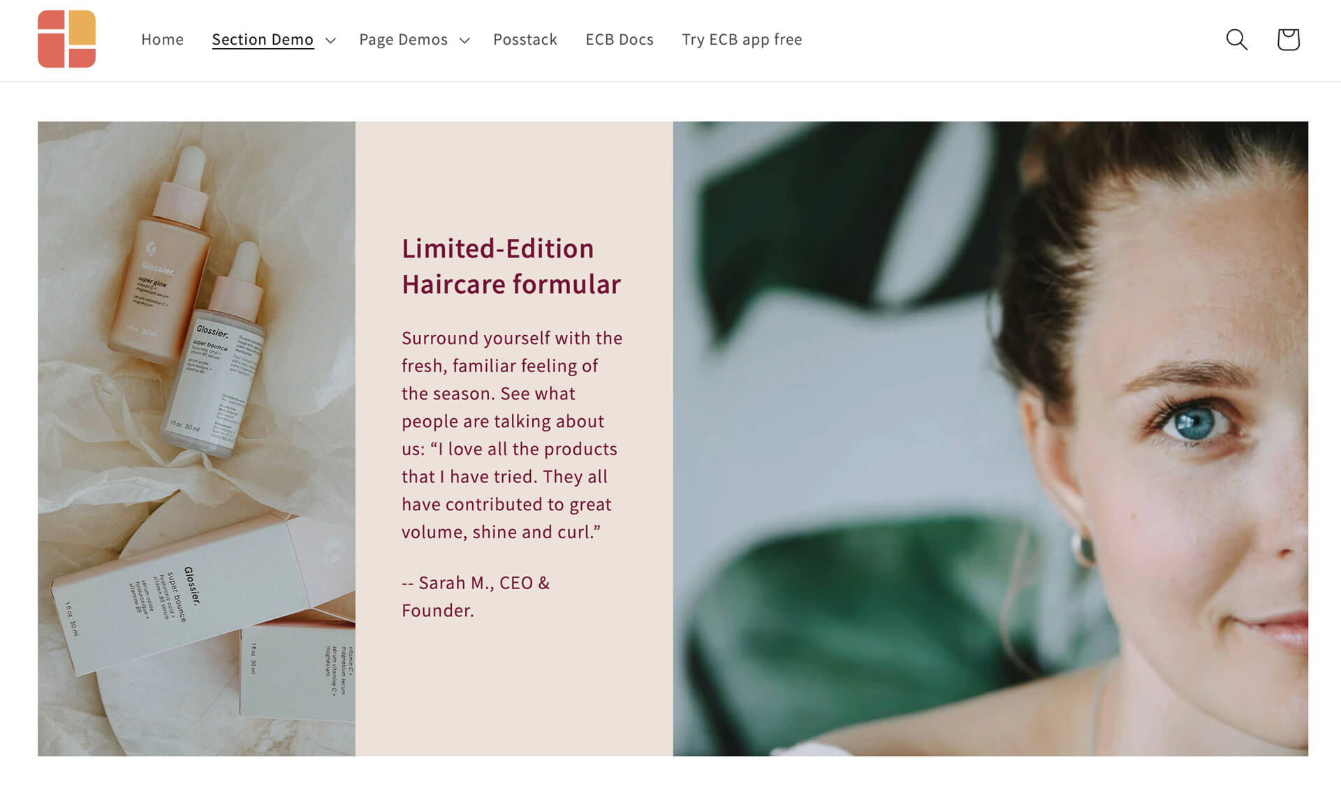
Example 1: the right image block is set to 50% of the section's width
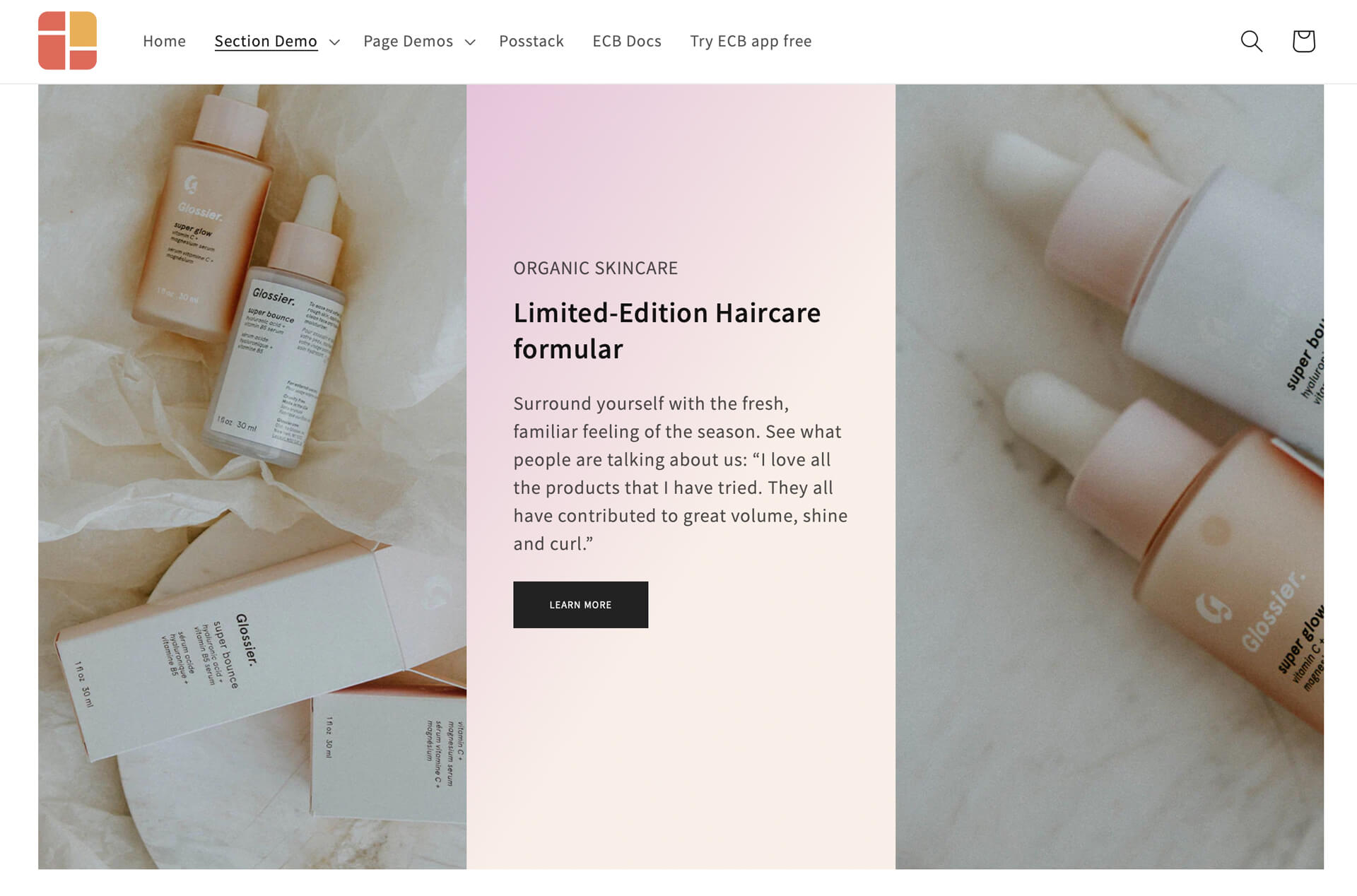
Example 1: All three columns with the equal width
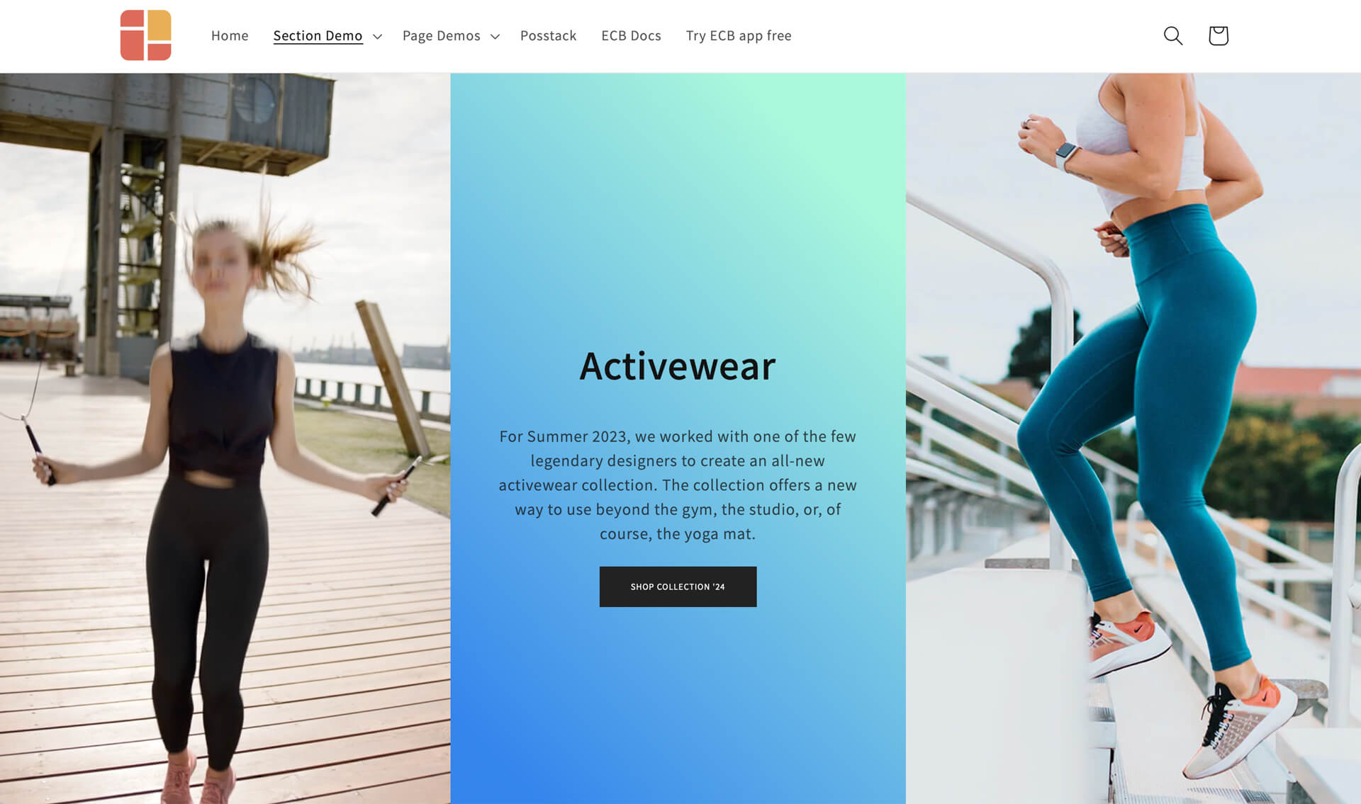
The predesigned section above is only the beginning. You can swap out each column with other rich content sections (such as Video, Before & After slider, etc.) in Easy Content Builder to suit your requirements. Here’s an example of how we transform the above example into a full-width section with an auto-playing video in the first column:
Example 2: Two-col section with multiple text blocks and divider lines in the left column
This custom section combines:
- Section Title (for the Heading, sub-heading, and body text blocks).
- Divider (for the divider lines between the text blocks).
- Section Settings (for the 2-column layout, color background, image background)
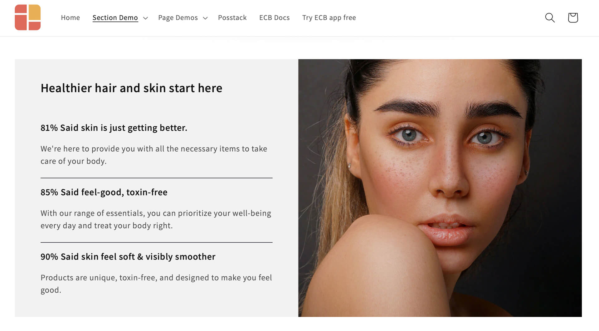
With a no-code tool like Easy Content Builder, you have the freedom to shift the image position to the right or left, tweak the width ratio between the text and image blocks, or utilize other custom line dividers (even your own uploaded custom divider).
Example 3: Two-col section with a left-side Before/After slider and a right-side text block grid
This custom section combines:
- Before & After Image Slider
- Section Title (for the Heading)
- Icons With Text (for body text block)
- Section Settings (for the 2-column layout, color background)
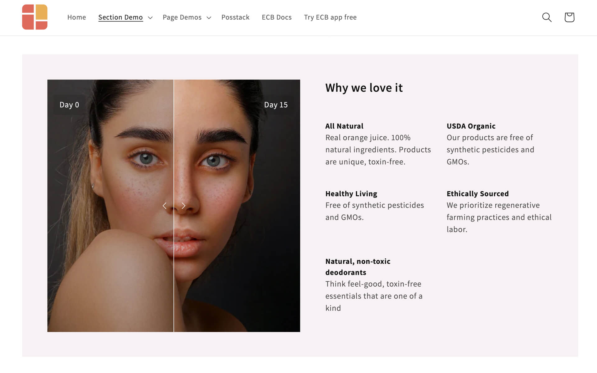
In the example above, you can swap out the Before & After image slider with other rich content sections if you prefer, such as a clickable image using the Image With Text overlay option, a video, or an auto-scrolling image carousel, and more. Likewise, you have the option to enhance the text block in the right column by adding visual icons for each text item. The possibilities are endless!
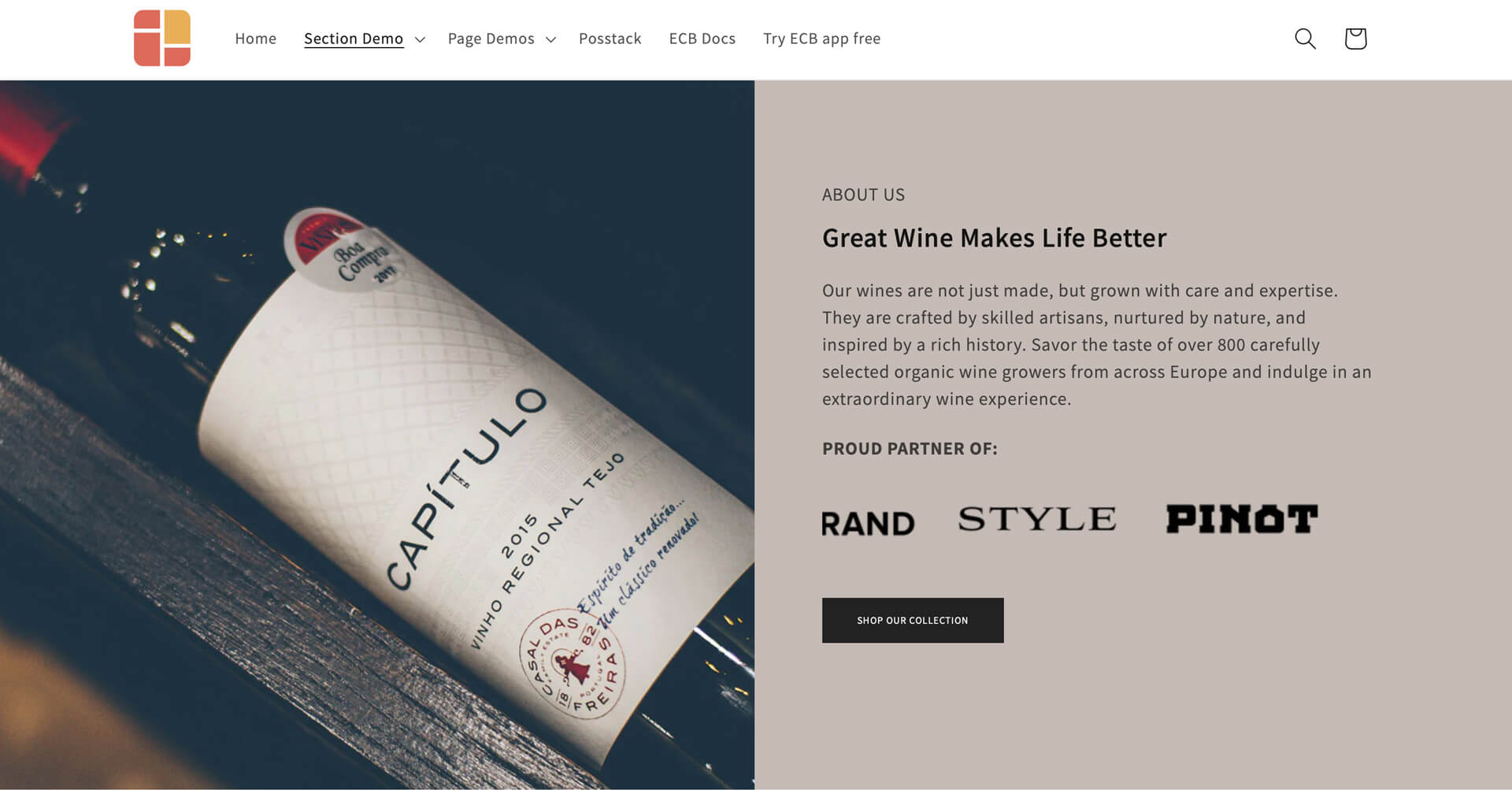
Example 4: Two-col section with text blocks, auto-scrolling logo list, and CTA button in the right column
This custom section combines:
- Section Title (for the Heading and body text)
- Icons With Text (for auto-scrolling logo list)
- Button (for the CTA)
- Section Settings (for the 2-column layout, background image, and background color)
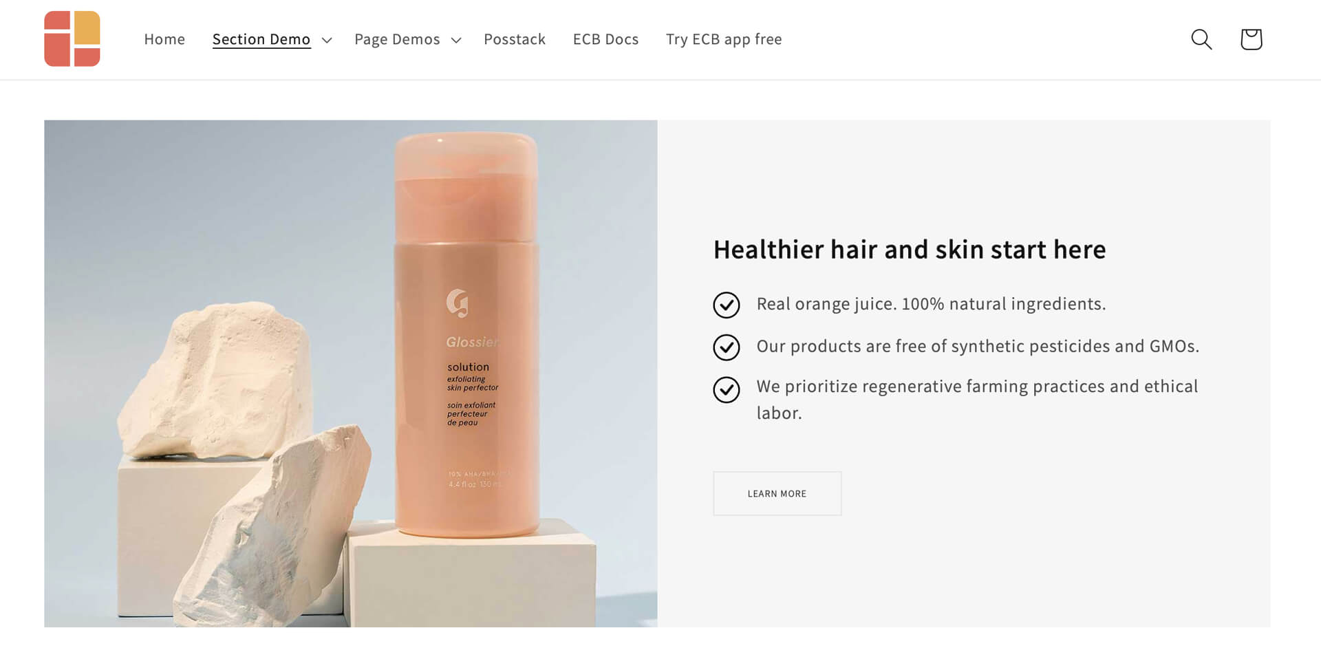
Or you can combine the Icons With Text, Section Title, and Button sections to present a bullet list of items, as demonstrated here:
Example 5: Two-col section with text blocks, signature image, Icons With Text, and CTA in the left column
This unique section includes:
- Title Section (for the Heading and body text)
- Icon With Text (for a custom signature and text columns with icons)
- Call-to-Action Button
- Section Customization (for the 2-col layout, background image)
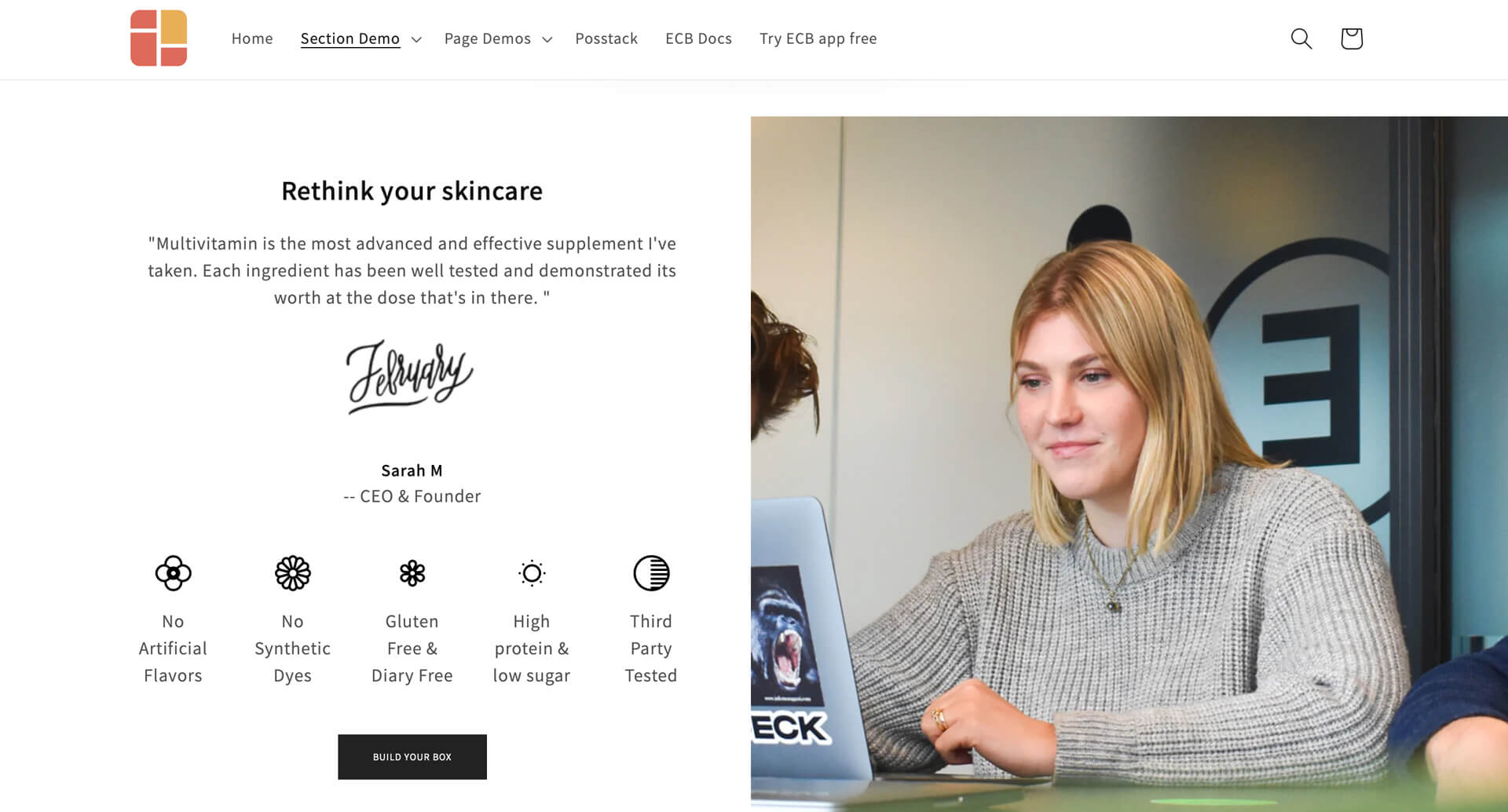
Displaying the CEO's statement and signature can be a powerful way to build trust with potential customers. The section above provides an example of this type of rich-content section. You can easily place this custom section anywhere on your Shopify store - whether it's your homepage, product page, or any landing page - without needing any coding skills.
Example 6: Two-col section with text blocks, full-width CTAs, and background image
This unique section includes:
- Title Section (for the text block in the right column and the heading on the left column)
- Call-to-Action Buttons (for the two full-width buttons and the text link)
- Section Settings (for the 2-column layout, background image)
- Custom HTML section (to add spacing between elements in the left column)
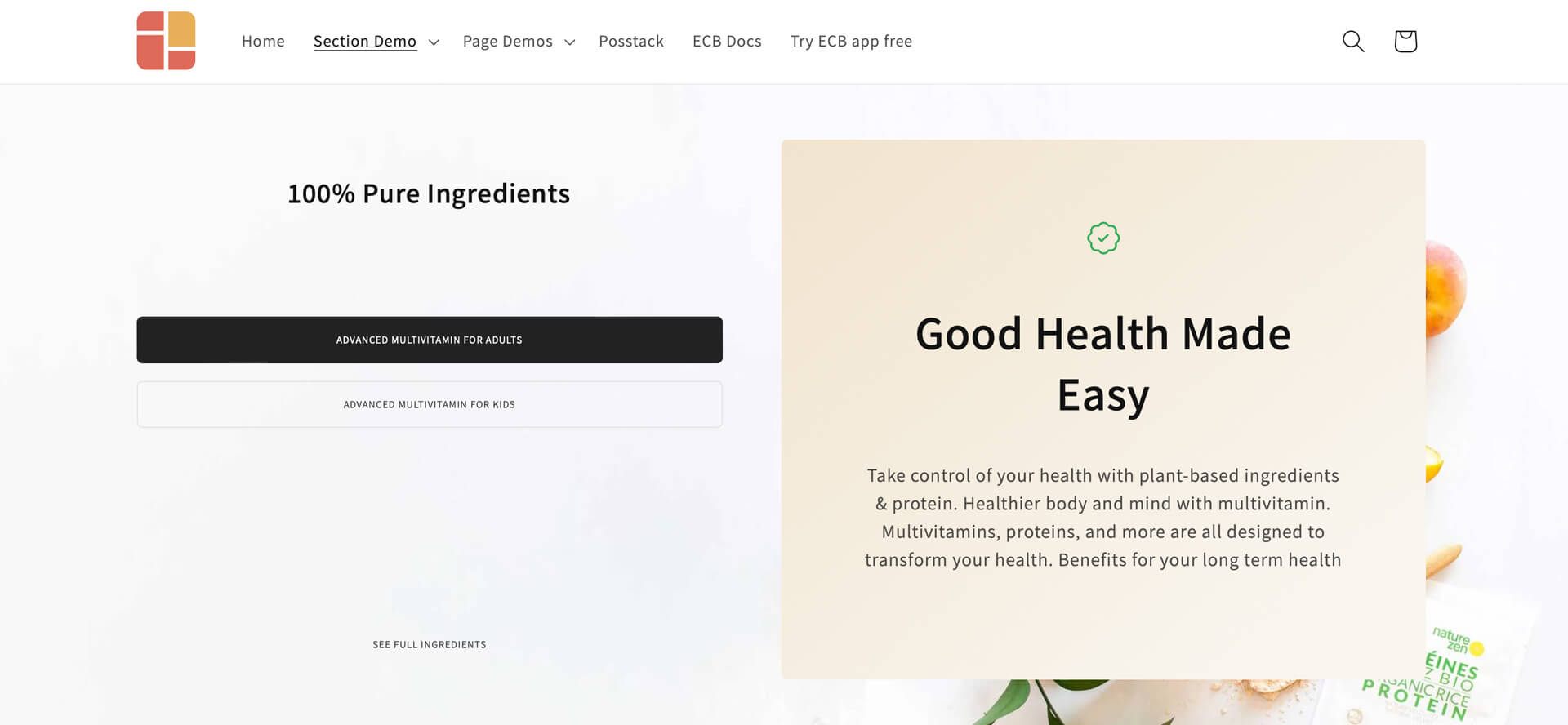
Need to feature multiple CTAs in a single section? With the Button section in Easy Content Builder, you can do this in a structured manner. By default, you can incorporate up to three buttons per Button section. If you want more CTAs, simply duplicate the section.
Example 7: Two-col section with text blocks and product collections
This unique section includes:
- Title Section (for the text block in the left column and the promo text in the right column)
- Circle Menu (for the product collections)
- Section Settings (for the 2-column layout, background image)
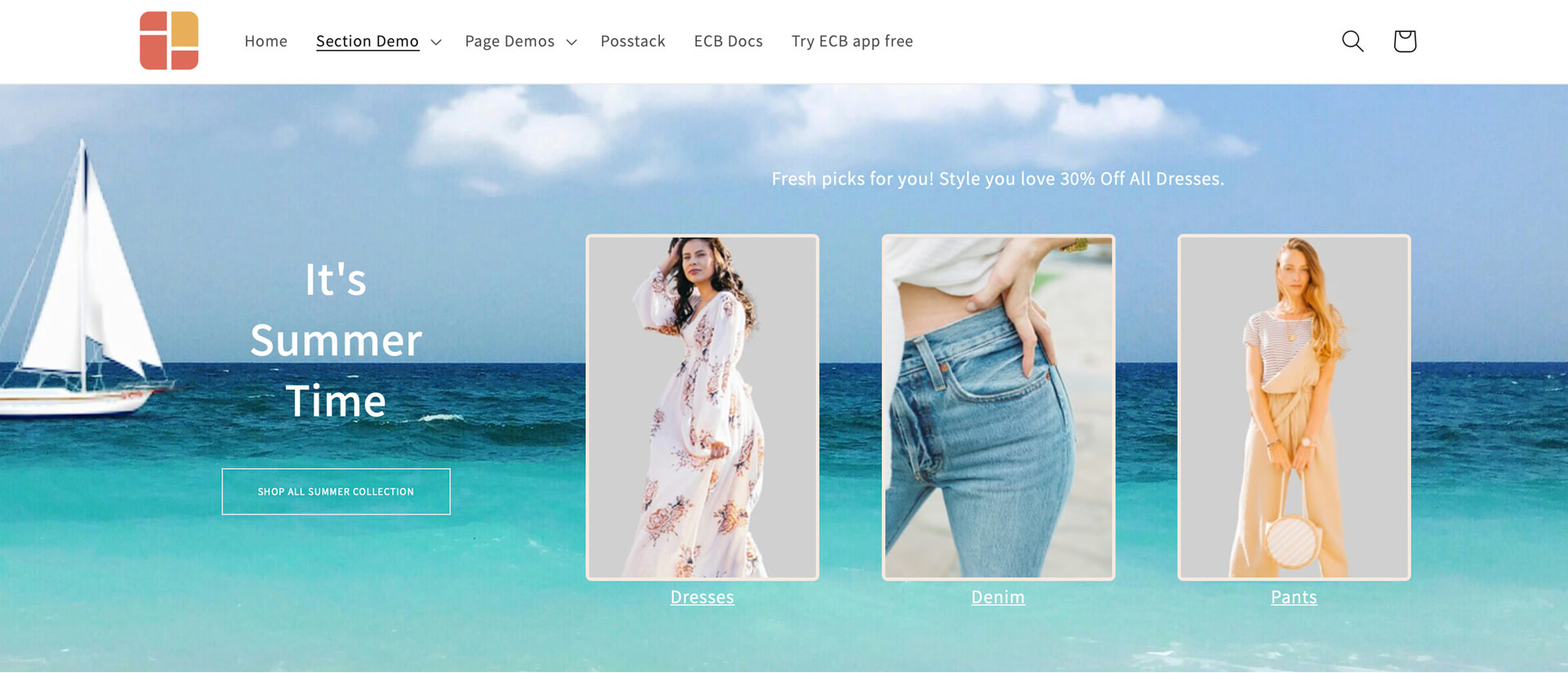
If you opt for the example above, you can use the Circle menu to show more product collections in either a slider or grid format. You can also flexibly adjust the image shape to circle, pill, or square.
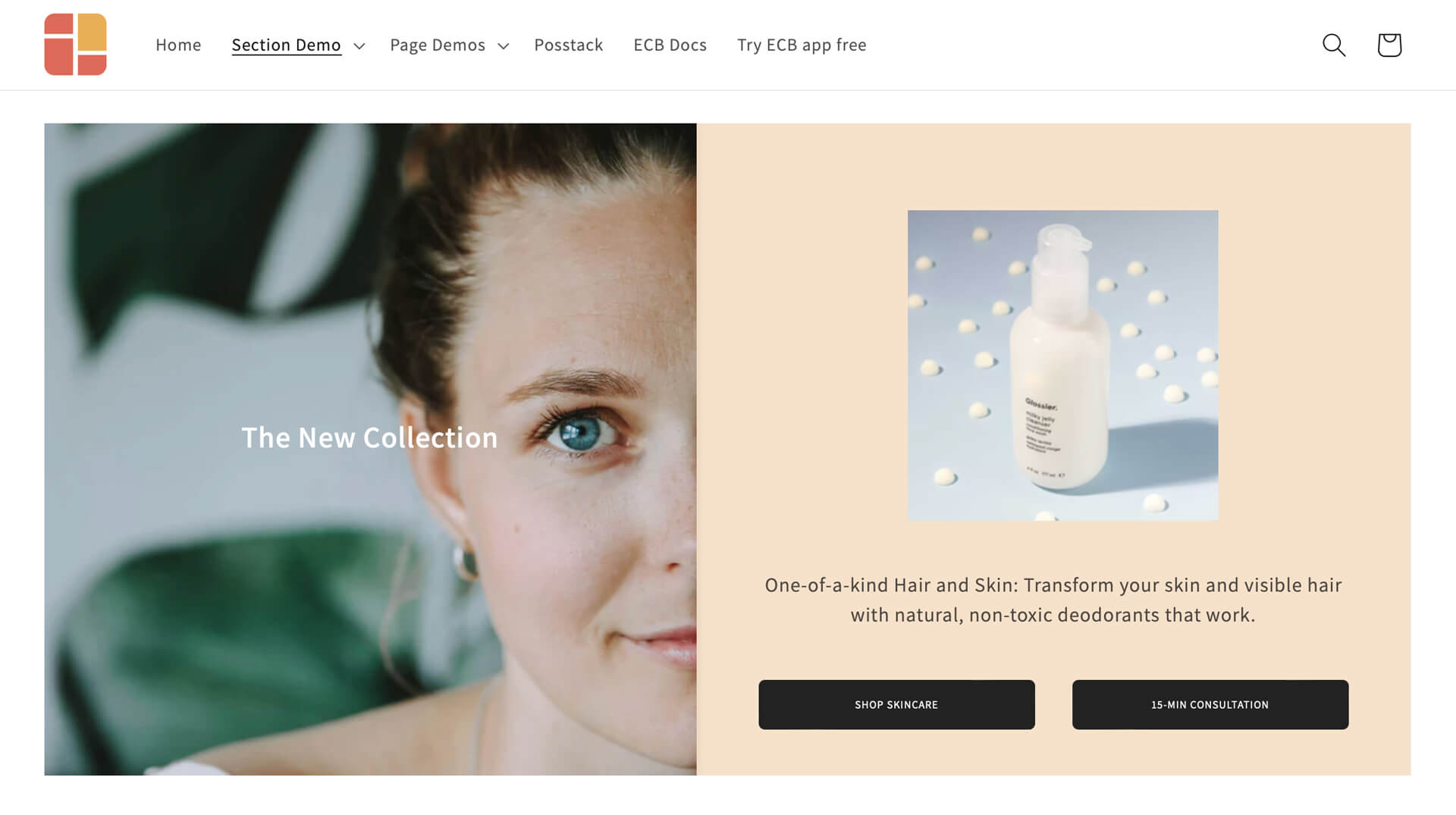
Example 8: Two-col section with a clickable image on the left and an image slider on the right
This unique section includes:
- Image With Text (for the clickable image in the left column)
- Icons With Text (for the image slider in the right column)
- Title Section (for the text block in the right column)
- Button (for the CTAs)
- Section Settings (for the 2-column layout, background color)
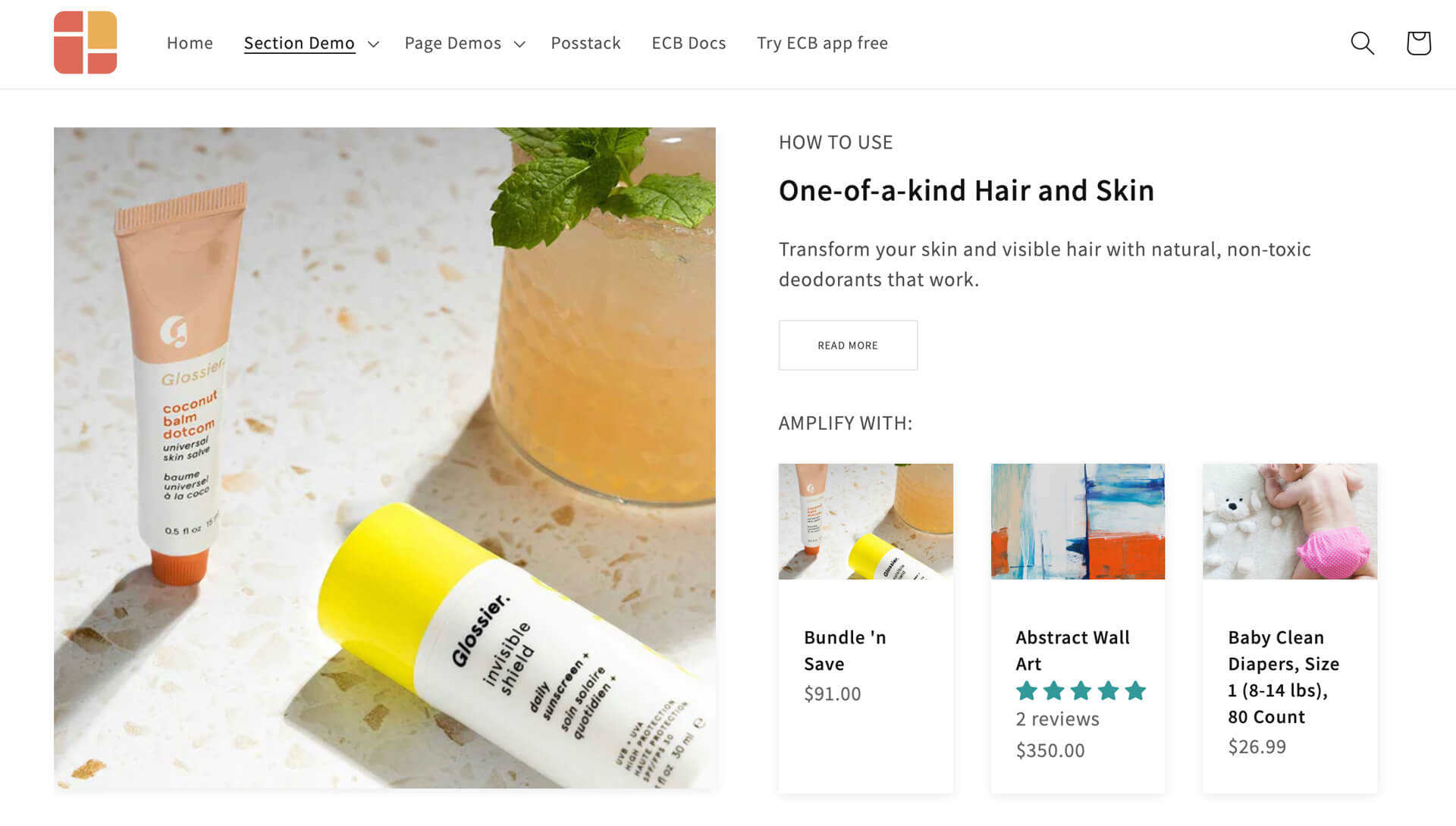
Example 9: Two-col section with a text block, CTA, and recommended products
This unique section includes:
- Image With Text (for the clickable image in the left column)
- Title Section (for the text & CTA in the right column)
- Featured Products/Collections (for the recommended products in the right column)
- Section Settings (for the 2-column layout)
Conclusion
I hope you have fun exploring those custom section examples. You can use them to create individual sections or entire pages on your Shopify store, from the homepage and product pages to landing pages and custom pages.
Do you have any specific custom sections in mind that you'd like to create beyond the samples above? We'd love to hear your ideas, so feel free to leave your feedback in the comment section.
