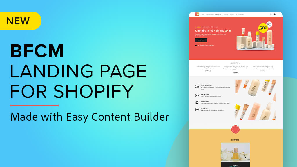
We're excited to introduce our new BFCM landing page template for Shopify, designed with Easy Content Builder. With the upcoming big sale events like Black Friday Cyber Monday and Xmas, our BFCM template empowers you to create a powerful and unique Shopify landing page that engages your audience and drives desired actions.
Let's take a closer look at some key sections and how you can optimize your Shopify landing page to effectively showcase your brand and products. From the compelling hero section to the versatile "Shop" section featuring a countdown timer, and the flexible color theme and column layouts, you'll see how each element can be tailored to suit your specific needs and create a unique and engaging experience for your visitors. Let's get started.
Hero Section
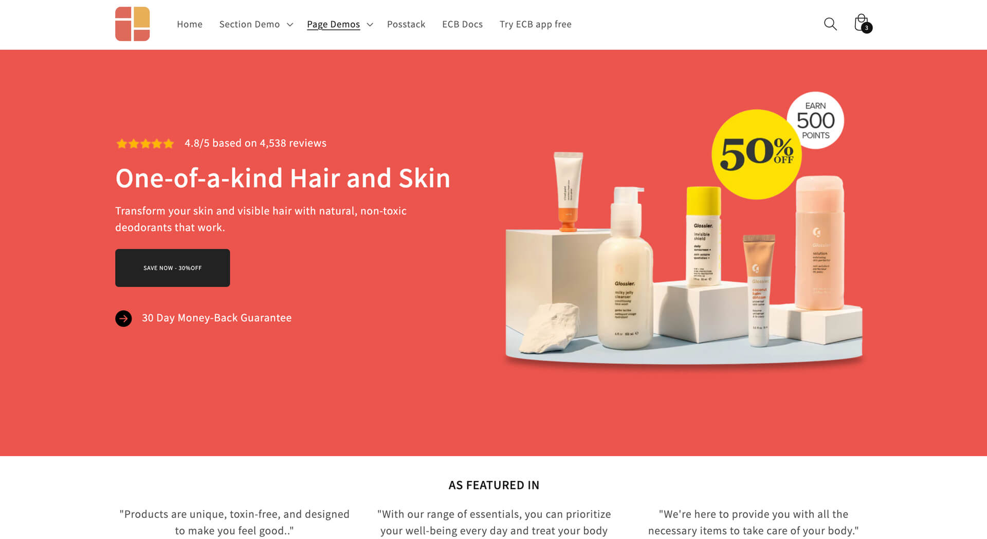
Shopify sections used:
- Image section: for the featured image on the right column.
- Icons With Text: for the star icon and the review statistic.
- Section Title: for the main hero’s heading, description, and CTA.
- Icons With Text: for the arrow and money-back guarantee statement.
The hero section plays a crucial role in your BFCM landing pages as it is the first thing visitors see. It's where you can display a captivating headline about your brand and a clear offer description.
Including positive reviews is important for building trust and showcasing social proof.
By default, the BFCM template includes one CTA button. If you need more CTAs, you can make use of our Button sections, which allow you to present up to 3 CTAs.
When designing your main featured image, ensure that it highlights the offer. For discount offers, you can either showcase them in a sticky bar at the top or feature them within your main image in the hero section.
Tip: Watch this video tutorial (refer to Part 1) to discover how to design a hero section featuring a background video with Easy Content Builder app.
Social proof

Shopify sections used:
- Section Title section: for the heading “As featured in”
- Icons With Text section: for the testimonials with media logos.
Showcasing positive feedback from industry experts or other customers can effectively persuade new visitors to make a purchase.
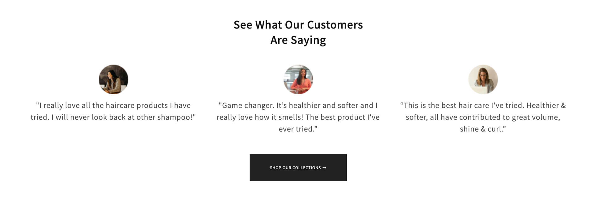
Depending on the section you add to the landing page, you can display your "Best Reviews" or simply show the star ratings for each item. It's a great way to build trust and increase sales. After all, shoppers tend to trust reviews from other buyers more than product descriptions since they're less biased. It's a simple yet powerful way to enhance your landing page’s performance.
Reasons to consider your brand/products
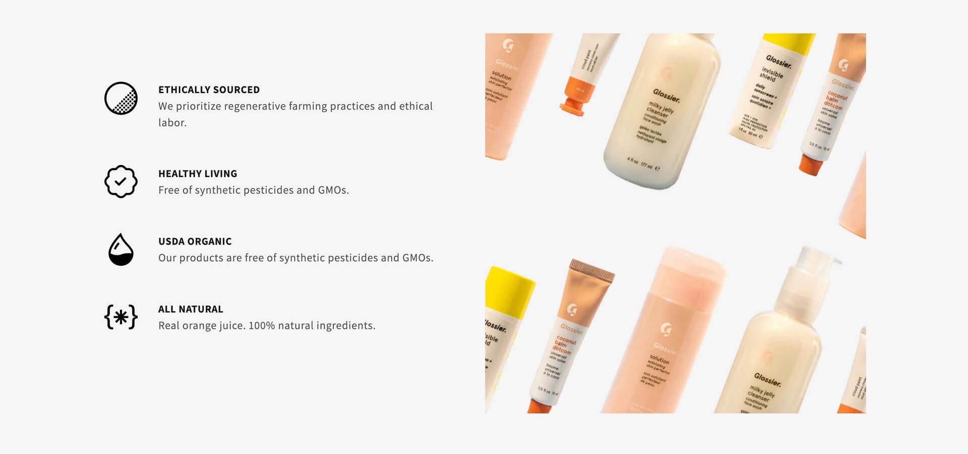
Shopify sections used:
- Icons With Text section: for the column of text with icons in the left-hand column.
- Image section: for the featured image in the right-hand column.
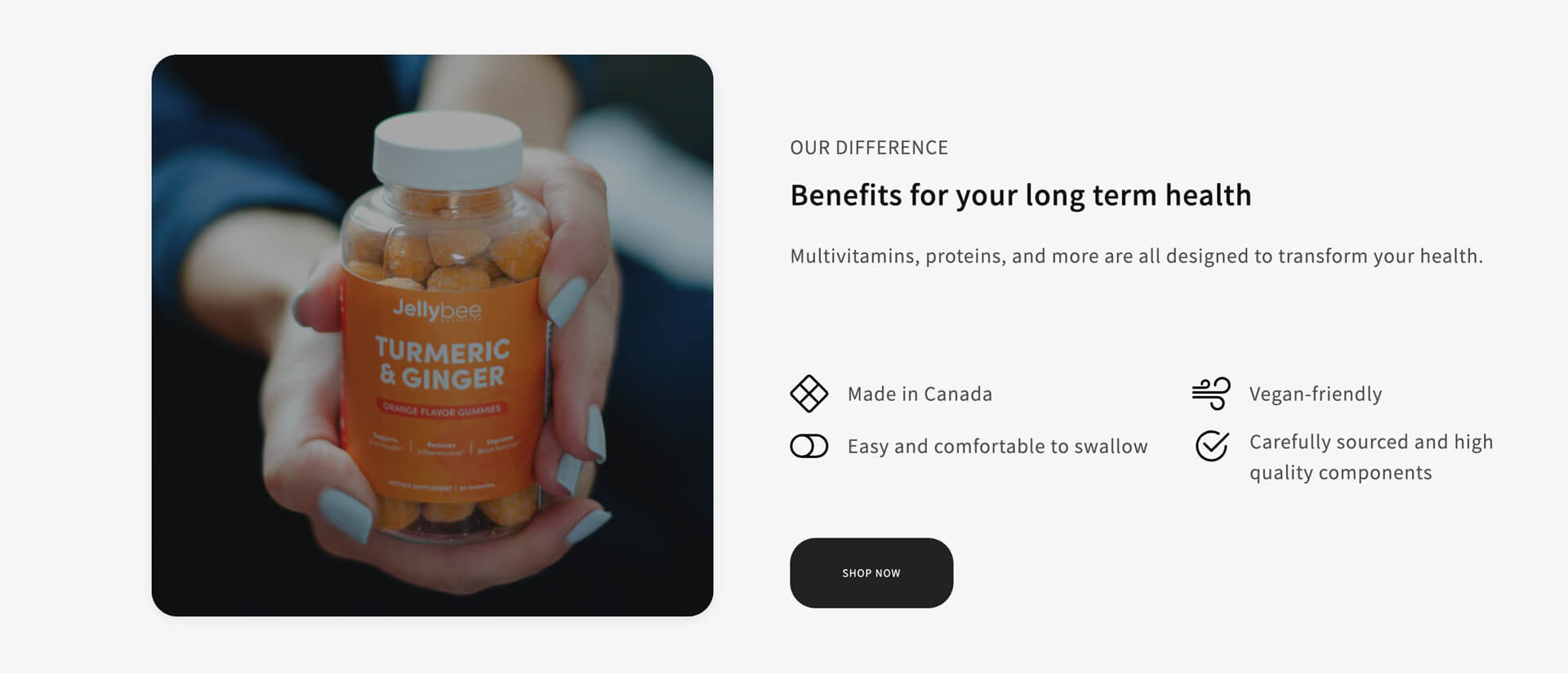
When persuading new visitors to make a purchase, it's important to show them the reasons they should try your brand/products. By using a combination of the Icons With Text and Images sections, you can provide a brief description of the value proposition using icons. This simple approach makes it easier for visitors to scan and understand the information.
Shop (featuring Countdown timer)
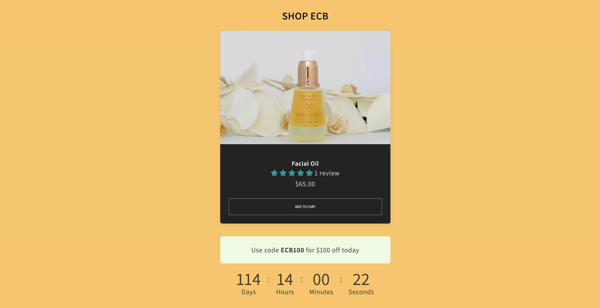
Shopify sections used:
- Item List: for the featured product cards
- Section Title: for the coupon code instruction
- Countdown section: for the countdown timer.
In the 'Shop' section of our BFCM landing page, you can directly display a product card featuring its product name, reviews, and a prominent 'Add To Cart' button using the List Item section. Below the product card, you can showcase a discount code with instructions and a countdown timer to create a sense of urgency and boost sales conversions.
With List Item, you have the flexibility to showcase multiple product cards in a grid or carousel format. Alternatively, if you prefer to provide more detailed information about the featured products, you can create a two-column layout. For example, you can feature a product image on the left and multiple text blocks with CTAs on the right, similar to this example:
How It Works
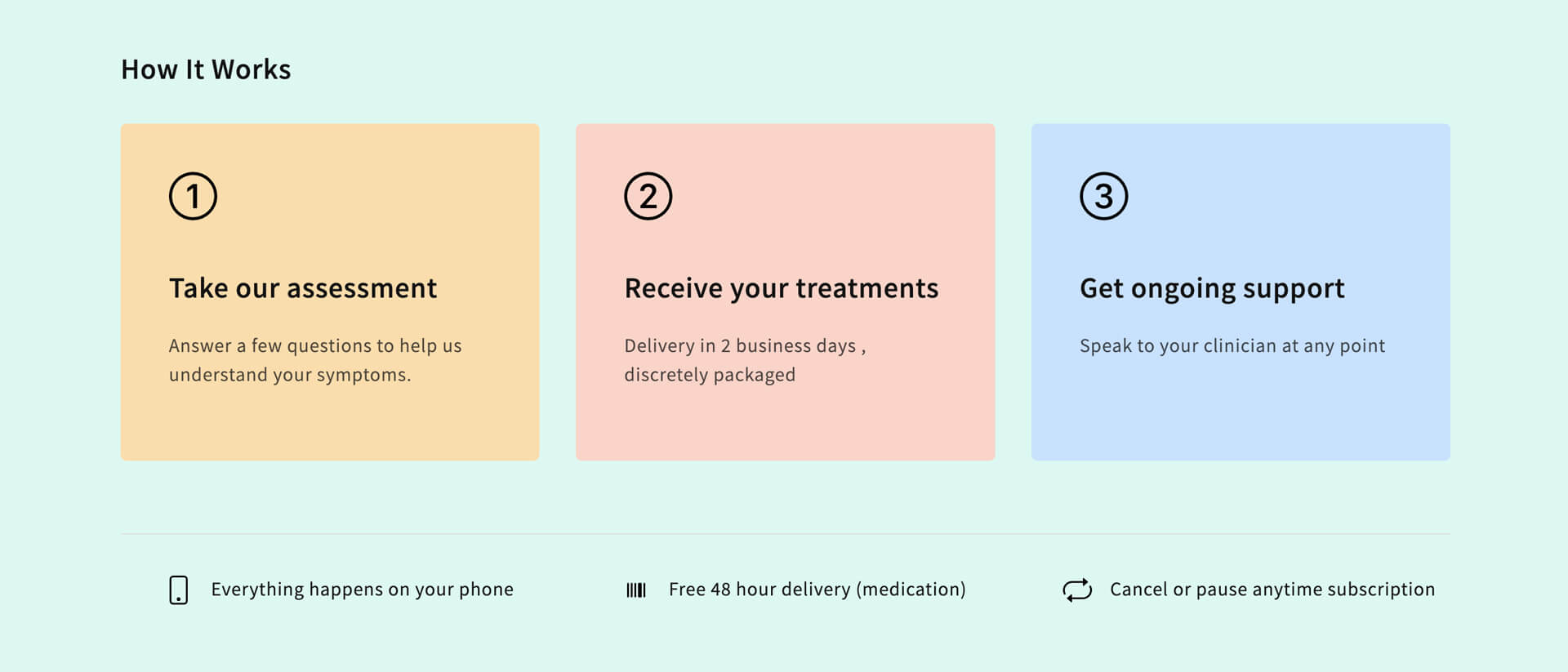
Shopify sections used:
- Section Title: for the “How It Works’ Heading.
- Section Title: for the three 1-2-3 blocks.
- Divider section: to add a divider below the How-it-work steps.
- Icons With Text: for the additional information below the How-it-work steps.
If your product involves specific steps, it's beneficial to visually highlight them as a key component of your landing page. Incorporating icons can help customers quickly scan through your content.
While our BFCM template provides a specific example with "How It Works," you have the flexibility to customize this section to highlight your unique value propositions or any other content you prefer.
Product feature comparison chart
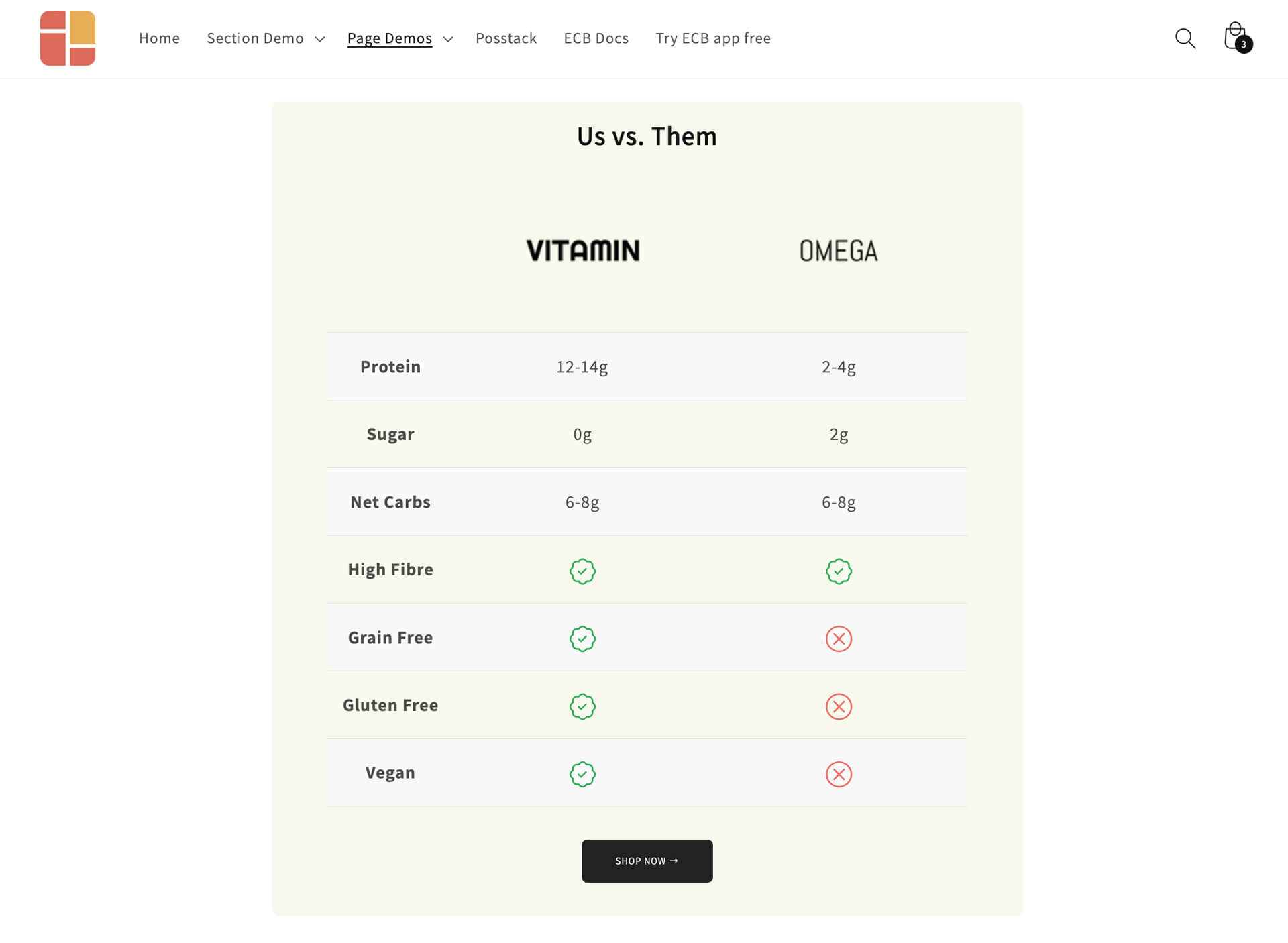
Shopify sections used:
- Section Title: for the comparison chart heading
- Table section: for the detailed comparison chart
- Button section: for the CTAs
With the Table section, our BFCM landing page allows you to generate a comparison chart, enabling your customers to conveniently compare product features and key differences side by side, helping them find the best option for their needs.
You can easily add your comparison data using our sample CSV file, and then simply copy and paste that data into the Table section. Additionally, you have the flexibility to customize the number of columns, fields' values, and include featured images in the chart. For more details, you can refer to the Configuration guide here.
Contact section

Towards the bottom of the BFCM landing page, you'll notice a straightforward Contact section in plain text. We've employed a gradient background color to create a two-color striped background, and you can conveniently adjust these colors using the Section Settings provided by Easy Content Builder to align with your brand guidelines.
The great thing is, you have the option to substitute this section with a FAQ, Newsletter form, or any other essential information that aligns with your brand and products.
Flexible Color theme & column layouts
Our BFCM landing page isn't a one-size-fits-all template, and you may likely need to create a customized landing page that suits your specific requirements. In such cases, you have complete control over tailoring our pre-designed BFCM template using Easy Content Builder. Here's what you can do:
- Narrow down the number of sections by simply hiding any section you prefer, or add new sections based on your specific needs.
- Reorder the sections within the BFCM landing page.
- Change the number of columns per each section within the BFCM landing page. For example, you can switch the current Shop section with one product card to a multiple product cards section, or combine a single product card with other rich content blocks.
- Add other rich content blocks into each section of the BFCM landing page.
- Configure the background color, image, etc., within each section to align with your brand guidelines.
Conclusion
In conclusion, creating an effective BFCM landing page involves strategic use of Shopify sections to maximize impact. From the hero section to social proof, showcasing product features, and creating a sense of urgency with countdown timers, each section serves a specific purpose in driving conversions.
Additionally, the flexibility offered by Easy Content Builder allows you to tailor the layout, section order, and content, providing a customized experience for your unique products and brand. Don't miss out on the opportunity to create a high-converting landing page that reflects your brand identity and drives success during the BFCM season.
