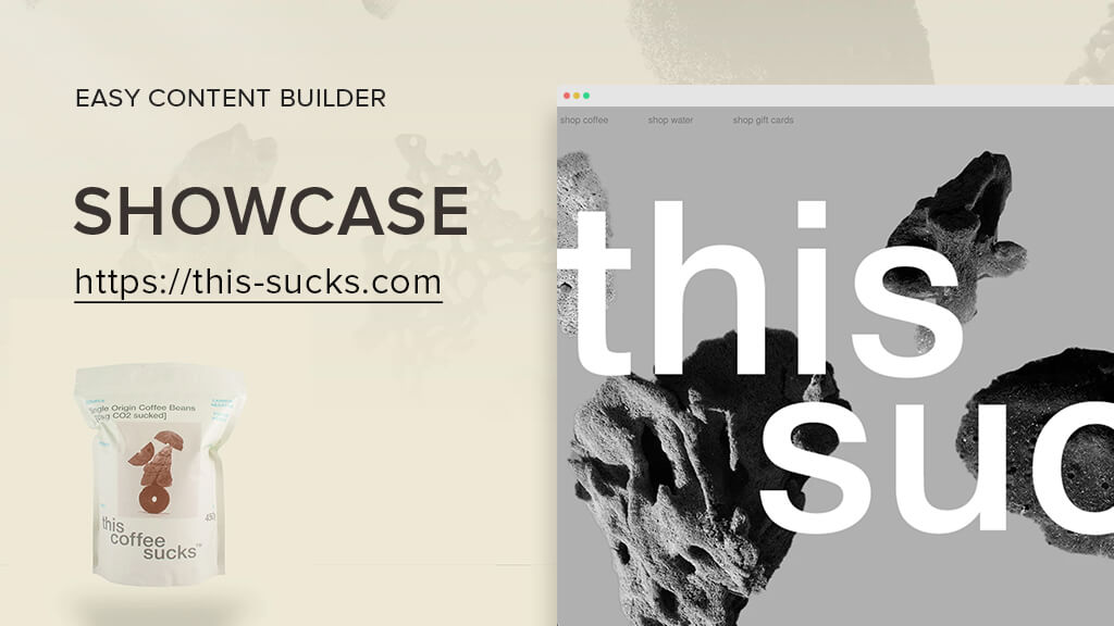
It is our pleasure to highlight a remarkable brand called This Sucks™ that produces and distributes single origin ground coffee and mineral water. This Sucks™ is a perfect representation of a Shopify store that features a simple yet elegant design, coupled with effective use of the Easy Content Builder to enhance its homepage - https://this-sucks.com.
Introducing the This Sucks™ brand
This Sucks™ is an incredibly carbon-negative brand, removing up to 90 times more CO2 from the atmosphere than the total emissions from the manufacturing and distribution of their products! They achieve this by reinvesting 75% of their profits into carbon capture projects that focus on reforesting in Australia and Newzealand.
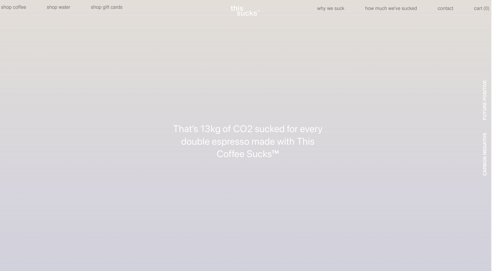
Let’s take This Coffee Sucks™ as an example. They buy 627kg of carbon offsets for every kilo sold, enough to offset the approximately 7kg carbon footprint of growing, roasting, and transporting their coffee, with an extra 620kg for good measure! So, that's 13kg of CO2 removed for every cup of This Coffee Sucks™. To give you an idea of the impact, the average Australian emits around 39kg of CO2 per day. So, having a cup of this coffee removes about a third of your daily emissions. Three cups a day...
The This Sucks™ Homepage with Easy Content Builder
Parallax scrolling
This Sucks™ did a fantastic job utilizing Parallax scrolling in Easy Content Builder, creating a captivating visual effect where the background moves at a different speed than the foreground content.
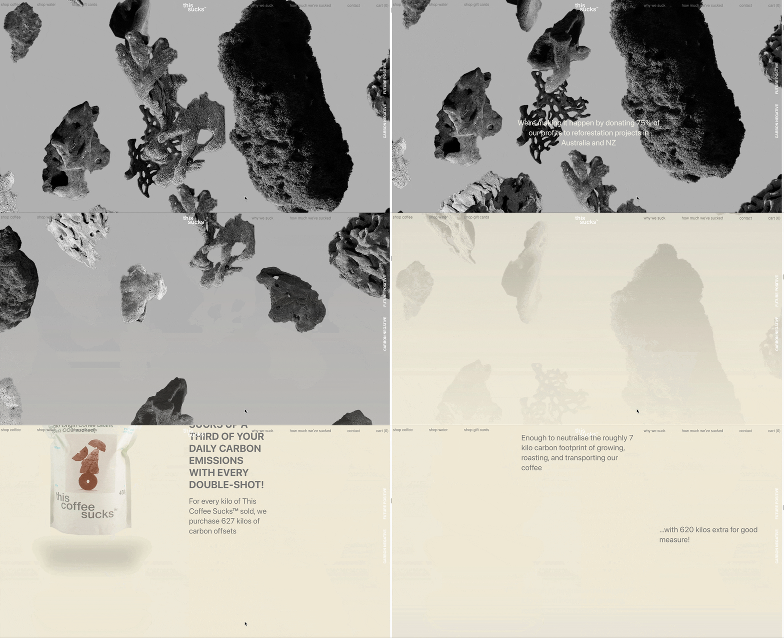
This feature adds a sense of depth to This Sucks™ homepage and engages users as they scroll through a page.
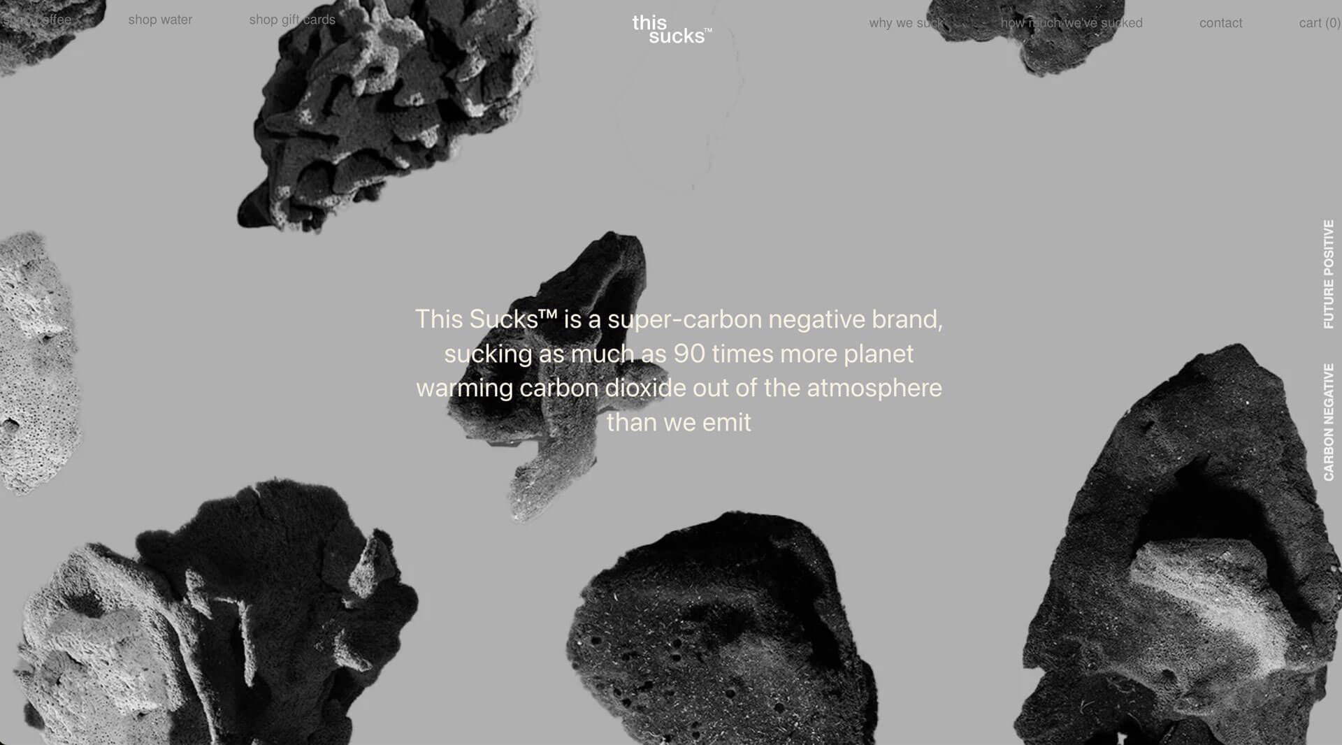
This Sucks™ intentionally incorporated and maintained ample space "to breathe" between the text sections (using Section Title) and images on the foreground layer. This strategy provides an effective means for communicating their super-carbon-negative commitment, capturing users' attention, and evoking emotions throughout the various sections on the homepage.
Multiple column layouts
When utilized effectively, empty space can be one of the most powerful elements in web design. This Sucks™ creatively leverages negative space in multi-column layouts, giving their homepage a distinctive edge.
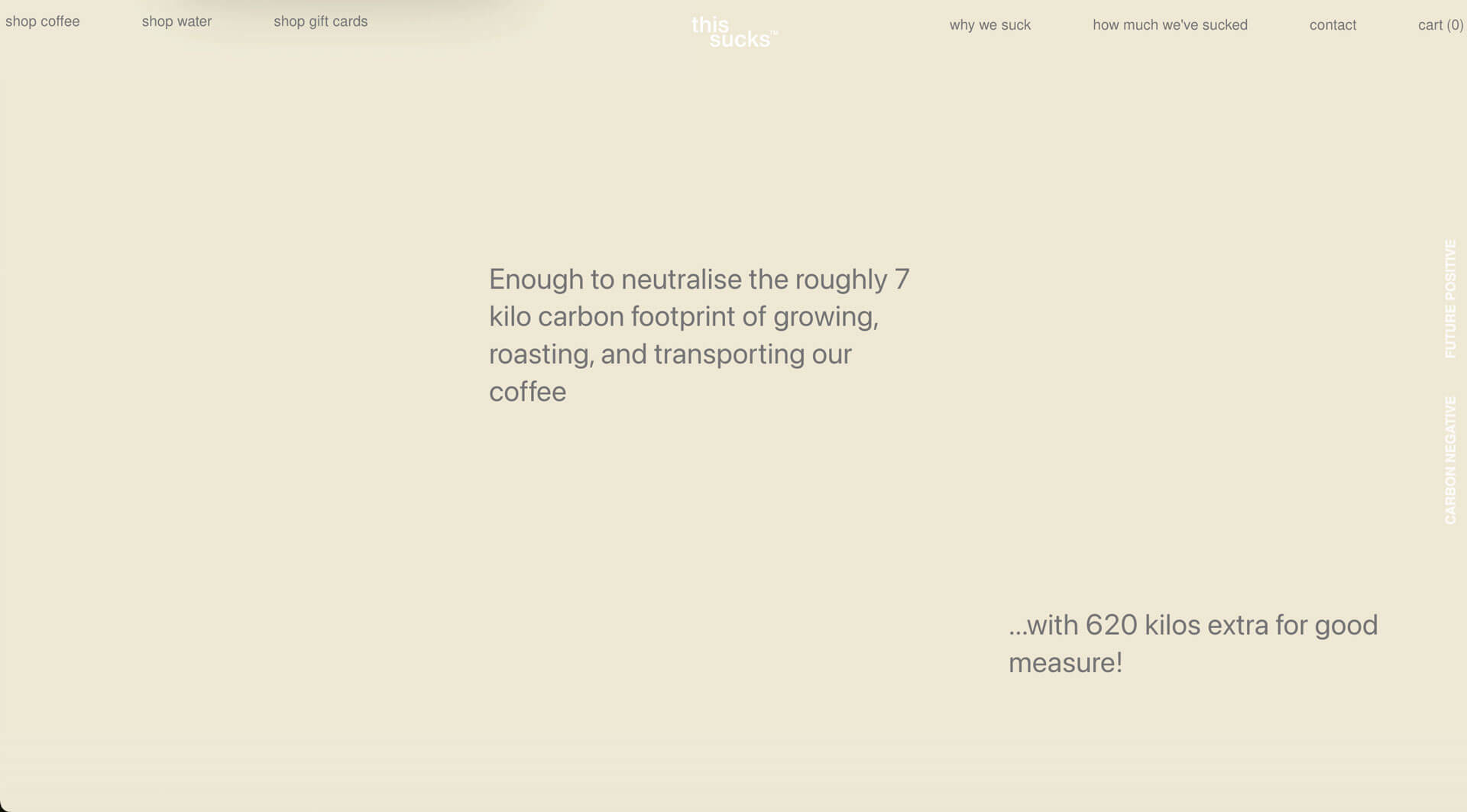
By using Easy Content Builder, they can effortlessly design a three-column section with two empty columns alongside one column displaying text content. This intentional contrast effectively guides the viewer's attention as they scroll through the page.
Gradient color and image background
In addition to the parallax scrolling effect, This Sucks™ creatively utilized the gradient color and image background options in Easy Content Builder.
At the top of their homepage, they applied an image as a background under the Section Settings and then added a transparent gradient image on the foreground using the Image With Text feature. These two layers blend together to create an impressive background effect.
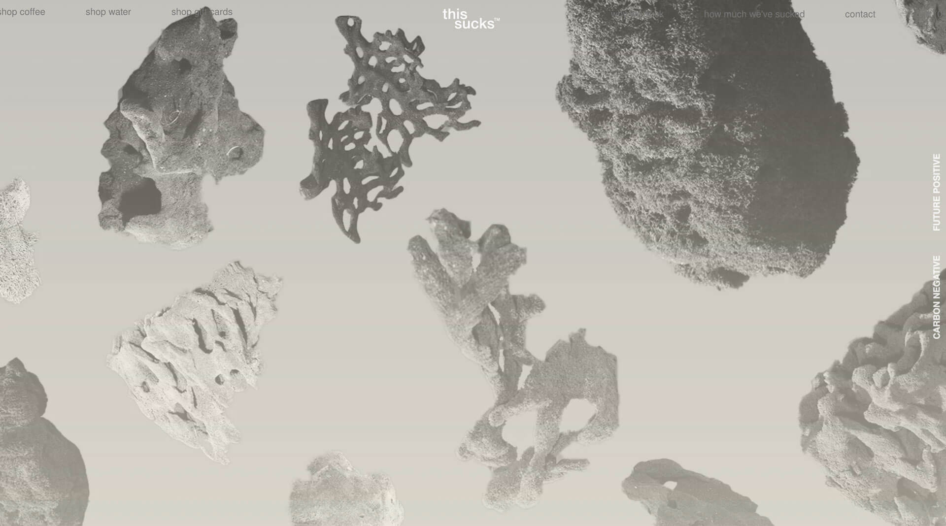
As users scroll down the homepage, they solely use a gradient color as a background, which was also configured under the Section Settings in the Easy Content Builder. This flexible approach allows you to incorporate any gradient palette that aligns with your brand guidelines.
FAQs Accordion
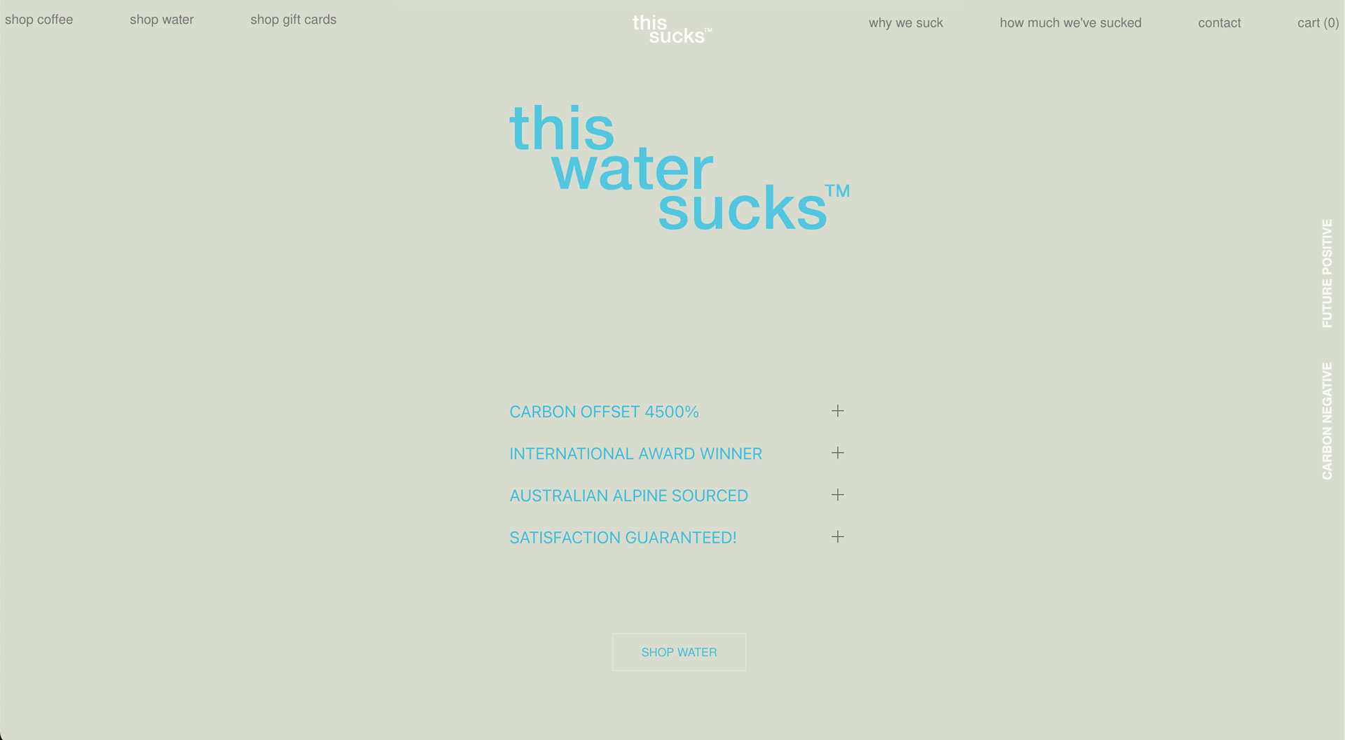
This Sucks™ incorporated two distinct FAQs, one for coffee and the other for mineral water products, directly on their homepage using the Accordion section in Easy Content Builder. This is a great feature that enables users to easily locate relevant FAQs for the products they are interested in.
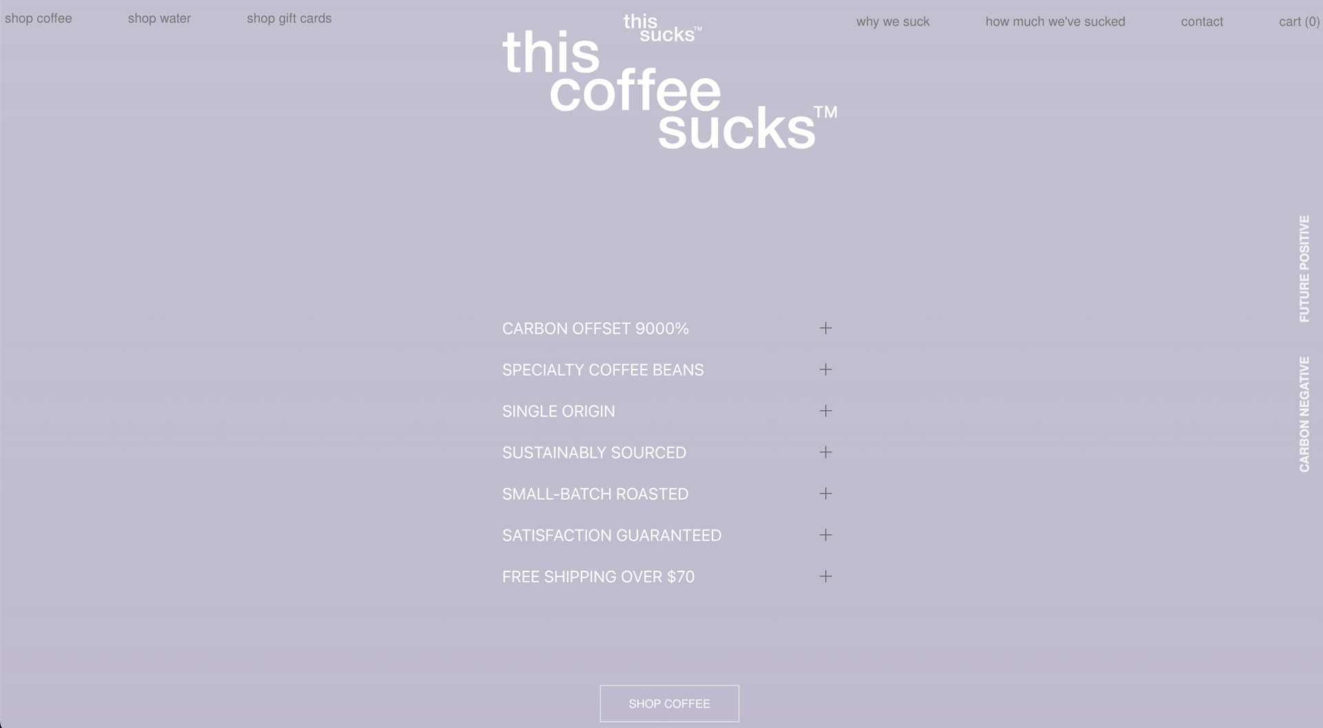
As can be seen, Easy Content Builder lets you define the width of the FAQs section flexibly, allowing it to be full-width or integrated as part of the column layout.
For those who are new to Easy Content Builder
Easy Content Builder offers a robust solution for creating engaging and functional Shopify stores, with flexible pre-built sections and blocks, as well as animation effects.
For new merchants who are looking for a quick start on Shopify, the Free version of Easy Content Builder provides a nice set of content blocks that allow you to build functional pages without the need for coding.
