After months of hard work, we are excited to release Easy Content Builder (V2) with a complete overhaul of the code base, UI, new features, and improvements.
Let's take a closer look at what's new in the Easy Content Builder (V2).
Overhaul the whole code base
Our team did go the extra mile and re-wrote the whole Easy Content Builder's code base to optimize the app further and made sure our new UI blends in nicely.
This new release (V2) for the Easy Content Builder brings entirely new UI improvements giving you more robust admin configurations and incremental performance optimization. As you can see, performance optimization has always been a key challenge for any Shopify store. We will keep updating our code to ensure our app doesn't negatively affect your store's performance. This has been and will continue to be one of our top priorities.
Improved sections & blocks
Accordion:

Easy Content Builder - Accordion
The accordion section allows you to show and hide sections of related content on a page. The Easy Content Builder (V2) gives you more control over the accordion behavior:
- No collapsing: if enabled, always maintain one open item (By default, all Accordion items can be collapsed). Preview this demo page.
- Multiple open items: to expand many Accordion items at the same time without one collapsing when the other one is opened (By default, as you open another Accordion item, the previously opened item automatically collapses). Preview this demo page.
The accordion section is a handy way of organizing and providing collapsible sections while letting you save vertical space.
Buttons:

Easy Content Builder - Buttons
Buttons are one of the other vital elements that we enhanced in this V2 release.
Button Styles:
Text buttons are useful for less-pronounced actions, including those located in cards like this demo (please scroll down to the blog post section).
Besides the common button sizes (small, large), you can also enable the 'Full Width' button to emphasize actions that users can take if they choose to. Sounds cool?
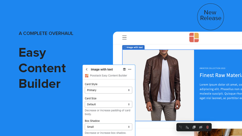
Image With Text

Easy Content Builder - Image With Text
What's the next item in the overhaul list of the V2 release? Yes, it's the Image With Text section.
You can now easily apply Card Style to each Image With Text section with various configurations:
- Card Style: Default, Primary, Secondary, and No Card style
- Card Size: No Padding, Default, Small, Large
- Set Image position: Top, Right, Left or Bottom.
- Box Shadow: No Shadow, Small, Medium, Large, X-Large.
- Vertical alignment: Top (default), Middle, Bottom
- Other typical elements: Badge, Tagline, Title, Description and Button.
Elements - like buttons, text, and images - are fine-tuned in a way that clearly indicates hierarchy. In particular, you can generate a small badge to the top-right of each section. The badge automatically adapts to the card's color to ensure visibility (See this demo).
We believe the card style helps users scan for relevant and actionable information easier.
Featured Products / Collections

Easy Content Builder - Featured Products/Collections
The Easy Content Builder (V2) merged Featured Collections & Featured Products into one section. You can choose to display a featured product slider for custom chosen products or collections in one place.
This section was revamped with more enhancements, including:
- Show/hide Description
- Description Length
- Card Style
- Card Size
- Box Shadow
- Show/Hide Dot Navigation
- Set the Slider Arrows' position
- Slide Sets: To loop through a set of slides instead of single items

Easy Content Builder - Featured Products/Collections
Here's an example of the Featured Products as product add-ons on the product page. We will keep enhancing the Featured Products/Collections in the upcoming releases so that you can take more advantage of upselling and cross-selling capability.
Gallery (Old: Image Grid)

Easy Content Builder - Gallery
Now, let's move to another cool upgrade in the Easy Content Builder (V2) - Gallery section (that replaces the old Image Grid section).
The Gallery section enables you to display a collection of images and video in an organized grid. As a side note, the video is available for the Easy Content Builder Pro version only.
Besides the revamped code base, the new Gallery provides you with more robust configurations like Set Gap between media items, Set Animation Effect (Fade, Slide, Scale) that provides your users with a unique experience when interacting with the Gallery items (See this demo)..
Tabs:

Easy Content Builder - Tabs
In this new release of Easy Content Builder, the improved Tab section makes it easier for you to divide your content into tabs, either horizontally or vertically. Here're a few major upgrades:
- Improved tab styling
- Set a position of tabs: Top (default), Left, Right.
- Set animations when switching between tabs: Fade, Scale up, Slide Top/Bottom/Left/Right.
- Improved responsive - the tabs display will turn to the default Top tab style on the mobile screen.

Vertical tab - Clothing product detail page demo
In addition to the tab-transition effects, you can also apply Animate on scroll to the whole Tab section - a powerful tool to create smoother transitions and improve engagement.
Other typical features
If you're new to our Easy Content Builder, you might want to know more about a few other handy features that we introduced recently in the Pro plan - Before/After Slider and Animation on Scroll.
Before/After Slider: A sliding visual comparison - two versions of an image will appear with a divider which can be moved to see the difference.

Easy Content Builder - Before/After Slider
Animations on scroll: it lets you apply different types of animation to elements within each section as you scroll down the page. You can choose different kinds of animation:
- Slide up
- Fade
- Flip up
- Flip down
- Flip left
- Flip right
- Zoom in

Easy Content Builder - Scrolling Animations
New product detail page templates
In case you missed it, we recently added new preset product detail page templates (here and here). You can use these pre-built templates as a starting point for quickly developing your custom template.
In this V2 release, the Easy Content Builder is also packed with new preset product detail page templates, including:

Baby Diapers - Product Detail Page

Dog Food - Product Detail Page
You can expect more preset templates to be added soon.
Get started
Easy Content Builder (V2) is a great complementary tool for your free OS 2.0 themes - Dawn, Craft, Refresh, Studio, Crave, or any other OS 2.0 themes.
With Easy Content Builder, you can easily build custom templates or sections in minutes without coding. The workflow is straightforward - simply install, add pre-built layouts and sections to your OS 2.0 theme, and customize in the Theme Editor.
The app has a free plan perfect for building a Shopify store on a budget. And you can stay on this version as long as you want. Install FREE Easy Content Builder here
If you want to build a custom store with robust features, we recommend the Pro plan.
Have a question? Just drop us a message at support (at) posstack.com.