We all know the product page is one of the most essential pages on your Shopify store. In many cases, a short and concise product detail page is crucial to encourage a conversion.
But there are several circumstances where long-form product detail pages can increase sales better than shorter ones. For instance, if your products/services are:
- Expensive
- Complicated
- Or require a big commitment
With longer product pages, you can provide more comprehensive product details and in-depth benefits, showcase the product development behind the scene, etc. This helps your visitors fully understand your product/service better and, in return, convinces them to purchase faster.
Since getting the long-form product detail page is no easy task, we curated 5 real-world Shopify stores to give you ideas and inspirations on product pages you can try out yourself.
Before we jump to the list, let’s look at what content blocks you probably use on a long-form product detail page.
What to include in a Long-form Product Detail page?
So you know the base elements of a regular product page - product description, product image and media, Call-to-action (CTA) button, and testimonials...
What else should you enrich your Shopify product page?
A long-form product detail page consists of multiple sections down the page. Each section may include a combination of the following:
- More detailed product specifications: The regular above-the-fold product description is where you briefly highlight the value of your product, then the product features (below-the-fold section) are perfect for getting into more technical details such as sizing specifications, maintenance instructions, assembly requirements, and so on. This extra product information can fit well in a dynamic accordion or tables.
- Supporting information: helpful FAQs section that answers questions customers might have about your product, breakdown of the specific parts of a product, etc.
- Highlighting shipping/return policies: Clear shipping fees and straightforward return policies help encourage visitors to complete a purchase.
- Social proof: Lists of any notable brands or people who have used the product in the past.
- Visuals (images or videos): bring your product to life with image illustrations or videos. This helps the product page feel more interactive and alive.
- Product Recommendations: feature similar or related collections/products that the visitor can consider.
While those content blocks all serve one purpose, how they are organized often varies greatly across Shopify stores. Since each business is different, there's no one-size-fits-all list of content blocks for designing an effective long-form product detail page. It’s best to A/B test page features like CTAs, rich content blocks, placement, and copy to find what connects best with your visitors.
Good to know:
I recommend watching this video tutorial that guides you on how to build a complete Shopify product page in under 25 minutes using Easy Content Builder's no-code sections. You don't need any coding or design skills — just start with your marketing ideas, and you'll transform them into a fully optimized product page with engaging sections in no time.
Top 5 Long-Form Product Detail Pages For You To Get Inspired By
Let's jump to some of the top Shopify stores and look at how they design long-form product detail pages that convert. It’s not just lots of content that matters, it’s how the content is organized that equally matters.
1. Then I Met You
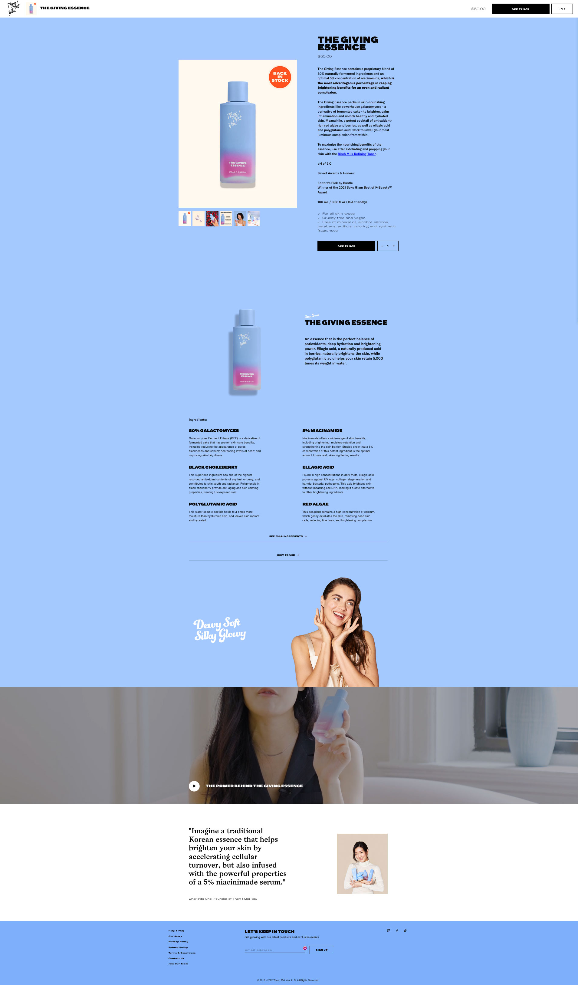
Then I Met You (a premium skincare line founded by Charlotte Cho) keeps a simple layout and focuses on helping visitors fully understand their offering fast. They showcase rich content blocks below the fold, including:
- Extra product introduction: display the featured product image and highlight the product's purpose and main benefits to visitors.
- Ingredients (Extra product description): describes the product’s main ingredients in a 2-column grid layout with bold subheadings.
- Full Ingredients and How to use section: shows a complete list of ingredients and a brief How to use guide under a neat accordion.
- Featured banner: a high-quality image that connects with potential consumers.
- Full-width featured video: explain what the product is and how the product improves their skin.
- The Founder's statement: a short but descriptive statement about the product's benefits.

2. Cowboy
Cowboy - Electric Bike for urban riders - has done a great job of making its product detail page comprehensive and compelling.
- Excellent visuals: they highlighted product images and videos that show the product in action. They streamlined multiple content blocks in various column layouts without cluttering the page: full-width one-column, two-column with the main column on the right / left, and three-column.
- Prominent and clear calls to action: displays bold, contrasting subheadings and CTAs directly beneath the fold.
- More product specifications: extra product details are shown neatly in an Accordion.
- Specification comparison: a table that compares the costs for similar bikes - a simple way to help customers figure out which one is best for them.
- Social proof: show the Instagram posts of the consumers who share product reviews and features into a live feed on the product detail page.

3. Rothys
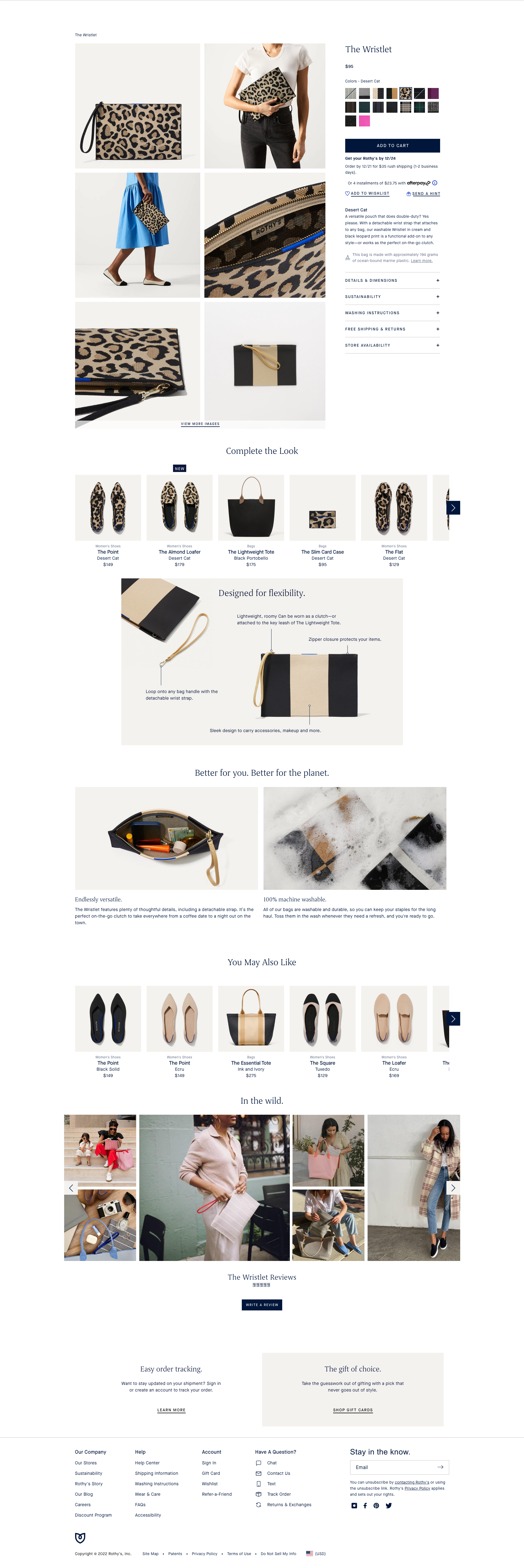
Rothys is an American direct-to-consumer fashion company founded in 2012 and launched in 2016 by Stephen Hawthornthwaite and Roth Martin. They opt to keep the product page concise and descriptive. All content blocks are carefully crafted to have more impact on conversions.
- Product recommendations: multiple product carousels suggest related products relevant to the product the buyer is considering. This is an effective up-sell/cross-sell strategy.
- Image illustrations: buyers are able to see every aspect of the product, including the details like texture, stitching, etc.
- Image gallery: photos of products being used help the buyers evaluate the product in real life.

4. Lastobject
Lastobject is a Danish manufacturing company based in Copenhagen that sells sustainable products online and in retail globally. They structured their long-form product pages with multiple rich content sections that deliver maximum conversions.
- Featured banners: Lastobject puts the featured banners right below the main product description, where it's impossible to overlook when visitors scroll down the page.
- Extra product information (below the fold): Lastobject uses three-column, two-column, and one-column content grids on its product detail page with a combination of featured images and text. This approach provides easily accessible and engaging information across the page, so it's much easier for the buyer to make a purchase decision.
- Featured brands: A list of any notable Lastobject partners
- Featured Products & CTAs: Lastobject combined related products, featured images, and call to action content within a single section - a great way to make the CTAs clear and prominent.

5. Kulalaland
Kulalaland - a luxury baby sleep brand - makes a straightforward product detail page with a 2-column layout. It mainly uses high-quality images, video, and accordions to concisely highlight the product features and communicates value to the user. The accordion pattern is ideal for breaking down long-form content into key pieces of information - a perfect solution for Kulalaland long-form product page.

Conclusion
You can choose so many different variations and content blocks when building a long-form product detail page. The more complex or expensive your product/service is, the more you need to explain, educate, and persuade visitors to buy. This is where the long-form product detail pages excel and help you gain the user’s attention and curiosity with more than just standard descriptions, photos, and the “Add to Cart” button.
We hope that the examples above give you ideas on how to present your long-form product page in a way that engages your visitors and persuades them to buy your products.
Useful tip:
Here are a few pre-built long-form product detail pages you can start from. The Easy Content Builder has done the work of getting rich content blocks all set up for you, so there is no need to start from scratch. Take a look at this tutorial video to learn how to create Long-form product pages on Shopify within a few minutes.
