How can you choose a typeface combination for your Shopify store? In this article, we'll share the top 10 free font pairings for your Shopify Dawn theme. These pairings are beautifully designed, mainly using Google fonts, and can help maintain consistency across your Shopify stores.
Choosing the right typeface combination is crucial; that's why many businesses consistently use the same font pairing across all of their marketing.
What are font pairings?
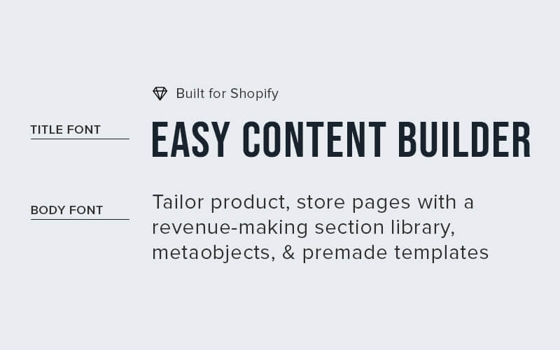
Font pairings involve combining two different fonts on a page or the entire Shopify store. Usually, one font is used for headlines, while another is used for the body copy. A third font may also be employed as an accent font for essential words.
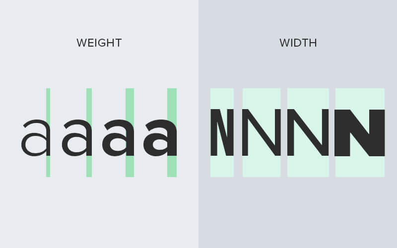
It provides flexibility to adjust your brand's personality, add variety through different weights (from the very light to the very heavy), widths (the horizontal space taken up by a typeface’s characters), and styles (regular, italic, oblique, small caps) or even just to do things that your primary typeface can't do.
Font pairing checklist
Whether you're selecting the first typeface for your new Shopify store, pairing a secondary typeface after the primary typeface has been made, or anything in between, this handy checklist can act as a universal guide to choosing a type.
Here are a few tips:
Choose harmonious yet contrasting typefaces
A good pairing involves typefaces that are harmonious but have sufficient variation. This adds contrast while drawing the reader’s eyes to key parts of the page.
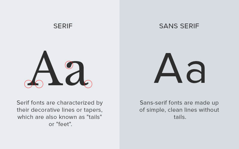
Pairing a serif and sans-serif font
Choose one that works well for your header and subheader text, and another for smaller text and longer copy. Pick the one that fits best with your brand and design.
Pairing different weights and widths
Combining different typefaces to convey emphasis and hierarchy. Alternatively, you can choose a single type family that provides multiple widths and weights. Generally speaking, a narrow typeface allows you to fit more words per line, a fat face helps scream personality, and multiple widths offer the typographer more ways to work with type without using more than one typeface.
Ensure readability
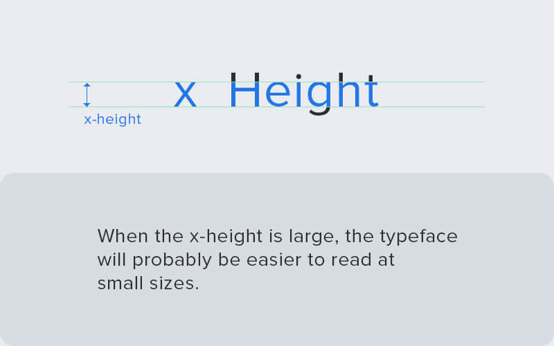
For better legibility, typefaces with different versions should be chosen for different sizes. Smaller sizes have less stroke contrast, larger x-heights, wider characters, and more open spacing. Larger sizes have refined features and tighter spacing, which can hinder readability in smaller sizes.
Choose the typeface that suits your brand
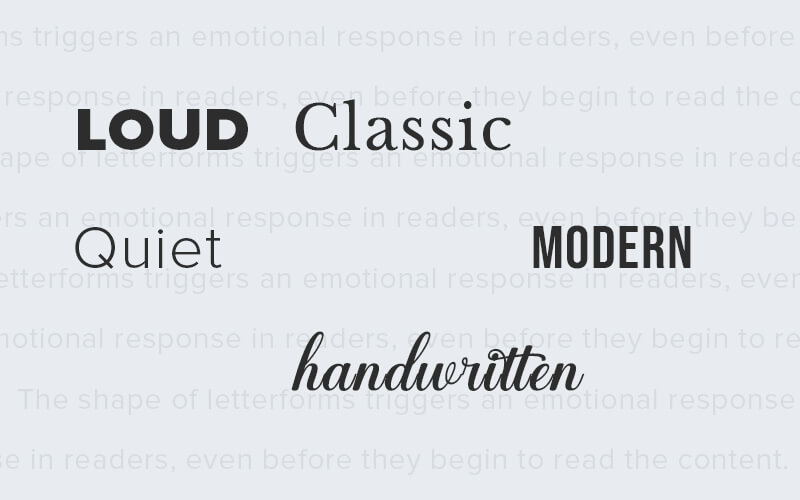
The personality of a font can evoke the desired emotional response from the audience. The shape of letterforms triggers an emotional response in readers, even before they begin to read the content.
Top free font pairing recommendations
Tip: Take a look at 50+ Google font pairings we've used in our prebuilt Shopify templates, which include the homepages, landing pages, one-product templates, product bundles, and product detail pages.
Libre Baskerville + Source Sans Pro
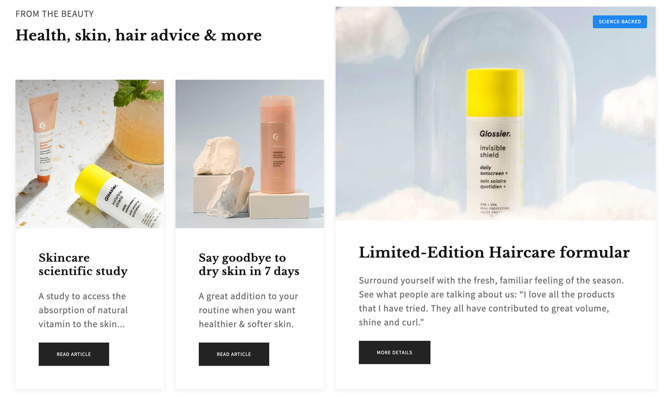
- Headline font: Libre Baskerville
- Body font: Source Sans Pro
- Sections: Section Settings (which defines the hierarchical grid), Section Title (for the Heading and tagline), and Image With Text (for the Image, Heading, and CTA buttons).
Quattrocento Sans + Quattrocento
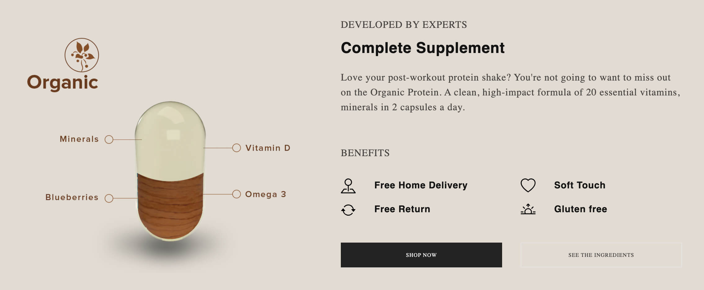
- Headline font: Quattrocento Sans
- Body font: Quattrocento (serif)
- Sections: Image With Text (for the featured image), Section Title (for the Title, description, and tagline), Icons With Text (for the text columns with icons), Button (for the two CTA buttons).
Bauer Bodoni + Questrial
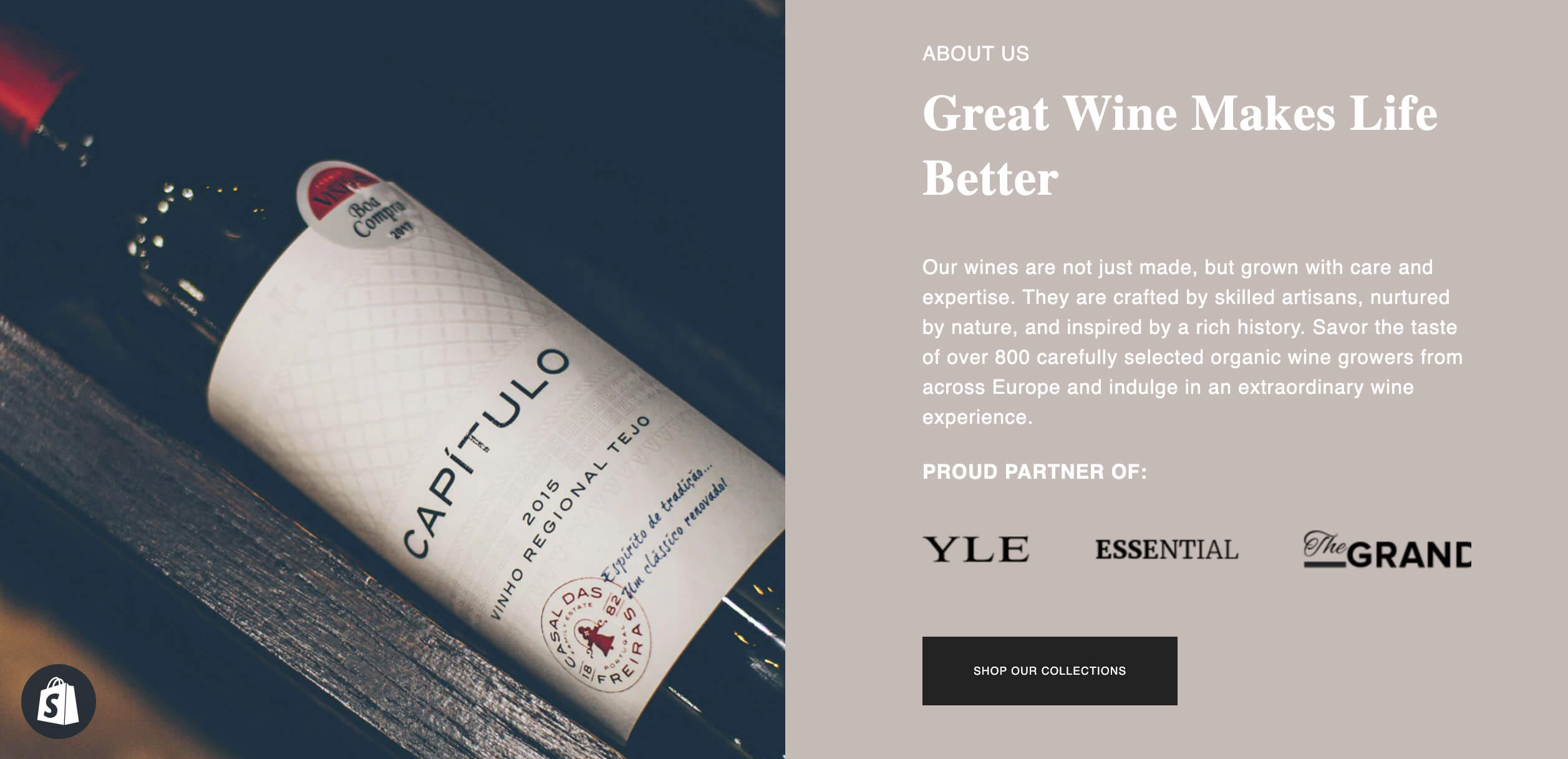
- Headline font: Bauer Bodoni
- Body font: Questrial
- Sections: Section Settings (for the featured image), Section Title (for the Title, description, tagline), Icons With Text (for the scrolling logo carousel), Button (for the CTA).
Montserrat + Poppins

- Headline font: Montserrat
- Body font: Poppins
- Sections: Section Settings (for the Heading) and Icons With Text (for the text columns with icons)
Prata + Questrial

- Headline font: Prata
- Body font: Questrial
- Sections: Icons With Text (for the featured image), Section Title (for the Recipe title, description, tagline), Divider (for the horizontal lines), Icons With Text (for the text columns with icons)
Fjalla One + IBM Plex Sans
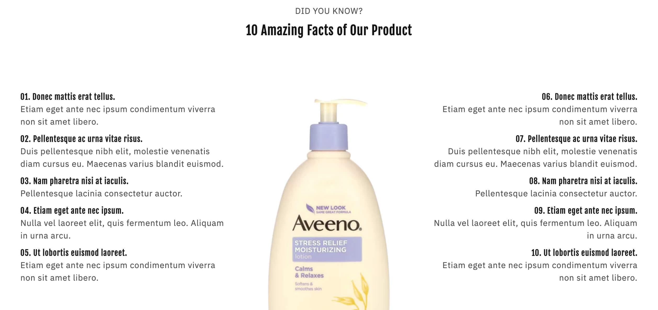
- Headline font: Fjalla One
- Body font: IBM Plex Sans
- Sections: Section Title (for the Heading, tagline), Icons With Text (for the two text columns), and Gallery (for the featured image)
Oswald + Poppins
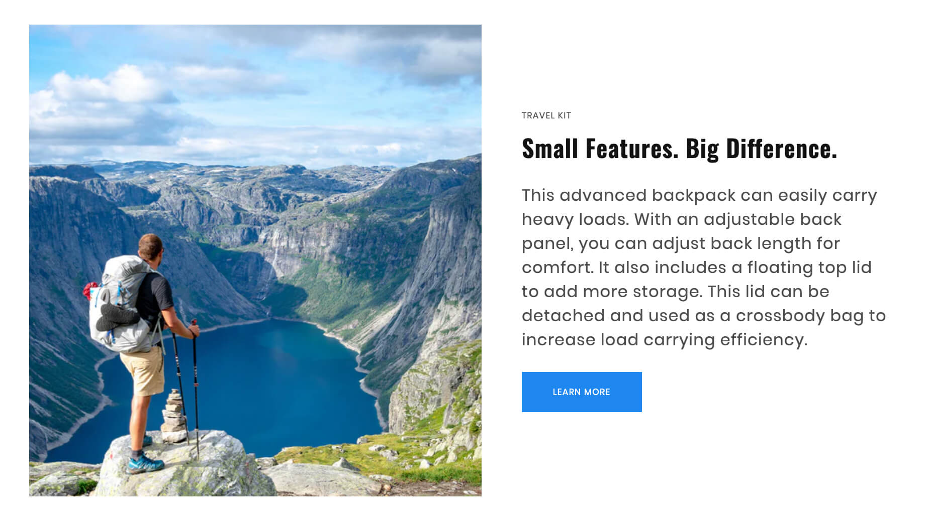
- Headline font: Oswald
- Body font: Poppins
- Sections: Image With Text (for the image, Heading, description, tagline, and CTA button)
Syne Bold + Syne Regular
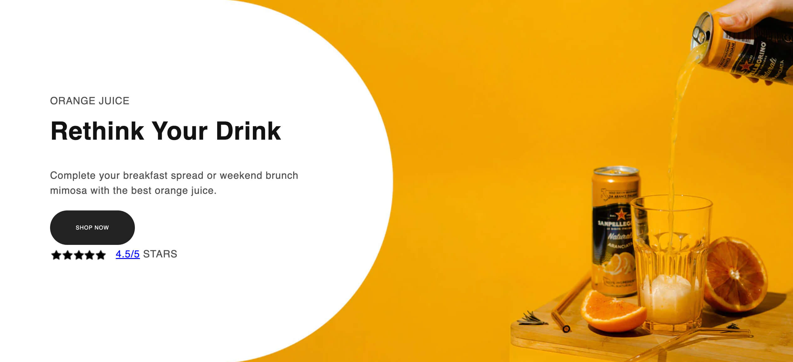
- Headline font: Syne Bold
- Body font: Syne Regular
- Sections: Section Title (for the Heading, tagline, and CTA button), Icons With Text (for the rating and star), and Section Settings (for the image background)
Libre Baskerville + Proza Libre
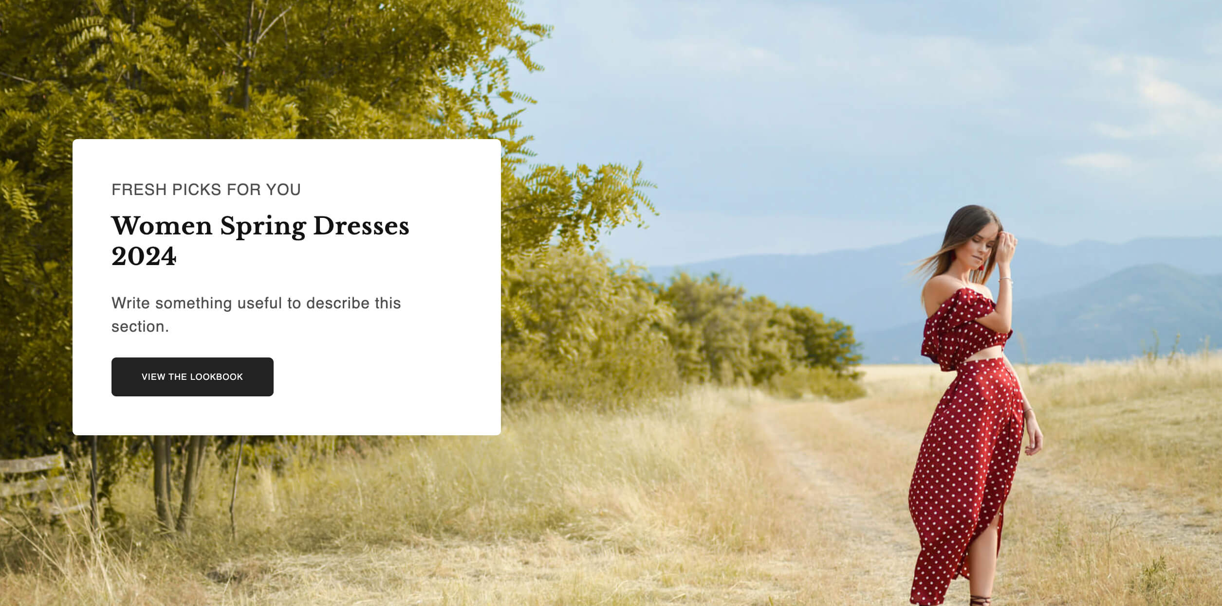
- Headline font: Libre Baskerville
- Body font: Proza Libre
- Sections: Section Title (for the Heading, tagline, and CTA button) and Section Settings (for the image background)
Playfair Display + Assistant
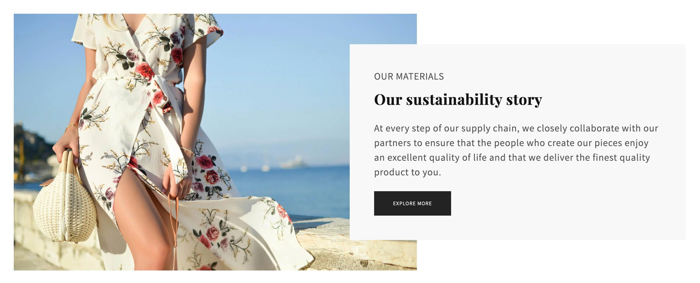
- Headline font: Playfair Display, serif
- Body font: Assistant, sans-serif
- Sections: Section Title (for the Heading, tagline, and CTA button) and Section Settings (for the image background)
Conclusion
We understand that there are no strict rules when it comes to font pairing, but we hope the suggested guidelines and font combinations mentioned above prove to be useful for you, especially if you're new to the world of fonts.
Google Fonts offers an extensive catalog that can help you bring personality and performance to your websites and products. We strongly suggest you take full advantage of it to integrate expressive types and icons seamlessly.
Helpful resources: If you're in niches like Apparel, Beauty & Fitness, or Home & Garden, take a look at these handy tips for creating effective product bundles in your Shopify store.
