When it comes to a Shopify store, hero banners are a key part of your home page and store landing pages. It's a powerful way to create an immediate impression, highlight promotions, and bring your products to life in an engaging, attractive format.
In this article below, you will learn 6 important things to get the hero banners right, the recommended format and dimensions, and 10 examples to inspire you to design your own hero banners.
Hero Banner best practices: 6 things to consider
1. Catchy images & soft colors to grab user's attention
Your hero banners can help convert leads, so it's crucial to create high-quality and relevant hero images to create a strong 1st impression. For a Shopify store, you should use your products or show your customers using the products as a star to engage the users at the forefront. We highly recommend not to use the stock images where possible. And above all, make sure what your images convey should be coordinated with your CTA messages.

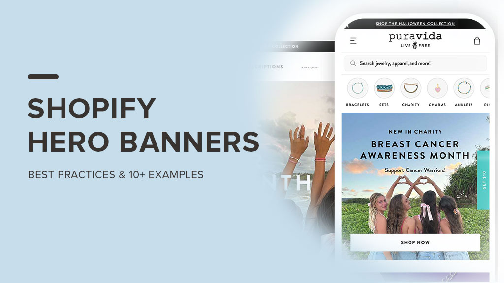
Source: https://www.puravidabracelets.com
Besides, another key thing is the choice of colors - it can help catch the user's eye and communicate the emotion you're going for. The heading, button, and background overlay colors - with tints and shadows can help create a strong contrast that makes your key CTAs stand out.
We highly recommend using the soft color schemes to offer a more comfortable, easy experience on the eyes.
Tip: Take advantage of the Parallax & scrolling animation Easy Content Builder provides to grab attention when users visit your Shopify store. This feature recreates the optical illusion that makes objects in the foreground close to us appear to move faster than objects farther away in the background.
2. Unique and compelling CTAs

Source: https://slingerbag.com
Your hero banner's goal can be brand-oriented, seasonal, or promotional. In all cases, the messaging must be clear, short, and bold to make your users want to check out your products and stay longer.
Tip: If you run a promo-related hero banner, using a Countdown timer is common to create a sense of urgency. (Easy Content Builder brings you a free Countdown timer section if you missed it.)
3. A separate hero image for mobile.

Source: https://www.puravidabracelets.com
More and more people make purchases on the go, it's crucial that you have separate hero images for mobile and desktop devices. If your hero banner doesn't display correctly across different devices with different screen sizes, the users will likely leave before checking out the rest of your Shopify store.
Tip: Using the Easy Content Builder, you can easily add a dedicated hero image for mobile devices.
4. Strong contrast is key to making the CTA stand out.

Bold and strong contrast hero section on https://www.cotopaxi.com
The whole point of a hero banner is to grab your user's attention before they scroll. Creating a strong contrast effectively holds users' attention and encourages them to explore more. You have a few options to accomplish this goal:
- Use a bold color for the main heading, CTA buttons.
- Use different button styles when using multiple CTA buttons (combine a ghost button with primary and secondary button styles).
- Add texture or color overlay to the background images to make the CTAs stand out and easy to read.
Tip: Mask image, Mask color, Mask opacity available in Easy Content Builder (check out these settings here) are handy to ensure the best contrast levels.
5. Above-the-fold content and imagery
Keeping your hero section visible above the fold is another critical best practice you should consider. Why? Because this is the most crucial area of every page that captures users' attention.

Hero banner with a background video on https://uk.fable.com
Most devices will display the top 600 pixels of a page. It's where users form their first impression. For the best UX, your store header and the hero banner should keep key elements highlighting your unique selling points and help users navigate your key pages quickly.
Tip: Background video can help you go the extra mile to connect with your users. Here's an example of a hero section using Easy Content Builder to feature a video background.
6. A/B Test your hero banners
As a rule of thumb, you should always create and test two or more options for your hero section. One of the most common ways is to tweak the heading, CTA button copy and color, the hero image or video, the text position, etc. After performing the A/B test between those options, you will know which option generates more engagement and conversions.
Choose the right hero image dimension
A general guideline from Shopify:
- Max hero image width: between 1280 and 2500 px
- Max hero image height: between 720 and 900 px
- Max hero image size: 10 MB
- Aspect ratio: 16:9
We recommend a (16:9) image ratio and 1,200px wide for a full-width hero image. To keep the banner above the fold, the ideal size is 1600 x 500 pixels - but feel free to adjust based on your desired look and layout. While you can size up the width to 1,800 px for large screens, this will need a larger file size, which might hurt your page speed. The hero images should be lightweight as much as possible.
For mobile, the ideal size is 800 x 1200 px. And for background video, the ideal size is 1920 x 1080 px.
We recommend JPG over PNG files to ensure your site loads as quickly as possible.
10+ Hero banner examples to get you inspired.
Tip: Check out this 2-minute video that guides you through creating a Custom Hero Section for your Shopify homepage or landing page without needing to use any code. You can easily combine different elements using Easy Content Builder to enhance the visual appeal of your hero section. You can follow the same process to enhance the visual appeal of your hero section with more robust elements from the app.
Tip: Watch this video tutorial (refer to Part 1) to discover how to design a hero section featuring a background video with Easy Content Builder app.
Let's look at 10+ examples of hero banners that Easy Content Builder created for demo purposes. This gives you an idea about a wide variety of options you can pull the elements - your image, video, your copy, your font, and your call to action - together into a unified hero section.
View all hero banner demos here
Example 1: Aligning the text block and CTA buttons to the bottom position.

Example 2: The text block on the left position with the parallax animation on scrolling enabled.

Example 3: Adding a space below the main heading and aligning the CTA buttons to the bottom position.

Example 4: Aligning the text block to the top position.

Example 5: A hero banner with a background video.

Example 6: Aligning the text and background color overlay to the center.

Example 7: A hero banner with a countdown timer

Example 8: A hero banner with 3 CTA buttons

Example 9: Aligning the extra text element to the bottom of the text block.

Example 10: A hero banner with a text and background color overlay on the first column. Parallax animation on scrolling enabled.

Example 11: A hero banner with a mask image overlay at 10% opacity

View all hero banner demos here
Conclusion
Designing your hero banner is one of the most important parts of your Shopify store setup. Hopefully, this post gives you practical tips and examples for creating compelling hero banners for your Shopify stores. When done right, a beautiful hero section will draw your users in from the first look and keep them exploring your store longer.
Plus, leveraging free page builders like Easy Content Builder makes creating flexible hero banners even easier just through your Shopify theme editor.
Curious to read more? Check out these articles: